Stop Painting Your Bedroom the Wrong White: 12 Neutral Bedroom Color Palettes That Actually Work
Here is something nobody warns you about before you start decorating — not all neutrals are created equal. You pick what looks like a perfect soft white on the paint chip, slap it on the wall, and suddenly your bedroom looks vaguely purple, or weirdly green, or just inexplicably cold and flat. Sound familiar? You are definitely not alone, and this is exactly why choosing a neutral bedroom color palette deserves way more attention than most people give it.
I went through three rounds of repainting my own bedroom before I finally understood what I was actually doing. The undertones, the light direction, the way colors shift between morning and evening — all of it matters enormously. Once I started approaching neutrals as a real design decision rather than a safe default, everything clicked. The room finally felt the way I always wanted it to feel: calm, warm, and like somewhere I genuinely wanted to spend time.
These 12 neutral bedroom color palettes are the ones that consistently deliver that feeling. Each one is distinct, livable, and more interesting than plain beige — even when beige is involved.
1. Warm White and Soft Linen
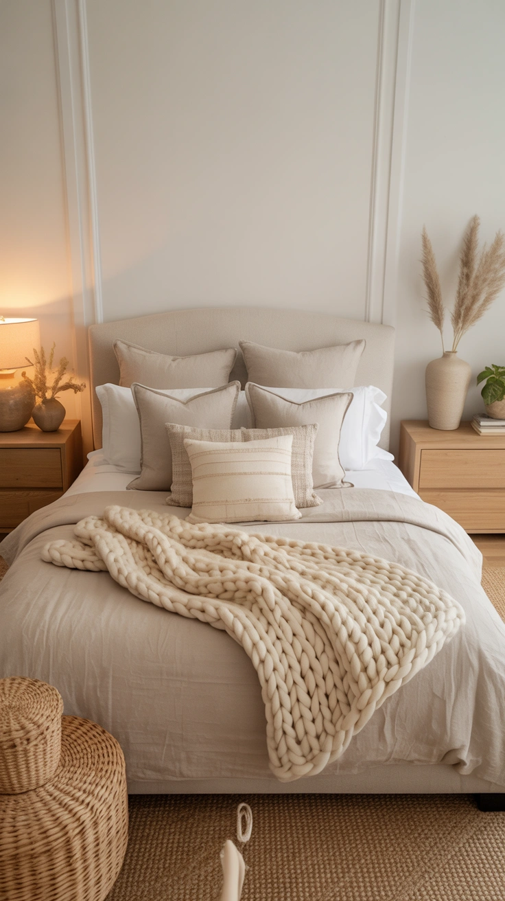
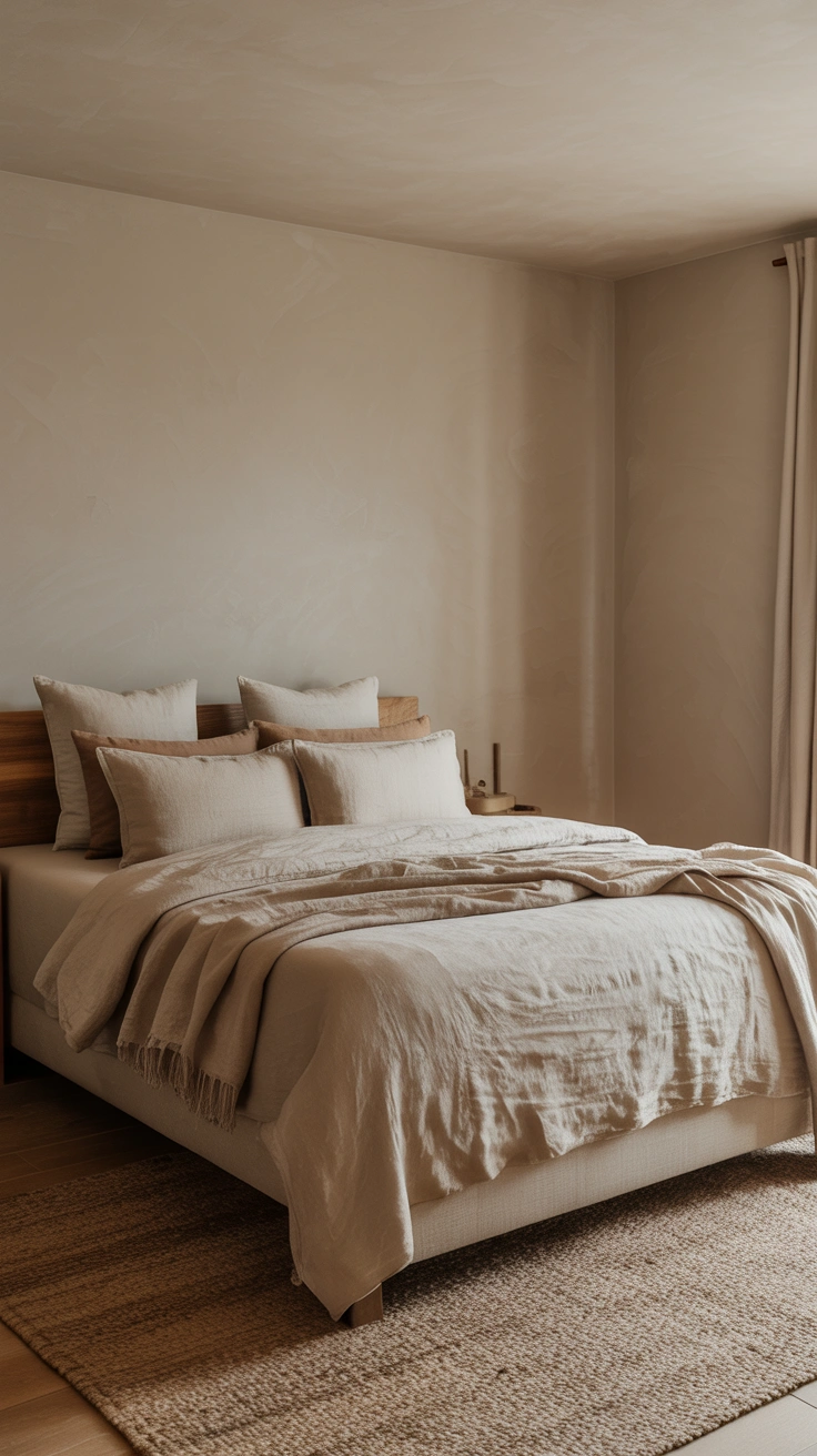
This is the palette that started my obsession with neutrals done properly. Warm white on the walls — think Benjamin Moore White Dove or Sherwin-Williams Alabaster — paired with soft linen-toned textiles creates a bedroom that feels clean without feeling cold.
The secret is in the undertones. Warm whites carry yellow or pink undertones that prevent the room from reading as sterile or clinical. They work beautifully in rooms with north-facing light, which tends to pull cooler and bluer during the day.
How to Build It
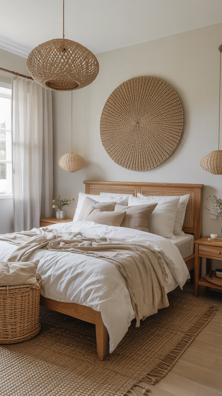
- Walls in a warm white with yellow or cream undertones
- Bedding in natural linen — undyed or in oat, flax, or warm ivory
- Wooden furniture in light oak or ash to reinforce the warmth
- Woven texture accents like a jute rug or rattan lamp base
This palette rewards layering. The more texture you introduce within the same color family, the richer and more intentional the room looks.
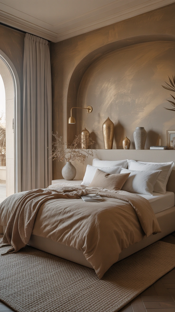
2. Greige and Warm Taupe
Greige — the beloved hybrid of gray and beige — remains one of the most universally flattering neutral bedroom color palettes available. It reads differently depending on your light conditions, which is partly what makes it so versatile.
In morning light, greige often pulls warmer and more beige. In the evening under artificial light, it can settle into a softer gray. This chameleon quality means it works in almost any orientation and pairs beautifully with both cool and warm accent tones.
Warm taupe sits slightly deeper and more golden than greige, making it an excellent choice for creating a bedroom that feels genuinely enveloping. Pair either with cream and caramel tones for a monochromatic effect that has real depth.
3. Soft Sage and Warm Cream
Sage green is technically a neutral at this point, and if you have not considered it for a bedroom, you are seriously missing out. A muted, gray-toned sage on the walls paired with warm cream bedding and natural wood elements creates one of the most serene and beautiful bedroom environments possible.
The key is choosing a sage that leans gray rather than bright. Bright or yellow-toned greens will read as a color statement rather than a quiet neutral. A dusty, desaturated sage does something entirely different — it recedes gently and makes everything around it look more considered.
FYI, sage pairs extraordinarily well with terracotta and rust tones as accents. A single warm-toned throw pillow or a terracotta ceramic lamp base grounds the palette beautifully without disrupting its calm.
4. Warm Gray and Charcoal Accents
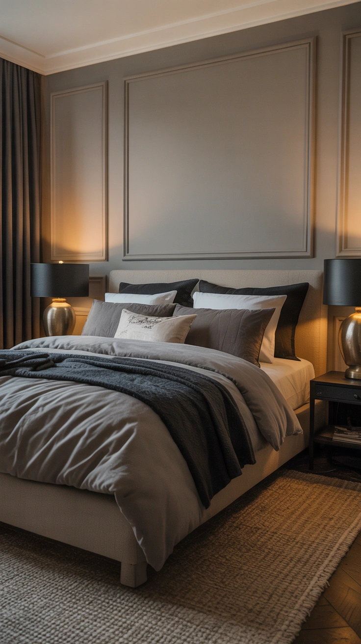
If you love gray but have struggled to make it feel warm rather than cold and depressing, the issue is almost always undertone. Cool grays with blue or purple undertones tend to feel unwelcoming in a bedroom. Warm grays with beige or green undertones feel entirely different.
This palette uses a warm mid-tone gray on the walls with charcoal accents introduced through textiles — a darker throw, deeper pillows, a charcoal linen duvet. The tonal variation between the wall gray and the charcoal accents creates depth and visual interest without introducing any additional color.
It is a particularly strong choice for a bedroom that wants to feel sophisticated and restful without leaning into more traditional beige territory. Add matte black or brushed nickel hardware to reinforce the cool-within-warm quality of the palette.
5. Creamy White and Natural Oak
Sometimes the most beautiful palette is the simplest one. Creamy white walls — not bright white, not cool white, but the warmest, softest white you can find — paired with natural oak furniture and floors is a combination that has sustained decades of interior design trends for a reason.
It works because it mimics the quality of natural light and organic materials. The cream reflects warmth. The oak adds grain, texture, and an earthy quality that no painted surface can fully replicate. Together they create a bedroom that feels genuinely restful from the moment you walk in.
This palette is also remarkably forgiving when it comes to layering additional elements. Almost any textile color — from blush to navy to forest green — sits comfortably within a creamy white and oak framework.
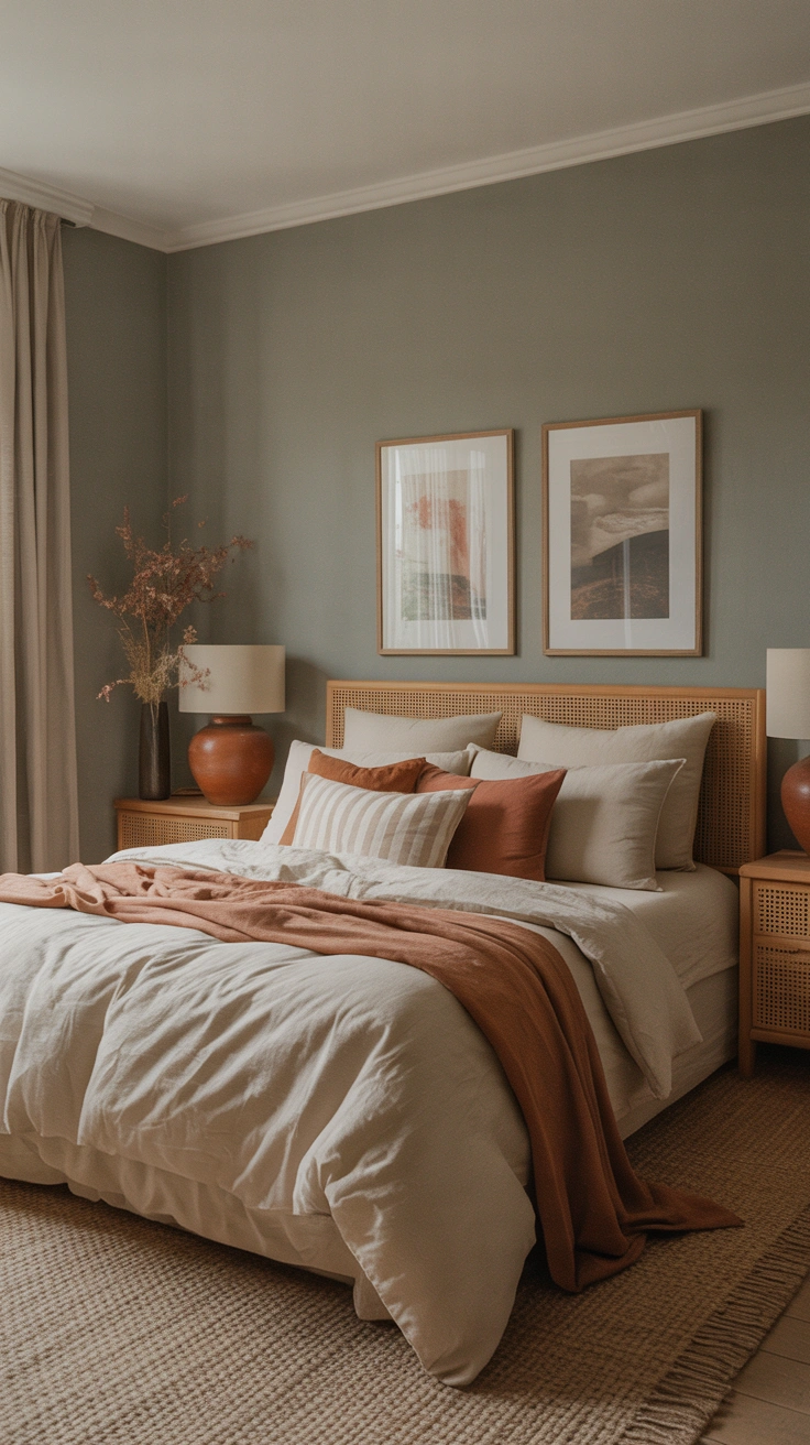
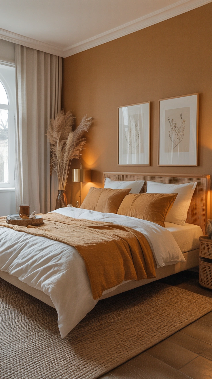
6. Sandy Beige and Warm Rust
This one is for the person who wants a neutral bedroom that still has energy and personality. Sandy beige — a warm, golden-toned mid beige — on the walls creates a sun-baked quality that feels incredibly welcoming. Introduce rust and terracotta tones through cushions, artwork, or a woven rug and the palette takes on a depth and richness that pure neutrals sometimes lack.
IMO, this combination works best in rooms with good natural light. The warm tones amplify sunlight beautifully during the day and glow richly under warm-toned artificial light in the evening. It is the palette equivalent of golden hour, all day long.
Keep the bedding itself in lighter, softer tones — cream, oat, or a pale warm white — to prevent the room from feeling too saturated.
7. Stone and Warm Putty
Stone is having a serious moment in interior design and it translates beautifully into bedroom color palettes. A warm stone tone — think the color of unpolished marble or a limestone floor — used on the walls creates a tactile, organic quality that feels genuinely luxurious.
Pair it with warm putty tones in the textiles. Putty sits between beige and gray with a slightly pinkish warmth that complements stone perfectly. The two tones are close enough in value to create a quiet, tonal effect but different enough to give the room visual dimension.
Accents That Elevate This Palette
- Aged brass or unlacquered bronze hardware and fixtures
- Linen bedding in oat or undyed natural tones
- A single piece of plaster or stone sculpture as a decorative object
- Matte ceramic vessels in warm off-white
This palette leans sophisticated and calm — ideal for a bedroom that aspires to a boutique hotel quality.
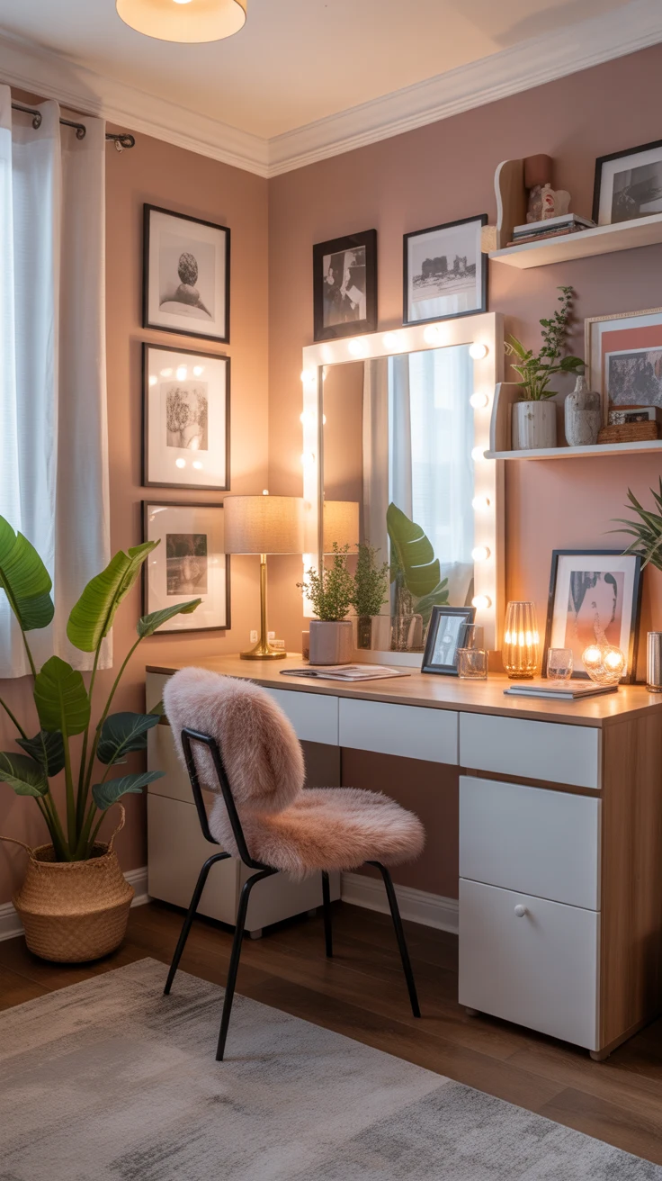
8. Off-White and Soft Blush
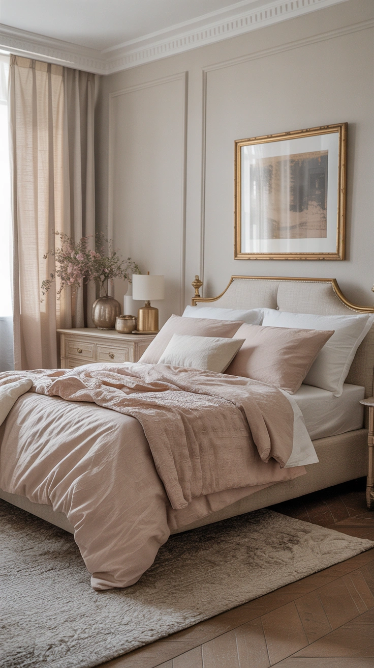
Blush in a bedroom is not a trend — it is a quietly enduring choice that consistently makes spaces feel soft, warm, and welcoming. The key is keeping the blush extremely muted. You are not going for pink. You are going for the faintest whisper of pink, the color of the inside of a seashell or the lightest possible blush rose.
Pair it with off-white walls rather than bright white. Bright white would make the blush feel babyish and precious. Off-white keeps it grown-up and refined. Add natural linen, pale wood, and a few touches of warm brass and the room achieves a genuinely elegant softness.
This palette works especially well in bedrooms with good natural light, where the blush tones pick up warmth throughout the day and read as almost neutral in lower light conditions.
9. Warm Chocolate and Ivory
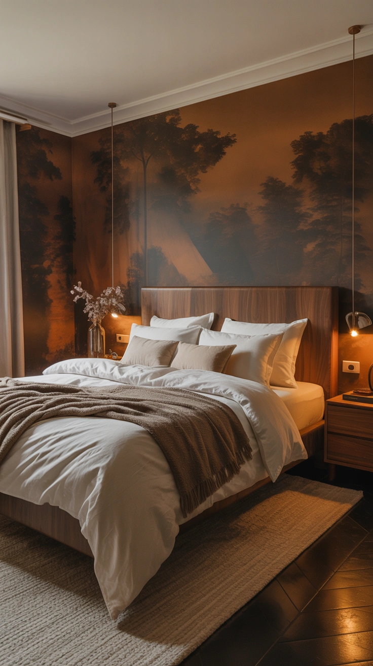
If you want a neutral bedroom that feels genuinely dramatic and sophisticated, this is the palette to explore. Rich warm chocolate brown — not cold dark brown, but the warm, red-undertoned brown of dark walnut or bitter chocolate — used on a single accent wall or even all four walls creates an enveloping, cocooning effect that is unlike anything else.
Balance the depth of the chocolate with ivory and cream tones throughout the bedding and soft furnishings. The contrast is striking without being harsh because both tones sit within the same warm color family. The result is a bedroom that feels deliberate, confident, and deeply restful.
This is one of those palettes that photographs beautifully and feels even better in person. Do not let it intimidate you — the warmth of the brown prevents it from ever feeling heavy or oppressive.
10. Pale Mushroom and Natural Linen
Mushroom is one of those neutrals that sounds uninspiring until you see it on a wall. It sits between a warm gray and a muted beige with a slightly earthy, almost purple-adjacent quality in certain lights. In a bedroom, it creates an incredibly sophisticated backdrop that makes every other element in the room look more considered.
Pair pale mushroom walls with natural linen bedding — undyed or in the palest oat — and the combination achieves a quiet, organic elegance that is very much of the moment in contemporary interior design. Add a natural fiber rug, some unfinished wood or rattan elements, and the palette feels complete.
The beauty of mushroom as a neutral is its specificity. It is not generic. It reads as a deliberate choice, which is exactly what a well-designed bedroom should communicate.
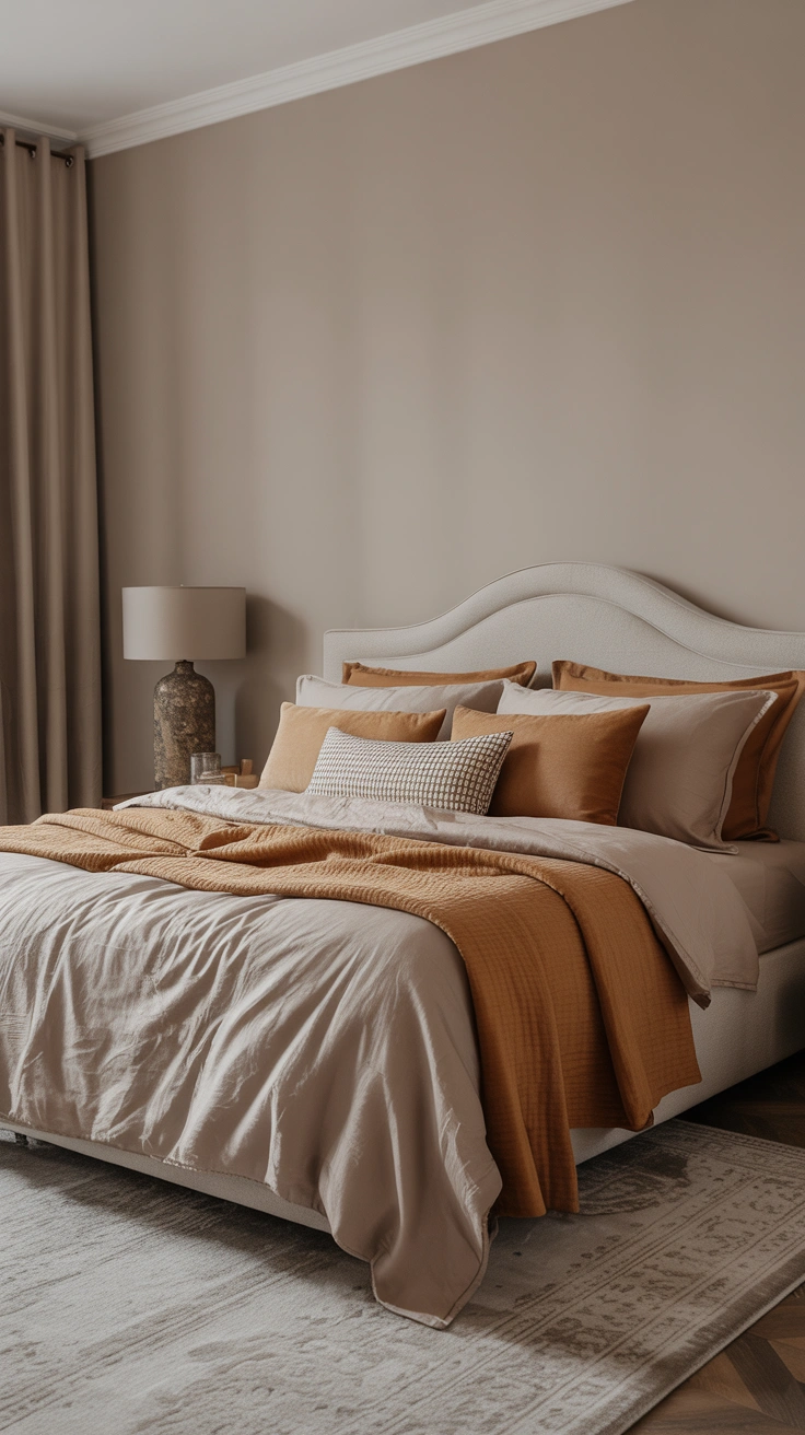
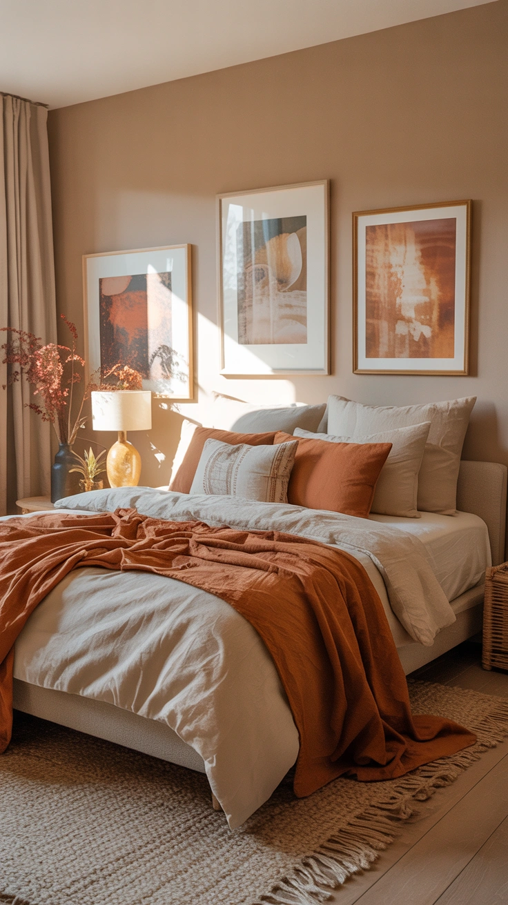
11. Soft Caramel and Warm White
Caramel as a wall color is deeply underrated. It is warm, it is rich, and it brings a golden quality to a bedroom that cooler neutrals simply cannot achieve. Soft caramel — diluted and muted rather than full-strength — on the walls creates a room that glows.
Paired with warm white bedding and natural materials throughout, caramel walls produce one of the most welcoming and genuinely beautiful bedroom environments I have ever experienced. It works particularly well in rooms that feel cold or get limited natural light, because the warmth of the color compensates for what the light cannot provide.
Layer in cream, ivory, and soft amber tones through textiles and accessories. Keep the overall palette tight and within the same warm color family for maximum impact.
12. Driftwood Gray and Coastal Cream
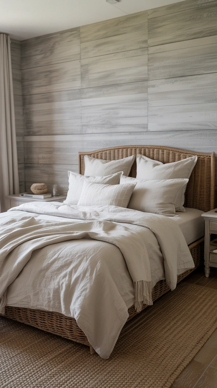
This final palette is for the person who wants a neutral bedroom with a quietly relaxed, unhurried quality. Driftwood gray — a warm, weathered gray with distinct beige and brown undertones — paired with coastal cream creates a space that feels effortlessly calm.
It draws on the palette of natural, sun-bleached materials: weathered timber, sea-washed stone, undyed cotton. Nothing in this palette feels forced or overly designed. It is the kind of room that looks like it came together easily, even though the casual quality is itself carefully constructed.
Key Elements
- Walls in a warm driftwood gray with visible beige undertones
- Bedding in unbleached cotton or coastal cream linen
- Woven textures throughout — seagrass, rattan, linen, jute
- Minimal accessories in matte finishes — nothing shiny or precious
This palette rewards restraint. The less you add, the better it looks.
Conclusion
Here is the honest takeaway from all twelve of these palettes — a neutral bedroom is not a compromise. It is not the safe choice or the boring choice or the choice you make when you cannot decide on a real color. A well-chosen neutral palette is one of the most sophisticated and intentional decisions you can make for a bedroom.
The difference between a neutral bedroom that feels flat and one that feels genuinely beautiful almost always comes down to undertone awareness, textile layering, and the courage to commit to a specific direction rather than defaulting to the most generic option available.
Pick the palette that genuinely resonates with the feeling you want your bedroom to produce. Test it on a large sample before committing. Layer your textiles within the same tone family. And trust that getting the neutral right is worth every bit of effort it takes.