Modern Living Room Design Ideas for Every Budget
Introduction
The living room carries more jobs than any other room: welcome mat for guests, cinema on Friday night, reading corner on slow mornings, and increasingly the backdrop of work-from-home life. Modern style is one of the most requested looks for this hardworking space — clean lines, honest materials, and uncluttered surfaces make a room feel calm and current at once.
The good news is that a modern living room is built from decisions, not dollars. The style is defined by restraint and intention — a clear palette, furniture with simple silhouettes, surfaces kept mostly clear, and light handled with care. None of those things requires a renovation budget. A rearranged room, a warm lamp, and a well-chosen textile can move a dated living room toward modern faster than an expensive new sofa ever will.
This guide walks through fifteen modern living room design ideas arranged from free to full-investment, so you can start exactly where your budget allows. Each idea adapts up or down in cost, and each one stands on its own — pick the three or four that fix your room’s weakest spots first. If warmth matters as much as polish to you, our roundup of cozy living room ideas pairs beautifully with these modern moves.
1. Start With a Calm, Cohesive Neutral Palette
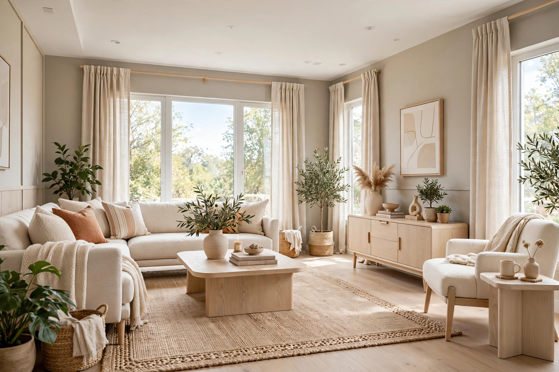
Modern rooms breathe, and breathable rooms start with the walls. Warm white, soft greige, oatmeal, and pale stone create a quiet canvas that lets light bounce and furniture take center stage. Cool, stark grays can read as flat or clinical in average daylight, while warm-leaning neutrals flatter both lamplight and skin tones. If you cannot paint — most renters cannot — you can still own the palette through the largest surfaces you control: a big area rug, wall-to-wall curtains, and a pale slipcover shift the room’s base color without touching the walls.
Depth comes from texture, not more colors. Layer linen, bouclé, jute, pale oak, and matte ceramics in the same tonal family, and the room reads as rich instead of blank. The mix of nubby, woven, and smooth surfaces keeps the space interesting at close range — get the base calm, and everything you add afterward looks more expensive.
2. Let One Statement Sofa Carry the Room
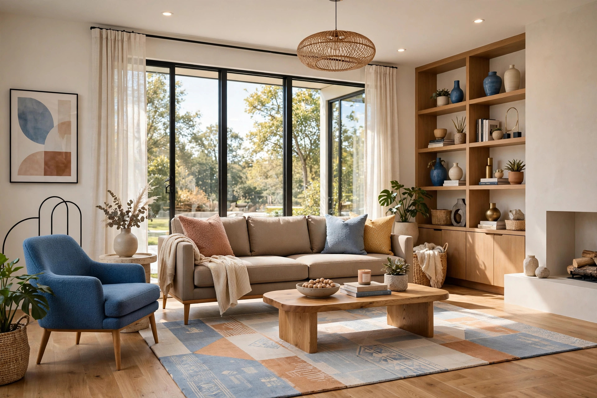
If a single piece deserves the biggest share of your budget, it is the sofa. It is the largest object in the room, the one your body judges most honestly, and the piece every other choice orbits around. A modern statement sofa has a low profile, clean lines, tailored cushions, and legs you can see under — nothing overstuffed, nothing fussy. In a warm neutral upholstery, it anchors the room quietly and lets smaller pieces carry the personality.
On a tight budget, fake the effect: a tailored slipcover, new tapered legs, and two structured cushions can transform a hand-me-down into something intentional. Placement matters as much as the piece — center the sofa on the room’s focal point, give it a rug and a light source, and it reads as the room’s deliberate center.
3. Do the Thrifty Makeover Before You Buy New
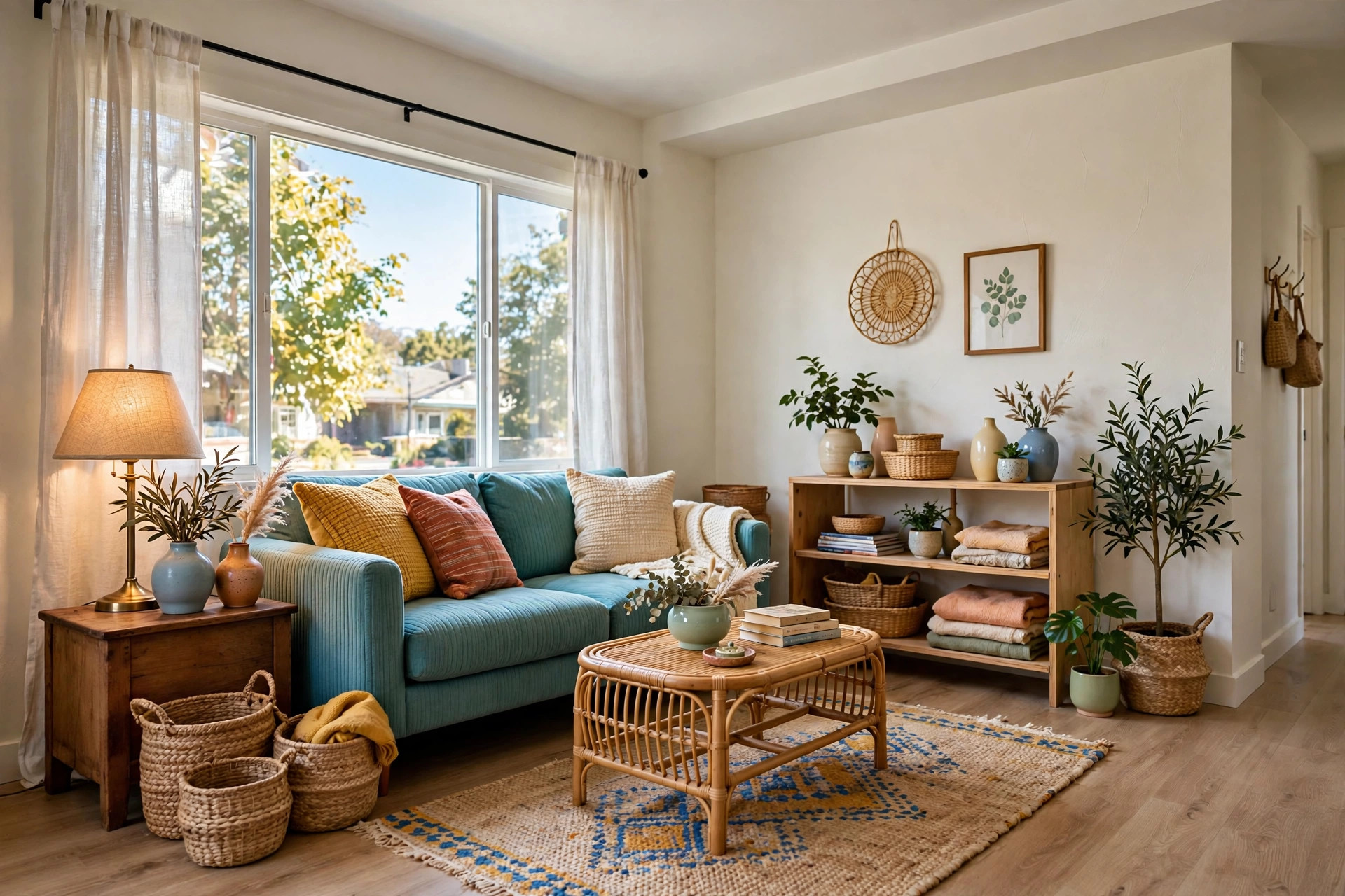
The most underrated modern living room is the secondhand one. Thrift stores and resale marketplaces are full of exactly what modern style loves: solid wood side tables, simple frames, ceramic vases, woven baskets, and lamps with good bones. The filter is material honesty — ceramic, glass, wood, cotton, and stone-look pieces almost always look more expensive than they are, while shiny plastic and glued-on details never do. One afternoon of hunting can furnish the supporting cast of a whole room.
Spend your actual money where the eye lands most: pillows, lighting, and the rug. Those three touch every sightline in the room, so upgrading them upgrades everything. If you want a full room-by-room plan for stretching a small budget, our guide to apartment decorating on a budget shows how to split limited money across the spaces that matter most. Buy from a short list of gaps, never from impulse, and the thrifty room will look curated instead of collected-by-accident.
💡 Pro Tip: Shop with three things open in your phone’s notes: your measurements, your three-color palette, and your list of gaps. If a find does not fit all three, walk past it — the fastest way to waste a thrifty budget is buying a bargain that belongs to someone else’s room.
4. Go Luxe With Marble and Velvet Touches
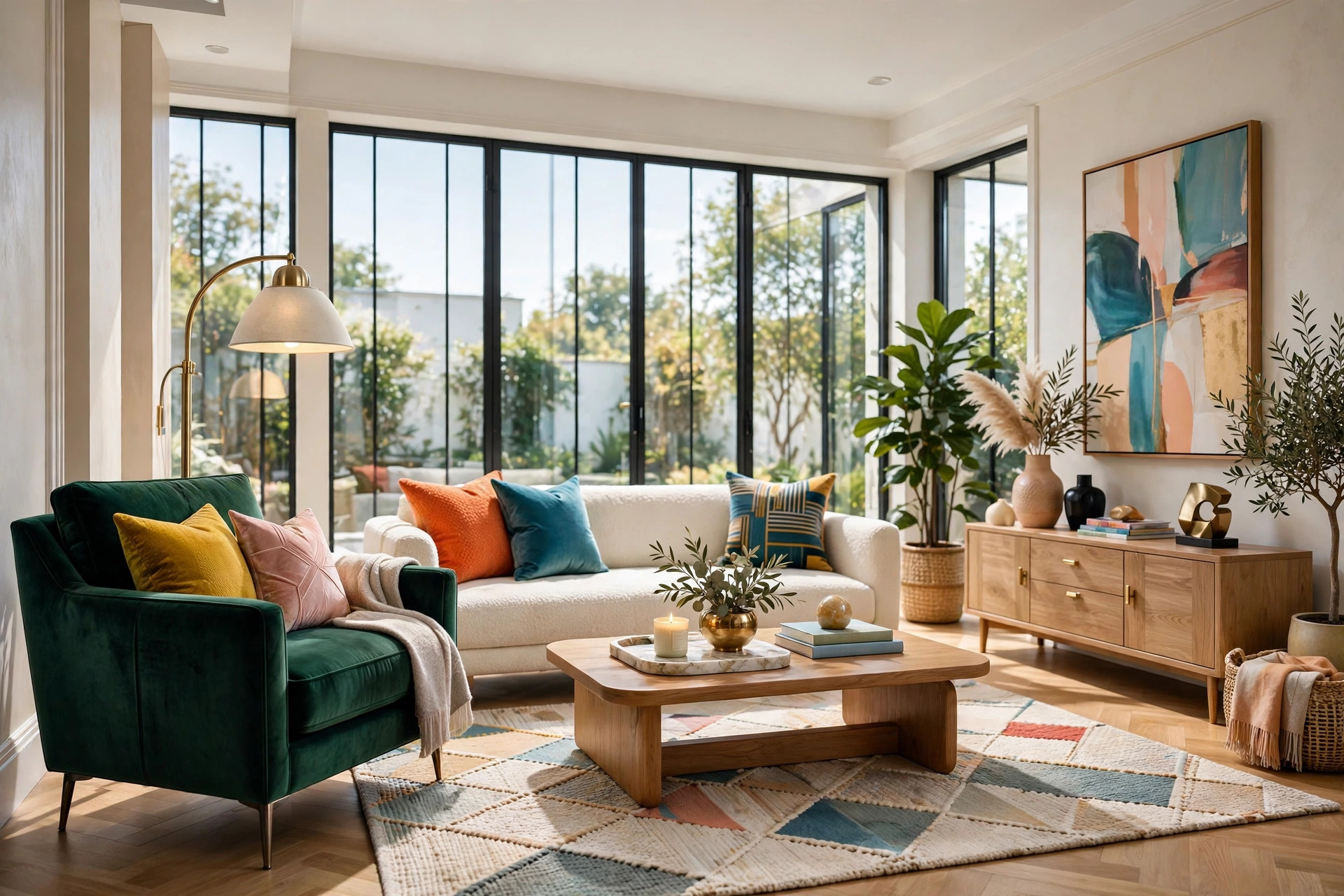
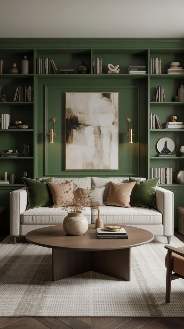
The high-end modern look is really a materials story: veined stone, deep velvet, brushed brass, smoked glass. You do not need a marble slab or a designer sofa to tell it. A marble-look tray on the coffee table, two velvet cushions in a saturated tone, and a brass floor lamp deliver the same material language at a fraction of the cost. The eye reads the materials, not the price tags — velvet catches lamplight beautifully whether it cost a little or a lot.
Restraint keeps the luxe look modern rather than showroom-stiff. Choose one or two rich moments and let the rest stay quiet: a velvet armchair against a calm neutral sofa, or a stone-topped side table beside simple linen seating. Two confident luxe touches in a calm room read as wealth; ten read as a catalog.
5. Style a Small Modern Living Room Without Clutter
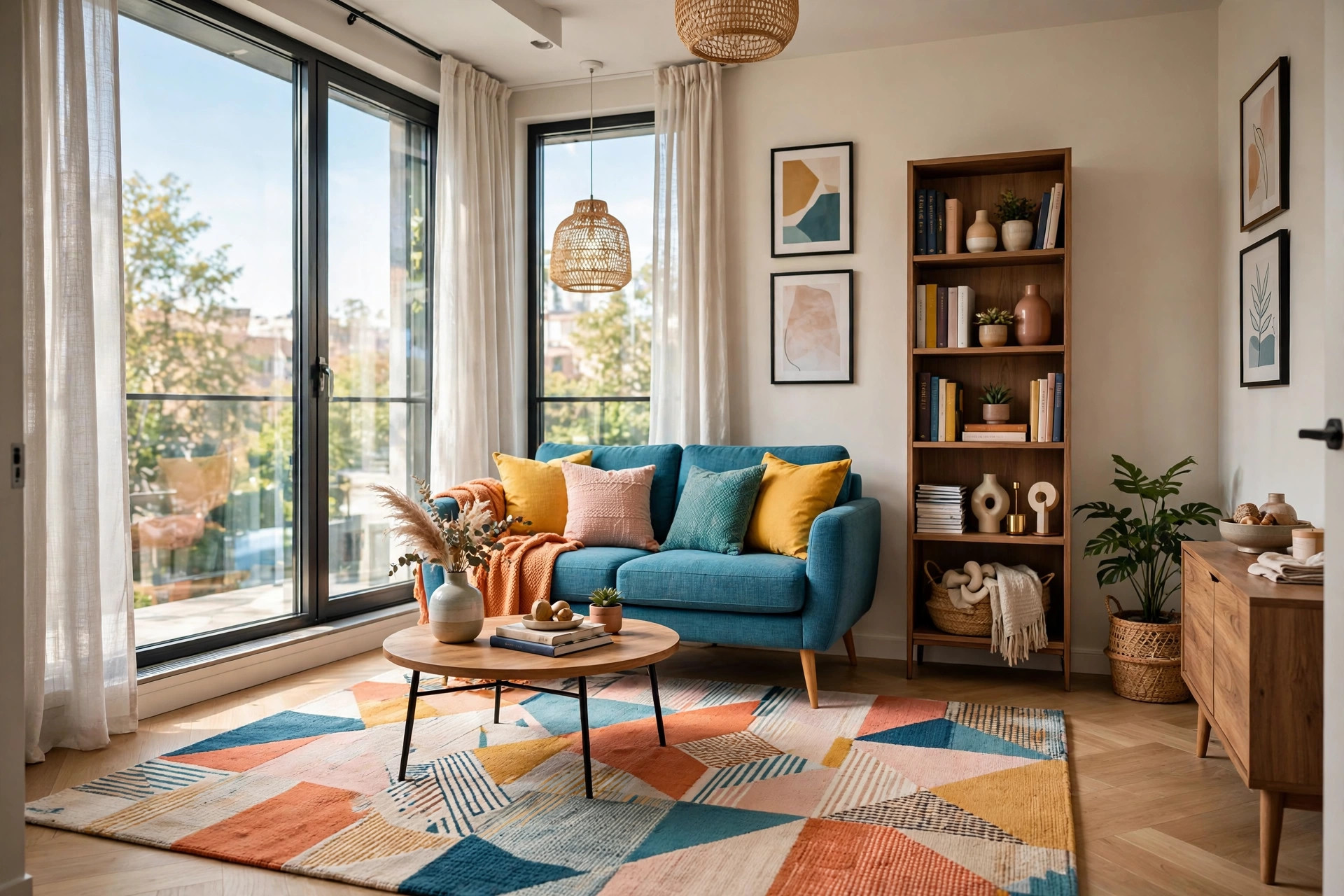
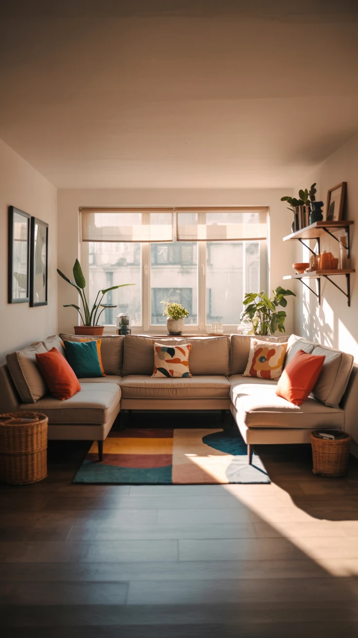
A small room does not need a smaller style — it needs stricter editing. Scale the furniture to the room: an apartment-sized sofa, leggy pieces that show floor beneath them, and one rug large enough for the front legs of every seat. Keep surfaces mostly clear, push storage up the walls with tall narrow bookcases, and let one statement piece — a sculptural lamp, a bold art print — give the eye a destination instead of scattering small objects everywhere.
The real trick is visual breathing room. Leave empty space on shelves, keep the coffee table styled to a tray with three objects, and resist filling every corner. For a deeper dive into compact layouts, our small living room ideas roundup covers right-sizing every piece for tight floor plans. Small modern rooms succeed when they feel intentional rather than full — every object earns its place, and the empty space is part of the design.
📌 Important: Measure the room, the doorways, and the largest pieces before you buy anything. In a small living room, a sofa that fits the space perfectly is useless if it cannot make the last hallway corner on delivery day.
6. Zone an Open-Plan Space Into Purposeful Areas
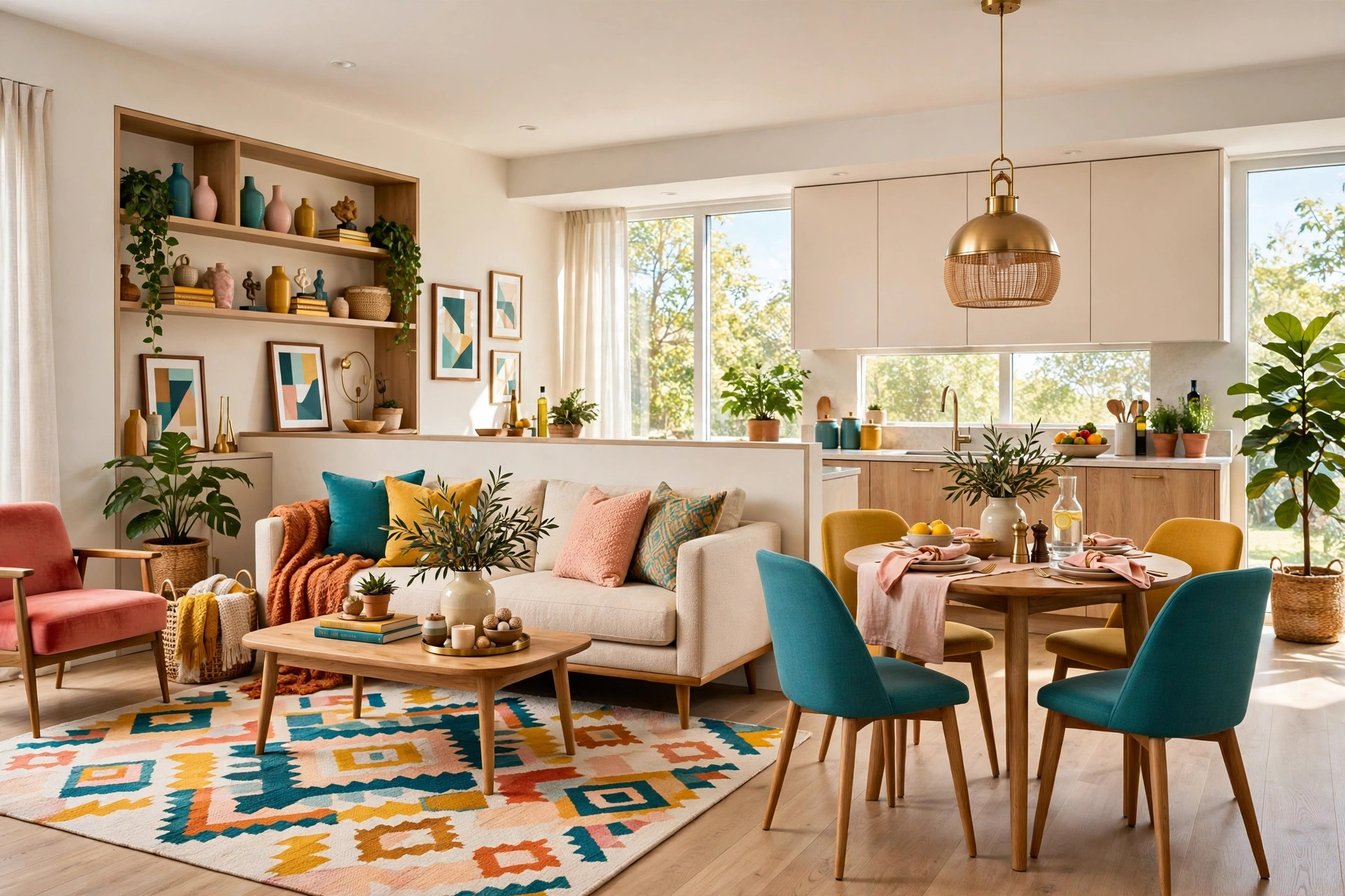
Open-plan rooms fail when they have no structure — one big box of furniture with no beginning or end. Modern zoning fixes that with soft boundaries: a rug defines the lounge area, the back of the sofa marks where living ends and dining begins, and a pendant light marks the table. Each zone gets its own anchor and its own light source, because light is what tells the eye “this is a place.” Two lit zones read as two rooms; one flat-lit box reads as a hallway with furniture.
Keep the palette continuous across zones so the space reads as one home. Vary the smaller layers for identity — a different rug texture in the lounge, a distinct pendant over the table — while walls and flooring stay constant. Keep dividers low and sightlines open; anything above waist height chops the light and airiness.
7. Build a Gallery Wall With Intention
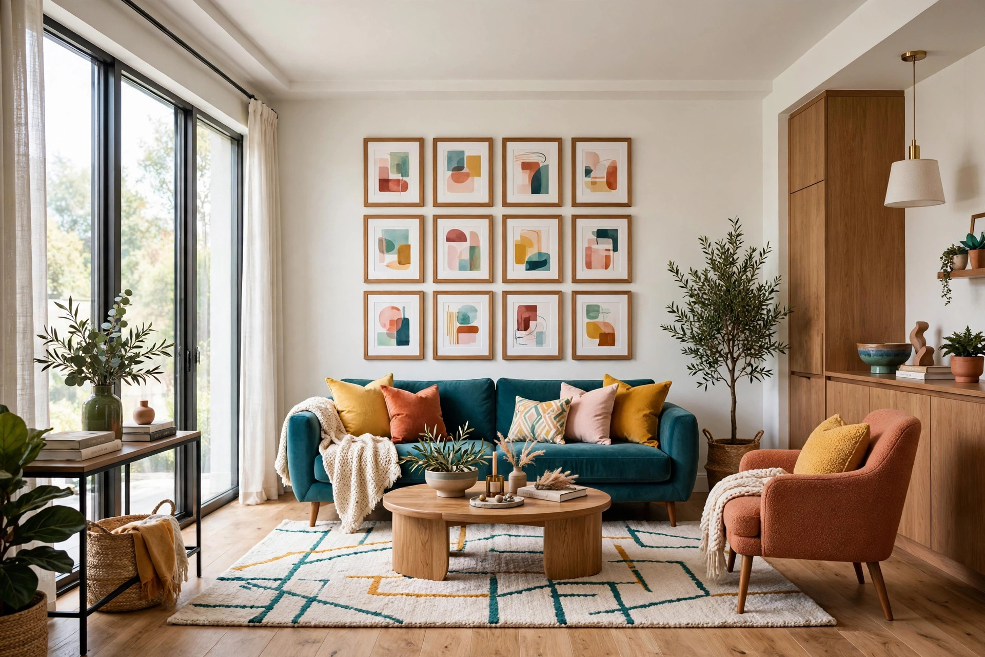
A gallery wall is the fastest way to give a modern living room a point of view, and the difference between artful and chaotic is discipline. Start with one wall — above the sofa or on the room’s dead wall — and commit to a tight cluster rather than art scattered hopefully across every surface. Matching simple frames do more work than expensive art: four prints in identical frames read as a collection, while four mismatched pieces read as leftovers.
Hang the arrangement’s center at eye level, roughly 57 to 60 inches from the floor, and keep the spacing between frames tight and consistent. Mix one larger anchor piece with smaller ones around it, and leave the surrounding walls calm — the gallery wall is the exclamation point, so the rest of the room should be the sentence. Step back to the doorway to check it; the doorway view is what guests and photographs register first.
8. Layer Lighting at Three Heights
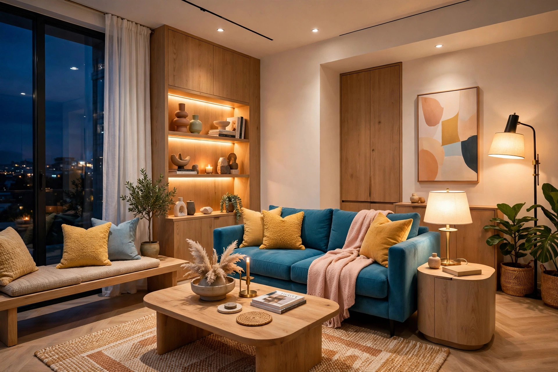
Nothing makes a living room feel dated faster than a single overhead light blazing down. Modern rooms are lit in layers: ambient light from above, task light at reading height, and small accents tucked low or high — a floor lamp in the dark corner, a table lamp beside the seating, one small glow on a shelf. Aim for at least three sources. Each pool of light becomes its own destination, and the room feels rich instead of merely illuminated.
Warmth is non-negotiable across every layer. Use warm-white bulbs throughout and put the two main lamps on dimmers, so the room drops from bright-and-functional to evening-glow in seconds. Uplight aimed at the ceiling pushes walls visually outward, while a small light washing a dark corner erases the gloomy edges that shrink a room after dark. When the overhead dies and the lamps take over, the whole room exhales.
⚠️ Warning: Keep every bulb the same warm color temperature — mixed cool and warm bulbs make a room feel restless even when you cannot name why. And keep fabric shades, throws, and dried arrangements clear of hot bulbs; warm light should never mean a warm hazard.
9. Mix Textures for Instant Depth
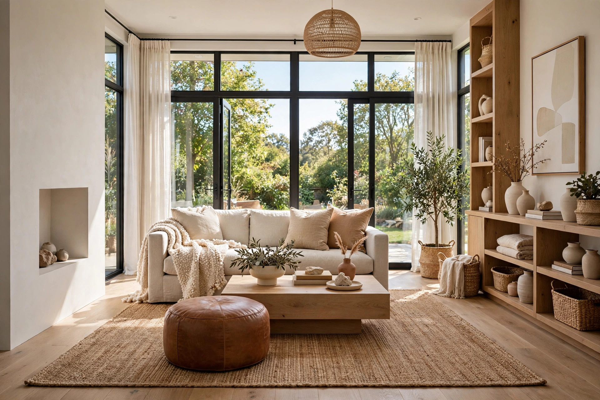
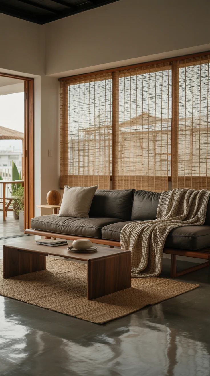
If your palette is disciplined, texture is where the room gets its richness. Bouclé, linen, wool, leather, jute, and grained wood can all live in one calm color family while giving the hand and the eye completely different experiences. A nubby throw on a smooth linen sofa, a woven jute rug under a leather ottoman, a rough ceramic vase on a sleek console — the contrast is what makes a restrained palette feel luxurious instead of flat.
The line between textured and cluttered is editing. Each texture should earn its place and repeat at least twice — the knit throw picks up the basket’s weave, the leather ottoman echoes the cabinet handles. Three or four rich textures, deliberately repeated, give warmth without adding a single object to dust.
10. Use the 60-30-10 Color Rule
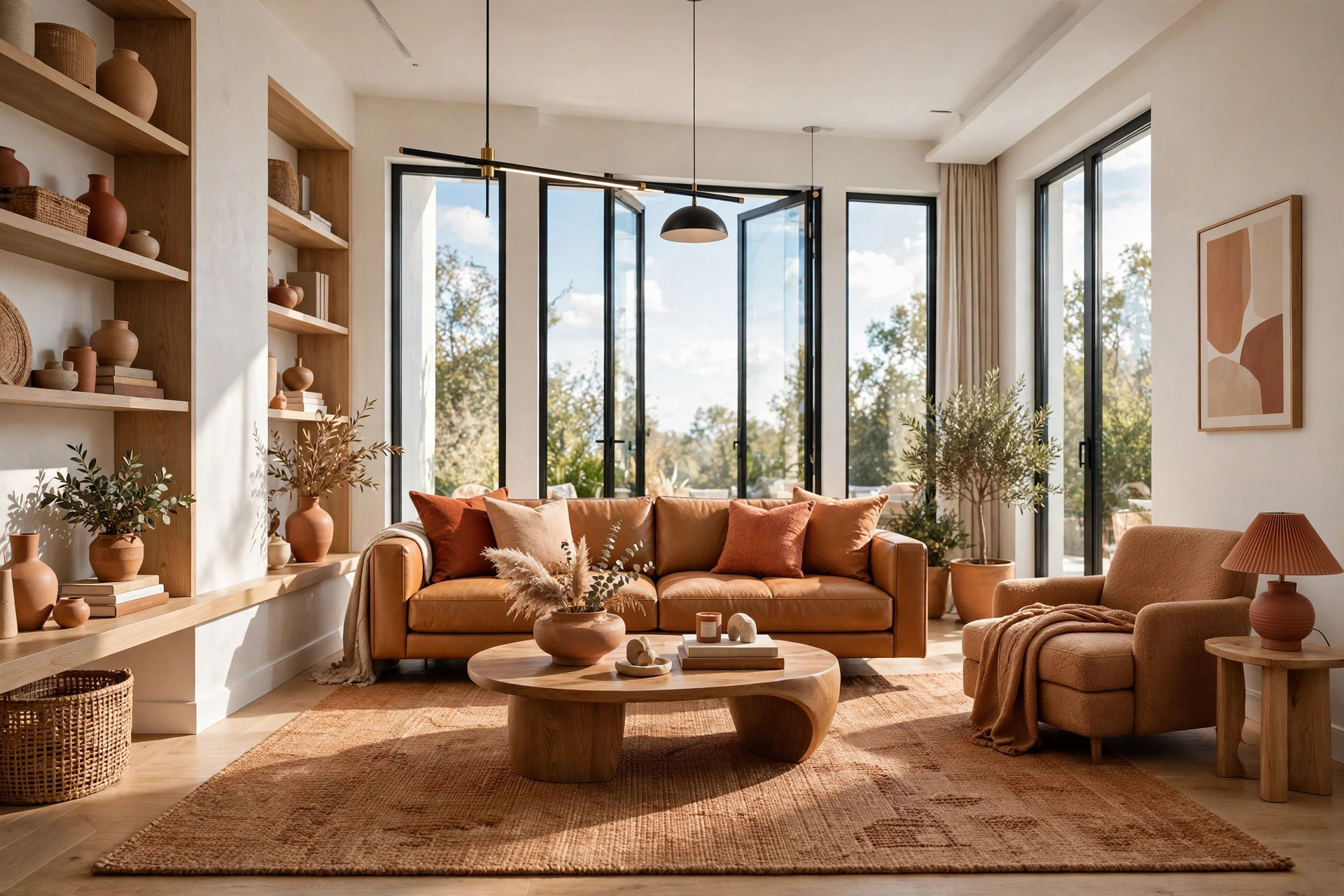
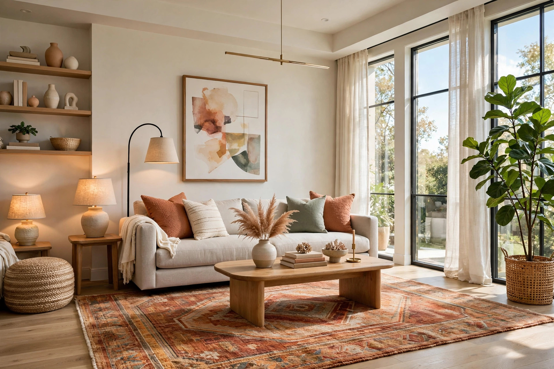
The fastest way to a designer-looking palette is a simple proportioning rule: about 60 percent of the room in a dominant color, 30 percent in a supporting color, and 10 percent in an accent. The 60 is the background — usually walls, or the biggest surfaces in a rental — the 30 is the middle layer of large upholstery, rugs, and curtains, and the 10 is the jewelry: cushions, art, small decor. When every color has a job and a budget, the room reads as intentional instead of busy. Our full breakdown of the 60-30-10 color rule walks through choosing and testing all three layers.
A classic modern combination: warm white as the 60, caramel or oatmeal upholstery and wood tones as the 30, and one saturated accent — terracotta, deep olive, or ochre — as the 10. The accent is also your cheapest refresh engine: swapping two cushion covers and a vase changes the room’s whole personality in an afternoon. Guard the proportions — the classic beginner mistake is letting the accent creep from cushions to curtains to rug until the hierarchy collapses and the room feels busy again.
11. Float the Furniture for Better Flow
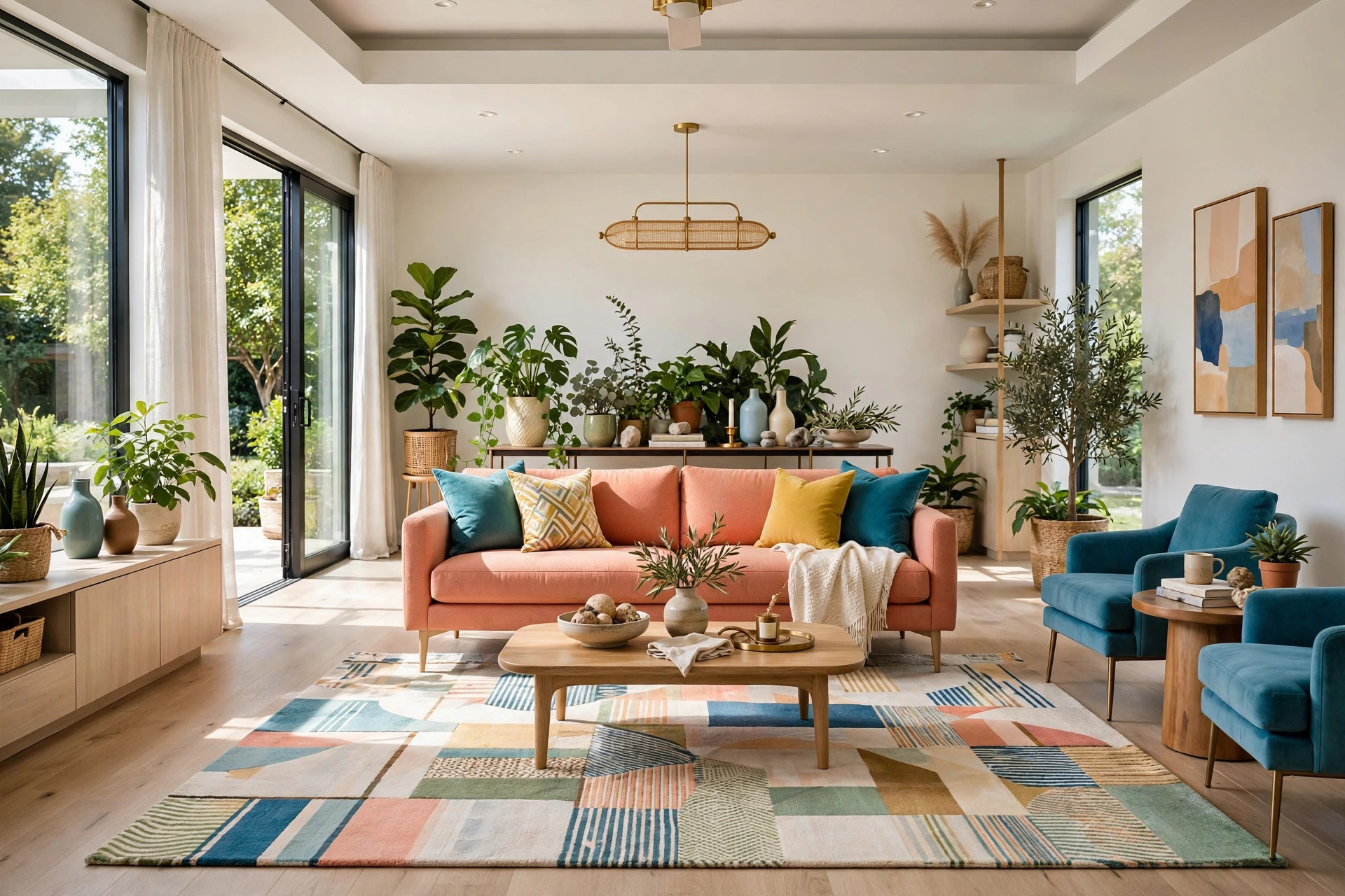
Pushing every piece flat against the walls feels like the way to maximize space, but it backfires: the room becomes a hollow middle surrounded by a ring of furniture, which reads as smaller and far less inviting. Pulling the sofa even six inches off the wall and grouping seating around a central rug creates shadow lines and depth that trick the eye into reading the room as larger. Conversation areas should face each other, not the perimeter. Our guide to furniture arrangement lays out repeatable layout formulas if you want a step-by-step plan.
Floating also fixes the traffic problem. When seating hugs the walls, the walking path cuts straight through the conversation zone; when you float the arrangement slightly, the path flows naturally behind the furniture instead. Style the revealed strip behind the sofa — a slim console, a floor lamp, a row of plants — so it reads as a deliberate design move rather than leftover space. Test any new layout with painter’s tape outlines on the floor first; it is free to undo.
12. Add One Large Mirror to Double the Light
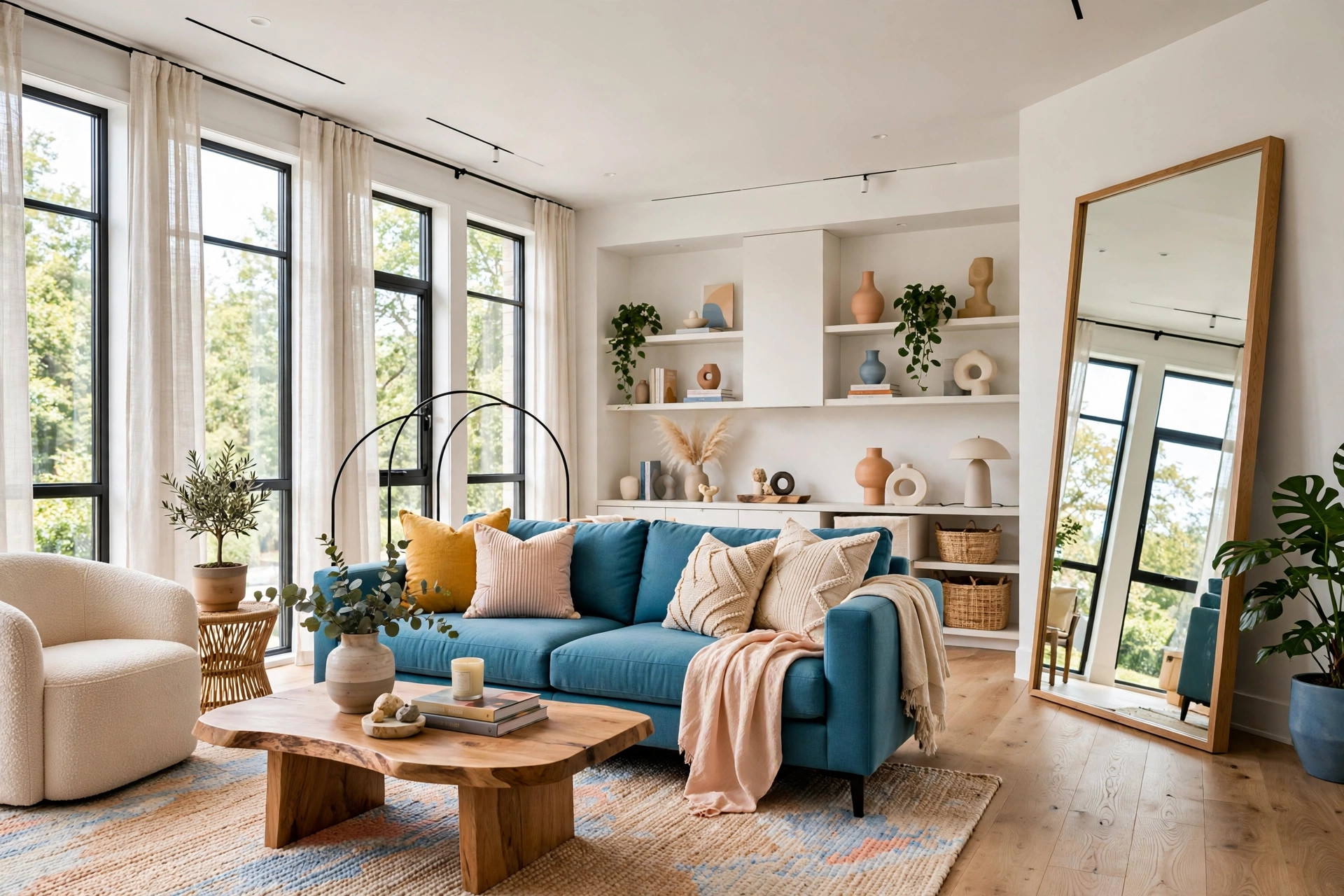
A mirror is the only decor item that adds square footage your eyes believe in. One large mirror — leaning full-length or hung opposite the window — catches daylight and throws it back across the room, effectively doubling your brightest light source for the price of a single piece. It also doubles the view, giving the eye somewhere pleasant to travel instead of stopping at a blank wall. Renters can lean rather than drill and get nearly the full effect.
Placement decides everything. The mirror earns its keep opposite or adjacent to the window, reflecting daylight and greenery; hung where it reflects a blank wall or the television, it just doubles the dullest part of the room. For sizes, shapes, and placements that genuinely expand a space, see our guide to the best mirrors for small spaces. Keep the glass clean and the reflected view intentional, and the mirror becomes the hardest-working square footage in the room.
💡 Pro Tip: Before you commit to a spot, hold the mirror in place and check the reflection from the doorway. If the reflection shows the window, a styled corner, or greenery, you have the right wall — if it shows clutter or the TV, move it before you hang anything.
13. Ground Everything With the Right-Sized Rug
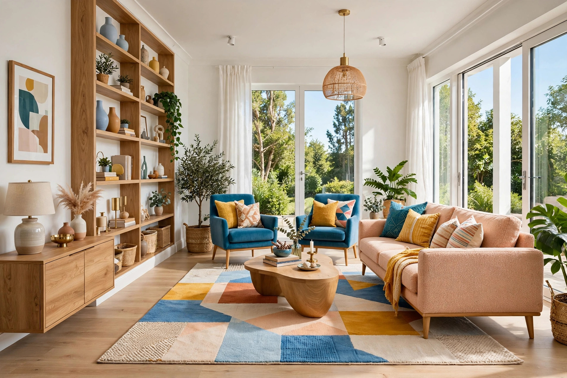
Nothing shrinks a living room faster than a postage-stamp rug floating in the middle of the floor — it chops the room into fragments and makes the seating look like it is drifting. One properly sized rug does the opposite: it unifies the seating group into a single intentional zone, and that unified zone reads as larger than the sum of its parts. The rule is simple — at minimum, the front legs of the sofa and all chair legs should sit on the rug. In most living rooms that means larger than you think, not smaller.
Choose low-pile or flat-weave so doors clear it, in a warm pattern that hides wear — a faded vintage-style rug or subtle warm geometric. On a tight budget, layer two smaller flat-weaves side by side with the seam under the coffee table; from above it reads as one generous rug.
14. Style Shelves and Surfaces Like Vignettes
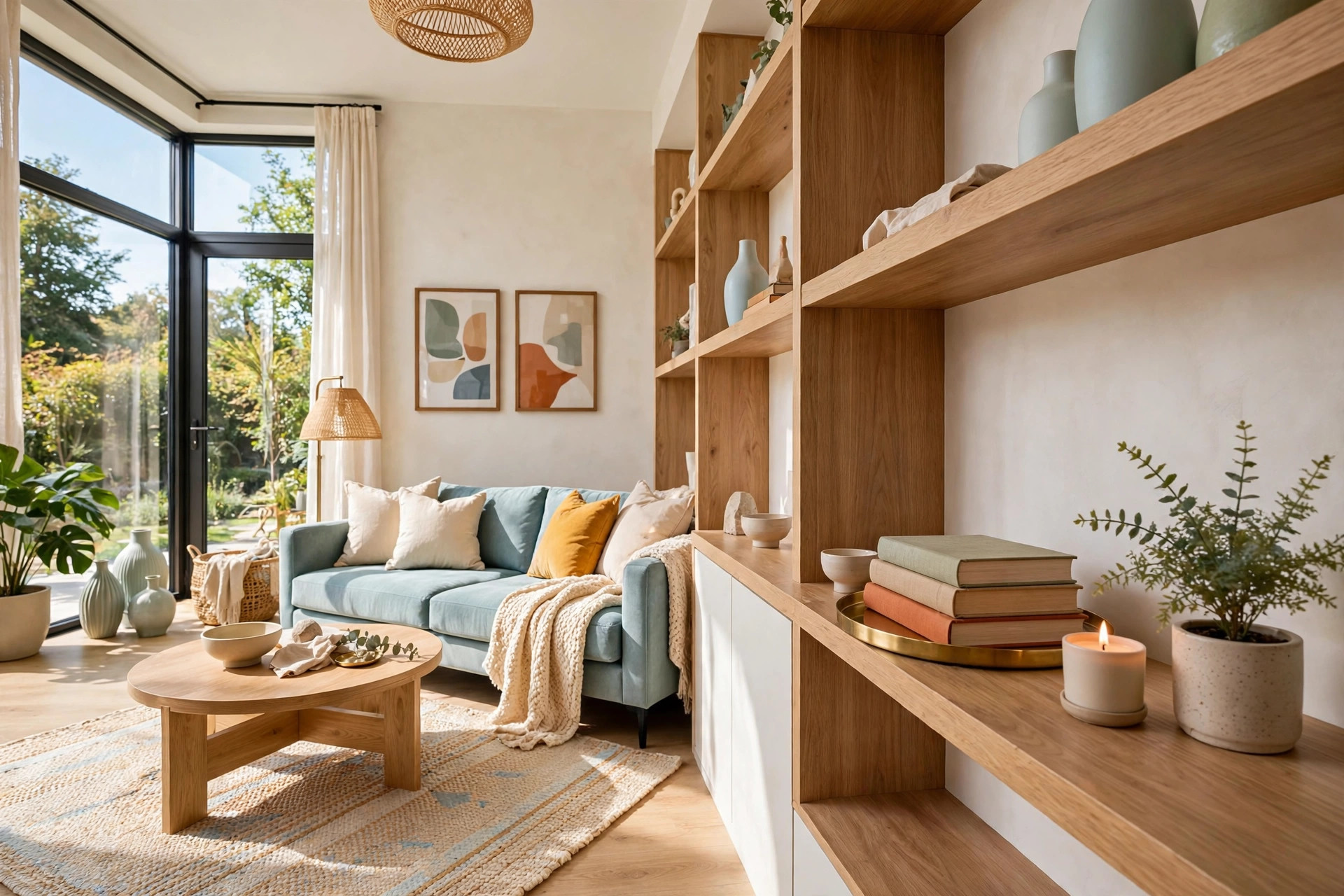
A styled surface is a small still life, and the formula is forgiving: a tray to corral everything, two or three beautiful books, one candle, one living thing — a plant or a bud vase. The tray is the secret; it turns scattered objects into one composed moment. Group in odd numbers at staggered heights, since odd groupings feel collected while even ones feel staged. Vary the materials — brass, ceramic, wood, glass — so the vignette reads as gathered over time.
Edit with breathing room. Packed shelves read as a storage sale, so aim for two-thirds full with books stacked both ways and one shelf nearly empty but for a glowing object. On the coffee table, keep the vignette low — nothing tall enough to block sightlines across the seating — and leave one corner clear for real life. Coasters and a tea cup belong there; the vignette should invite sitting down, not guard the table.
💡 Pro Tip: When a surface starts looking cluttered, remove one object instead of rearranging. The fastest path to a styled shelf is subtraction — take away the weakest piece and the remaining ones suddenly look deliberate.
15. Finish With Warm Wood and Living Greenery
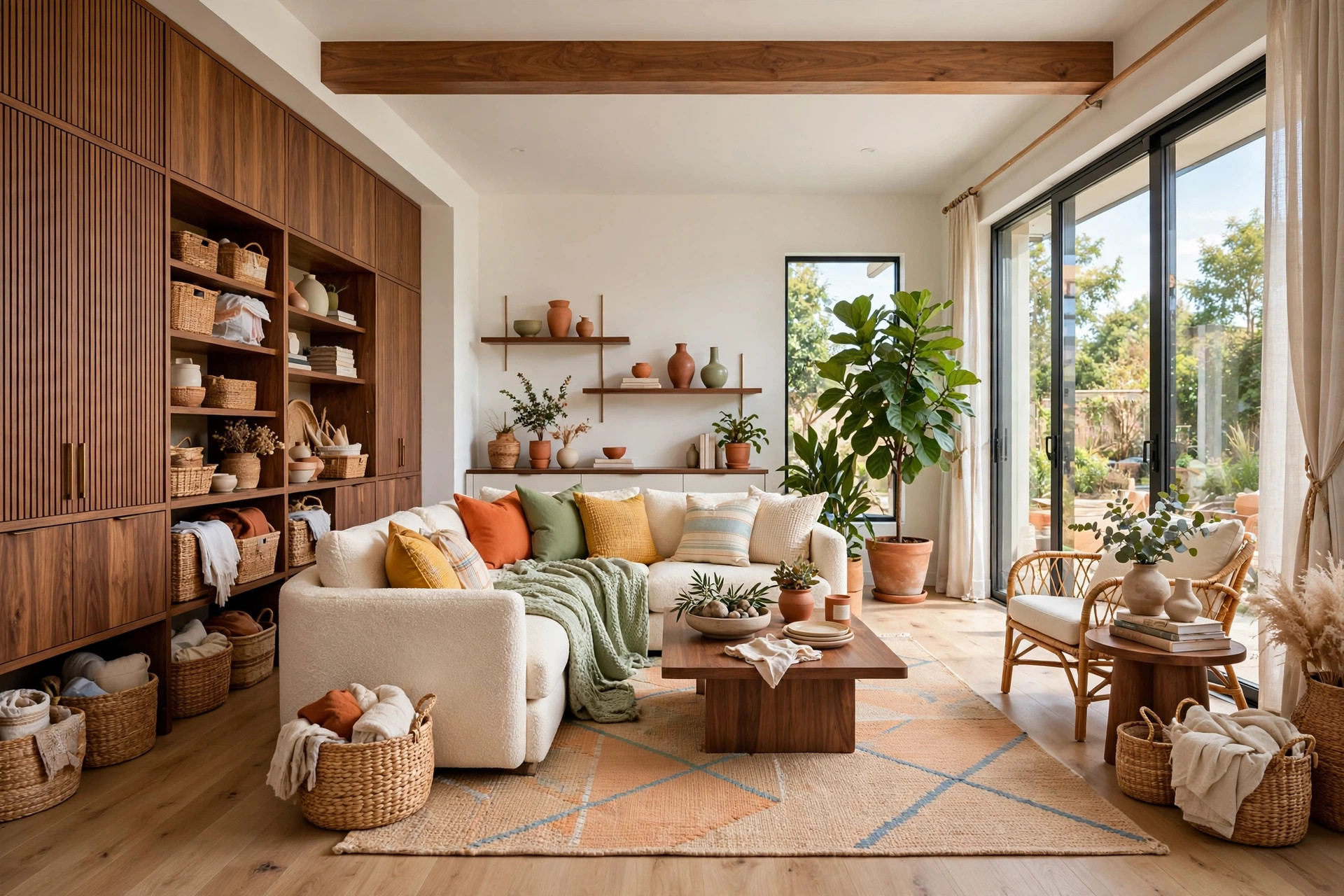
The final layer of a modern living room is the living one. Warm wood tones — walnut, honeyed oak, rich teak — pull the eye in and keep minimal rooms from feeling cold, while greenery fills vertical dead space with something alive. A tall plant softens hard corners, and its deep green makes warm neutrals look warmer by contrast. Together, wood and plants are the difference between a room that looks modern and a room that feels like home.
Layer wood through small repeats rather than big purchases: a tray, a turned-wood lamp base, woven baskets, a serving board — repeated at least three times so it reads as a choice. Place plants where the eye needs softness: beside the reading chair, flanking the media wall, in the dead zone by the console. Choose warm-material pots — terracotta, woven baskets, matte ceramic — and the whole layer ties back into the palette you built in step one.
Quick Comparison: Modern Living Room Design by Cost and Effort
Modern Living Room Design Ideas Quick-Start Checklist
- ✅ Define your palette first: one neutral base, one deeper tone, one accent — then buy nothing outside it
- ✅ Measure the room, the doorways, and the largest pieces before any purchase
- ✅ Edit every surface: one tray, three objects max per vignette, breathing room on shelves
- ✅ Layer three light sources at different heights, all in the same warm white
- ✅ Anchor the seating on a rug big enough for every chair’s front legs
- ✅ Float furniture off the walls where space allows, and test layouts with painter’s tape first
Common Modern Living Room Design Mistakes
Mistake 1: Buying furniture before measuring
The most expensive mistake is also the most avoidable. A sofa that looked perfect online can swallow a small living room whole, block a walkway, or fail to fit through the door — and returns are rarely free. Measure the room, the doorways, the hallway turns, and the elevator before you order anything, and tape the footprint on the floor to walk around it first.
Mistake 2: Relying on a single overhead light
One ceiling fixture flatters nothing and no one — it casts harsh shadows, flattens texture, and makes even good furniture look tired. Modern rooms need layered light: an overhead for ambient fill, lamps at seating height for warmth, and small accents for depth. If you change one thing this weekend, make it the lighting.
Mistake 3: Choosing a rug that is too small
The too-small rug is the silent killer of living room design. It chops the floor into fragments, strands the furniture visually, and makes the whole seating area look like it is camping rather than settled. When in doubt, size up — a rug that runs under the front legs of everything instantly makes the room look designed.
Mistake 4: Mixing too many accent colors
Modern style runs on restraint, and nowhere does that matter more than color. Three competing accents — say teal cushions, mustard art, and red books — give the eye no hierarchy to rest on, and the room registers as busy. Pick one accent, repeat it in three places at different heights, and let the neutrals do the rest of the work.
Mistake 5: Pushing everything flat against the walls
It feels like the logical way to maximize floor space, but a full ring of furniture against the walls outlines the room’s exact dimensions and turns it into a display case. Pulling even the sofa a few inches off the wall breaks the boundary, creates useful space behind it, and lets air and shadow soften the edges — which reads as room to breathe.
Frequently Asked Questions
1. What defines a modern living room style?
Clean lines, simple silhouettes, a restrained palette, honest materials, and uncluttered surfaces. Modern design favors function and calm over ornament — low-profile furniture, visible legs, layered warm lighting, and texture doing the decorative work that pattern and trim do in traditional rooms.
2. How can I make my living room look modern on a tight budget?
Start free: declutter, rearrange, and float furniture off the walls. Then spend where the eye lands most — pillows, lighting, and the rug — and hunt thrift stores for solid wood, ceramics, and lamps with good bones. A disciplined neutral palette and layered warm light do more than any single purchase.
3. What colors work best in a modern living room?
Warm-leaning neutrals — warm white, greige, oatmeal, pale stone — as the base, one deeper supporting tone like caramel or olive, and a single saturated accent such as terracotta or ochre. Keep big surfaces neutral and let the accent live in swappable textiles so the room can evolve cheaply.
4. How do I style a small modern living room?
Scale furniture to the room, choose leggy pieces that show floor beneath them, anchor everything on one right-sized rug, and edit surfaces ruthlessly. Go vertical with tall narrow storage, keep one clear focal point, and use a large mirror opposite the window to double the light.
5. Should the sofa face the TV or the window?
Face the room’s best focal point — usually the window, since daylight is the room’s cheapest luxury. If the TV anchors the layout, angle one chair toward the window, and never block the window wall with tall furniture either way.
6. How many light sources does a living room need?
At least three, at three different heights: ambient from above, task light at reading height, and a small accent glow. Put the main lamps on dimmers and keep every bulb the same warm color temperature. Dark corners get their own small light — gloomy edges are what make rooms feel smaller after dark.
7. How do I keep a modern living room from feeling cold?
Warmth comes from texture, wood, and light — not from adding clutter. Layer nubby textiles, repeat warm wood tones at least three times, add one tall plant, and keep all lighting warm and dimmable. A restrained palette with rich textures feels calm and enveloping; a restrained palette with hard, smooth surfaces feels like a showroom.
Conclusion
A modern living room is not a price point — it is a set of decisions made with intention. A calm palette, one confident sofa, layered warm light, honest materials, and the discipline to edit will carry any room further than an unlimited budget spent without a plan. The fifteen ideas in this guide are designed to meet you where you are: start with the free moves, add the thrifty ones, and invest only where your eyes land every day.
Pick three ideas that fix your room’s weakest spots and give yourself one weekend — small moves compound fast when the palette and the light are working with you. The modern living room you want is closer than it looks, and it probably costs less than you think.