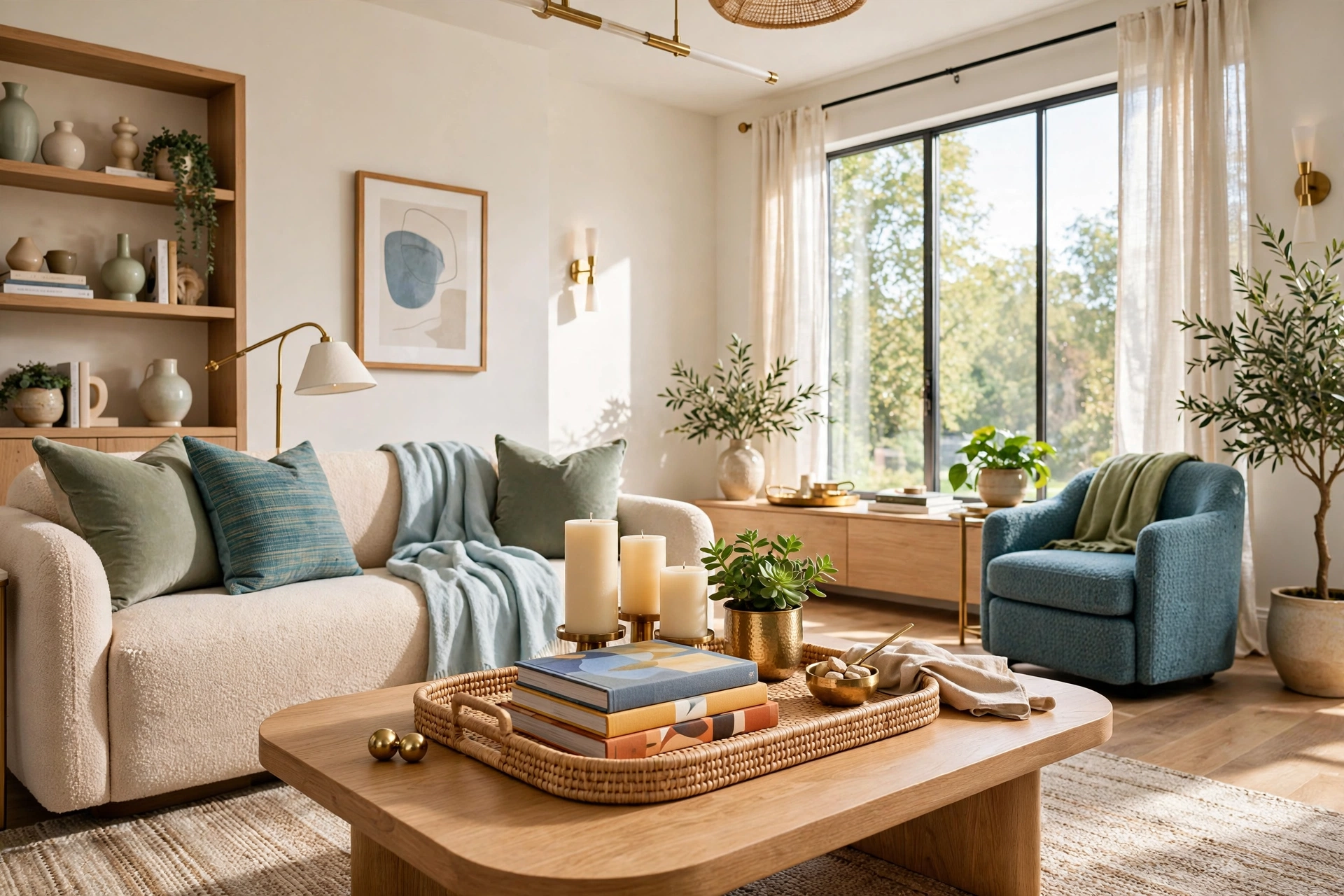
How to Style a Coffee Table Like an Interior Designer
Introduction
The coffee table is the most looked-at surface in the living room and the least intentionally styled. It sits in the middle of every sightline — from the sofa, the doorway, the chair across the room — which means it quietly sets the tone for the whole space. A cluttered one makes the room feel restless. A styled one makes it feel finished, even when nothing else has changed.
Interior designers treat the coffee table as a small still life, not a storage surface. The approach is surprisingly methodical: anchor the composition, build height in three layers, mix materials so it looks collected rather than bought in a set, and then edit ruthlessly. None of this requires designer prices. Most of the pieces below are books you already own, a candle, something living, and one tray to hold it all together.
This guide breaks how to style a coffee table into fifteen practical steps in the order a designer would actually work: clear, anchor, layer, personalize, and edit. Whether your table is a massive ottoman or a tiny apartment sidekick, the same principles apply. And if your wider room needs attention too, our roundup of cozy living room ideas pairs beautifully with a freshly styled table.
1. Clear the Table and Start From Zero
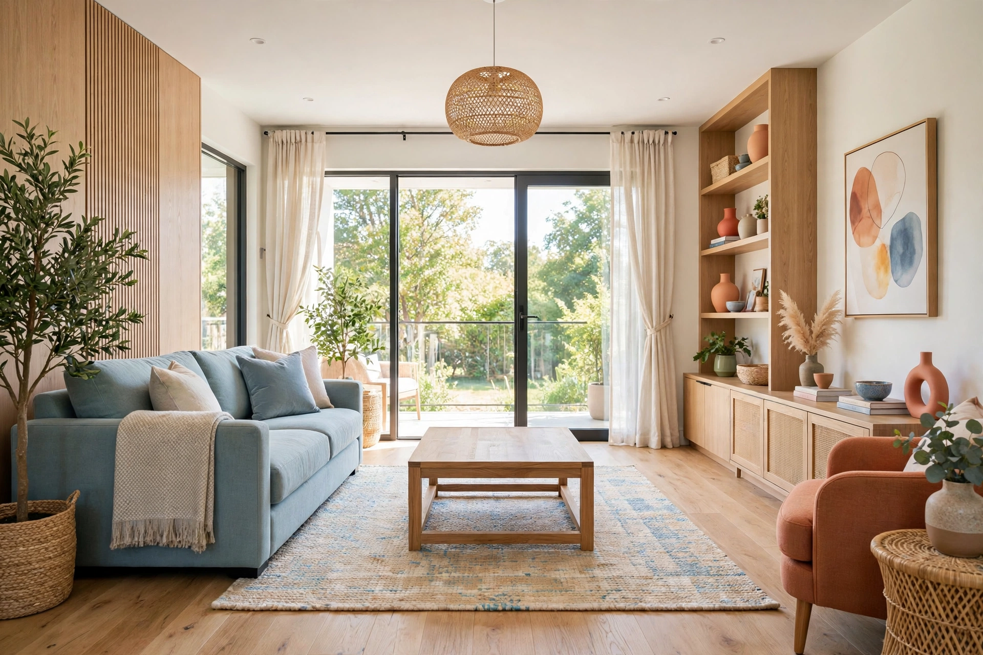
Every designer starts by stripping the surface completely bare. You cannot compose a still life on top of a to-do list — the remotes, the mail, the half-read magazines all have to leave the room first, even if they come back later in a tidier form. A blank table resets your eye and shows you the true scale of what you are working with: the wood tone, the shape, how much surface you actually have.
Wipe it down while you are at it. Dust and ring marks read as neglect in a way no styling can fix, and a clean surface makes every object you place look more deliberate. This is also the moment to be honest about the table itself: is it the right size for the seating, does it sit at a comfortable height, does the finish still suit the room? Styling cannot rescue a table that fights the space, but most tables just need a fresh eye.
2. Anchor Everything With a Tray
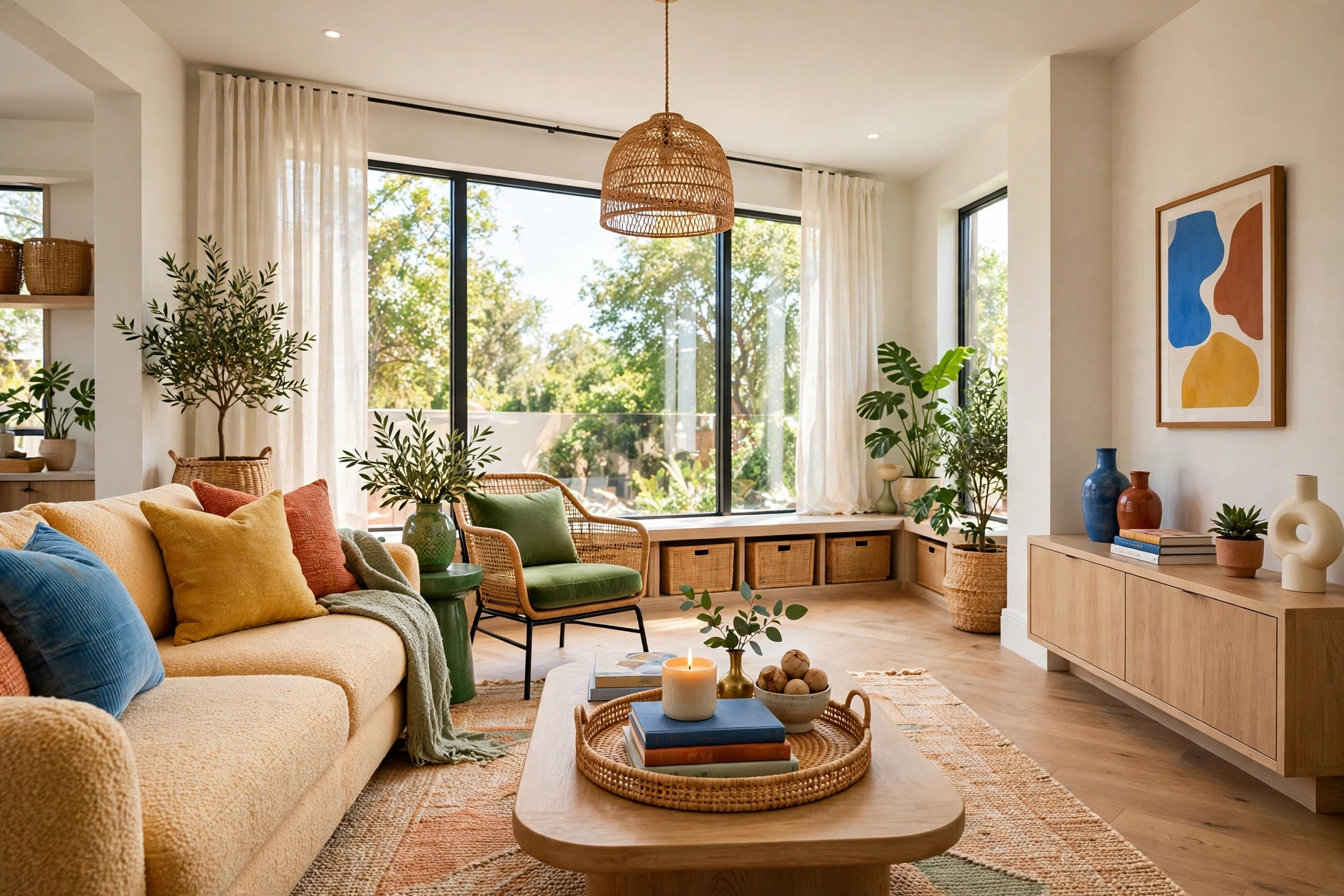
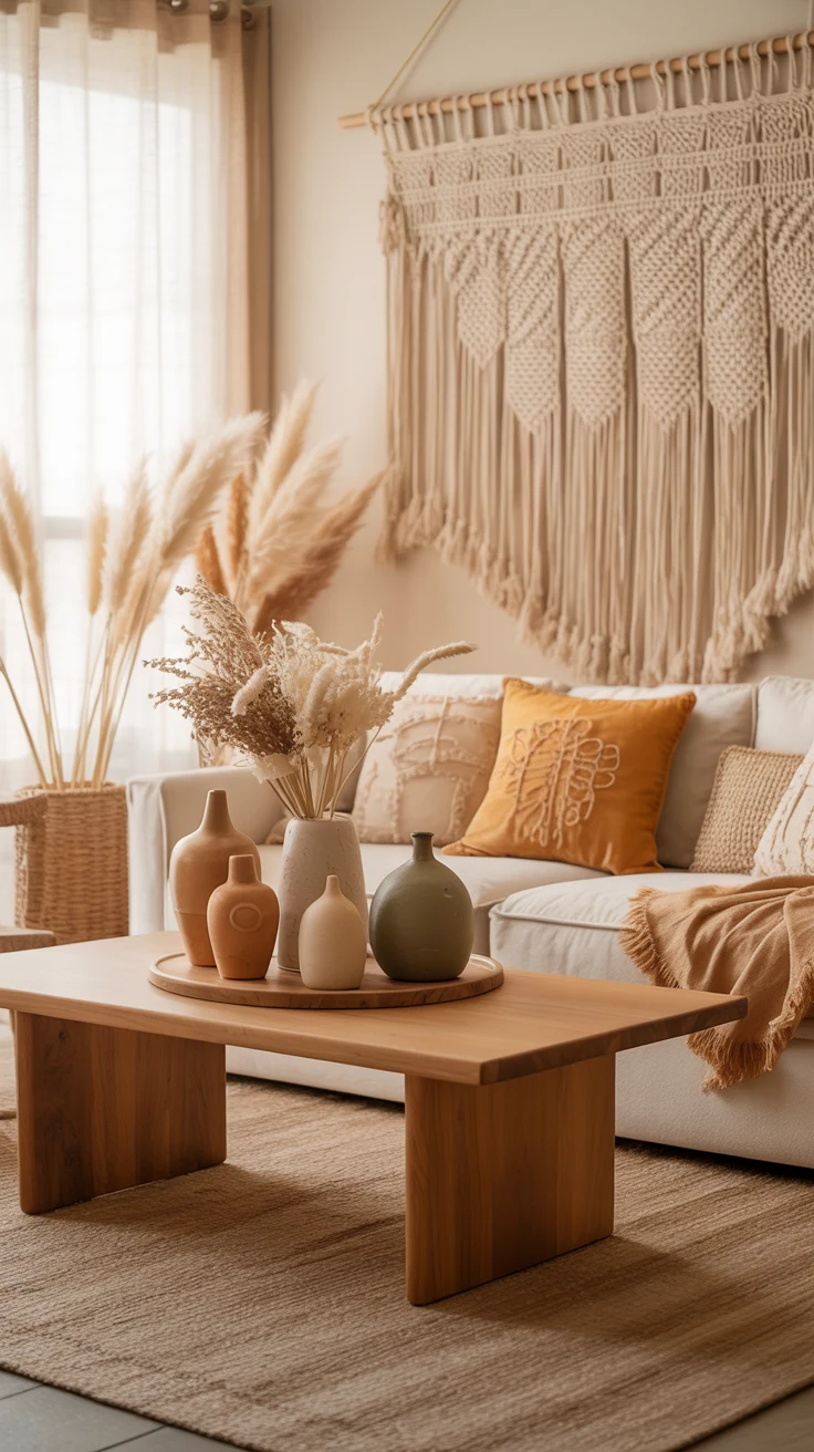
The tray is the single most powerful coffee table tool a designer owns. It takes a scatter of unrelated objects and instantly makes them read as one composed vignette — visually, the tray draws a boundary that says “this is a deliberate arrangement, not clutter that accumulated.” Rectangular tables suit rectangular trays; round tables love round or oval ones.
Size the tray to cover roughly a third to half of the table’s surface. Too small and it looks like a postage stamp lost in the middle; too large and there is no room left for real life — the tea cups, the book you are actually reading. Material matters too: a woven rattan tray warms up a sleek glass table, a lacquered black tray sharpens a rustic wood one. The contrast between tray and table is where the interest begins.
💡 Pro Tip: Choose a tray with a low profile and a handle-free silhouette so objects sit stable and the tray itself disappears into the composition. If your table is glass, a tray also solves the visual noise problem — it gives the eye one calm zone instead of everything floating on transparency.
3. Stack Two or Three Beautiful Books
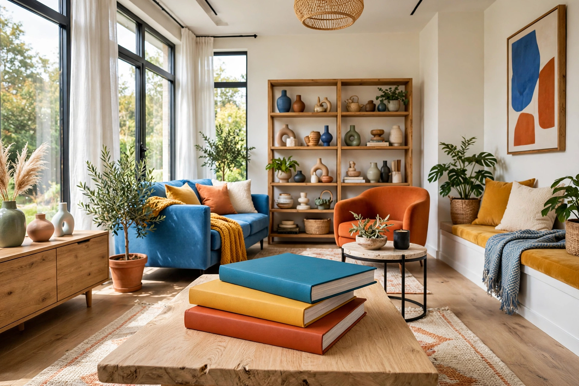
Coffee table books exist for exactly this job, and designers use them as the structural base layer of the vignette. A stack of two or three large books adds height, weight, and color in one move — and unlike a decorative box, it earns its footprint by being genuinely browsable. Choose covers you actually like looking at: art, photography, travel, interiors.
Stack them largest on the bottom, slightly offset rather than perfectly squared. The slight rotation is the difference between “styled” and “staged” — designers call it the casual stack, and it makes the arrangement feel collected over time rather than placed this morning. Top the stack with one small object: a bud vase, a brass dish, a sculptural candle. That topper is the exclamation point; without it the stack is just a pile.
4. Add Height With Candles or a Lantern
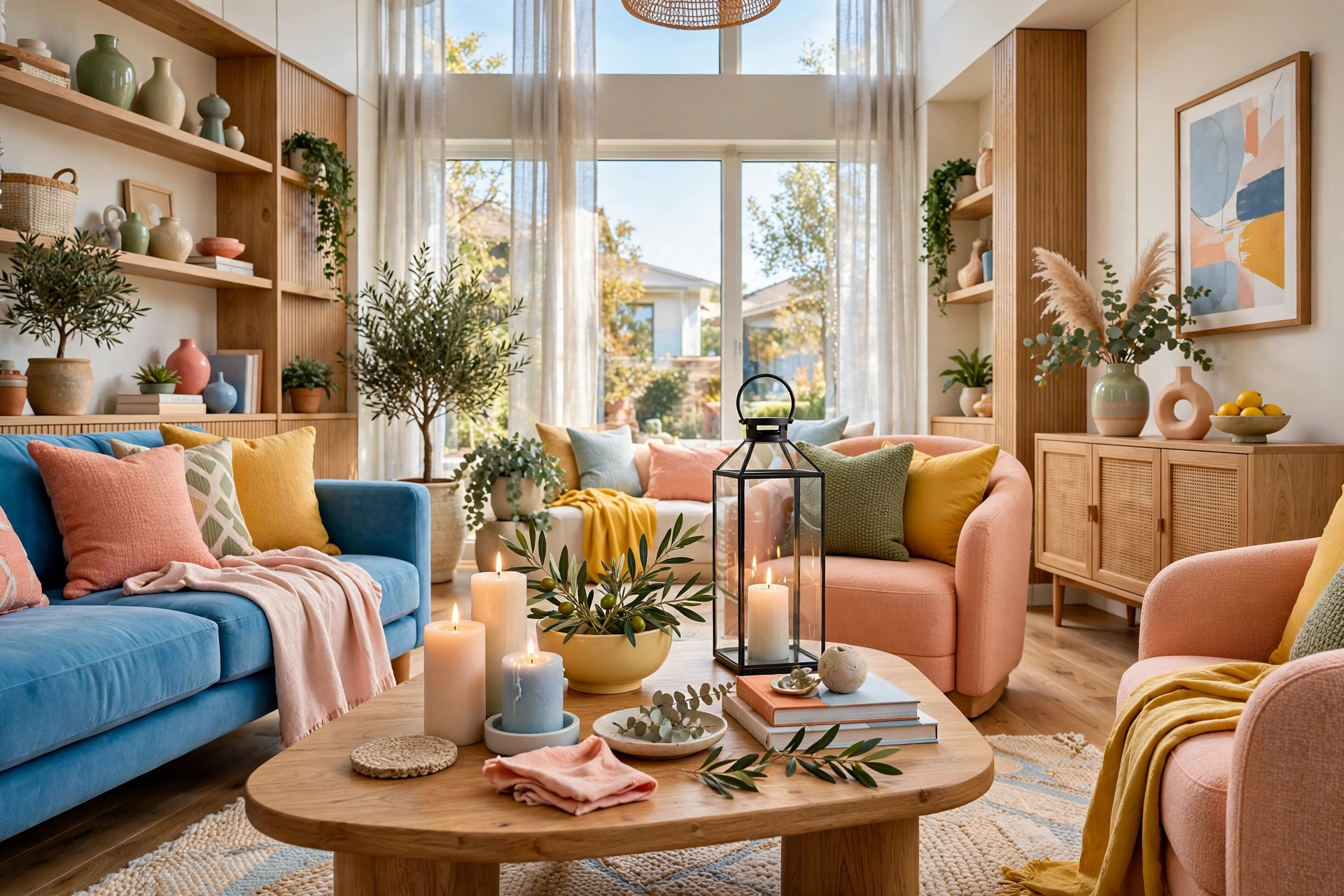
Every composed surface needs vertical range, and candles are the designer’s favorite way to get it on a coffee table. A pillar candle, a pair of tapers in mixed holders, or one sculptural lantern adds the tall note that balances the low sprawl of books and trays. Vary the heights if you use more than one — a cluster of three at staggered levels reads as intentional, while three identical candles in a row read as a gift set.
Unlit candles still do the job visually, but the real payoff comes in the evening. One lit candle on the coffee table does more for a room’s mood than a new throw pillow ever will — it gives the whole seating area a warm center of gravity. Keep the flame away from anything flammable and low enough that it never competes with conversation sightlines across the table.
5. Bring in Something Living
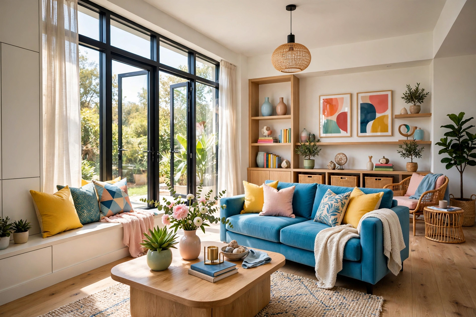
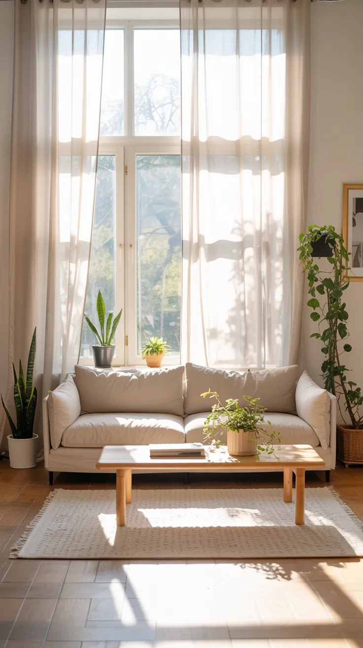
The one element every designer insists on is something alive. A small plant, a bud vase with fresh stems, even a bowl of lemons — the living layer is what stops a styled table from feeling like a showroom display. Greenery adds an organic shape that contrasts with all the rectangles of books and trays, and its color makes every other tone in the room look richer.
Scale the living element to the table: a trailing pothos in a ceramic pot for a large table, a single stem in a bud vase for a small one. If your thumb is not green, quality faux stems in a real vase pass convincingly at coffee-table distance — just keep them dusted, because dusty fake leaves are the giveaway. Swap the stems with the seasons and the whole vignette refreshes itself for free.
6. Layer Three Heights: Tall, Medium, and Low
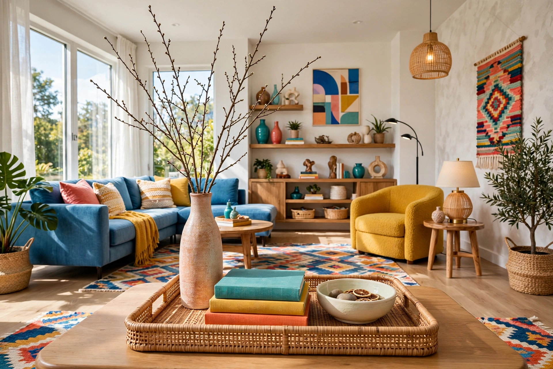
Professional stylists think in a simple pyramid: one tall element, one or two medium pieces, and low grounding pieces filling out the base. The tall item — a branch in a vase, a candlestick, a sculptural object — draws the eye up and gives the vignette its silhouette. The medium layer — the book stack, a lidded box, a low bowl — carries the visual weight. The low layer — coasters, a small dish, scattered beads — fills the gaps so the surface feels finished, not sparse.
Build the layers inside the tray first, then place one or two things outside it. Designers almost always keep something outside the tray’s boundary — a low stack of books, a small plant — because a vignette that spills slightly past its anchor looks abundant and lived-in rather than contained. Check the composition from the sofa, not just standing over the table; that seated sightline is the view that matters.
📌 Important: Keep the tallest element under twelve inches. Anything taller starts blocking faces and the television, and the table stops being part of the conversation area and becomes a barrier. Measure once — you will be surprised how quickly “just a small vase” crosses the line when it holds tall branches.
7. Mix Materials for a Collected Look
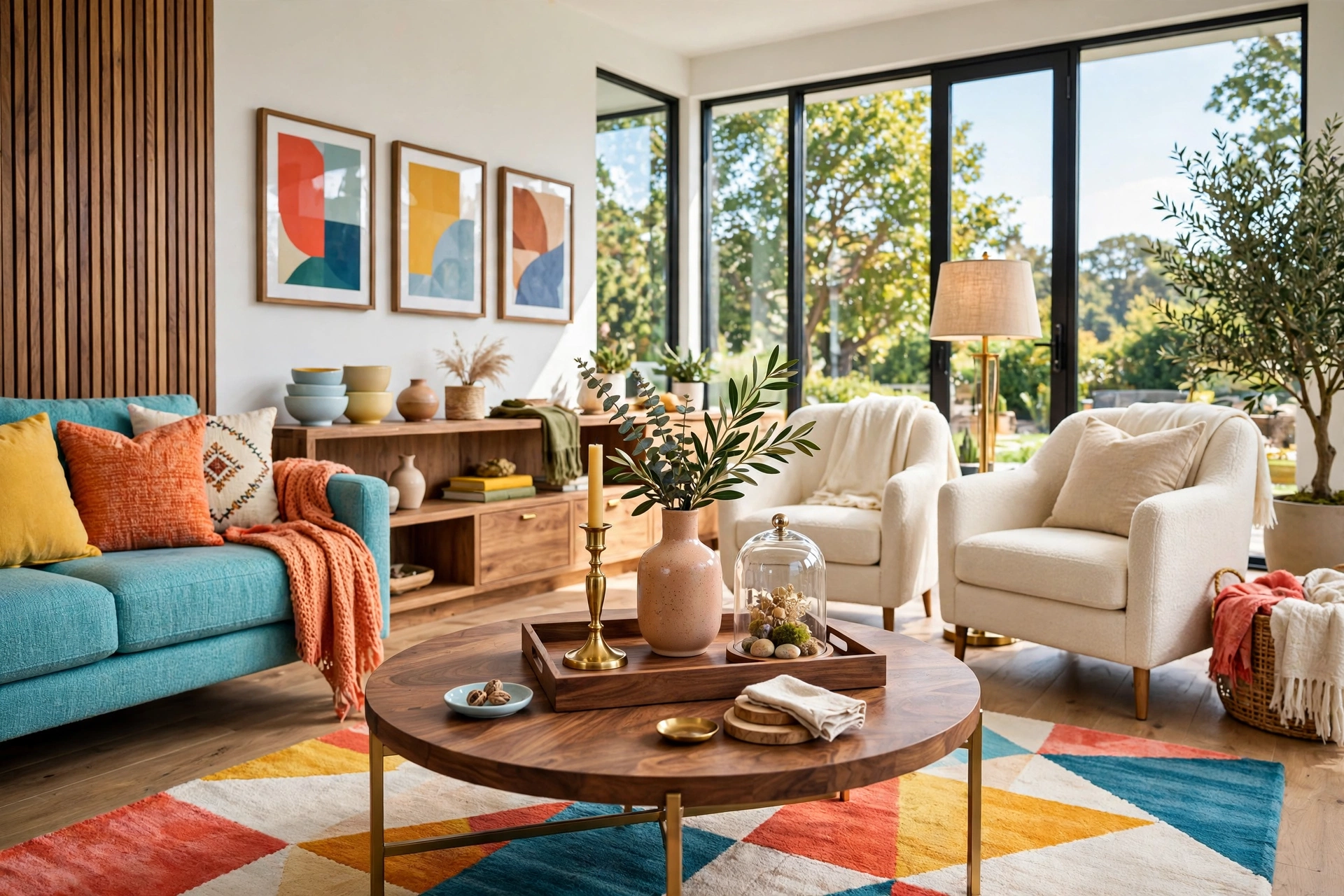
The difference between a designer table and a catalog table is material variety. Wood, glass, metal, ceramic, stone, woven fiber, paper — when three or four of these appear together, the arrangement reads as gathered over time, which is the whole secret of the “collected” look. A brass candlestick on a walnut tray beside a ceramic vase and a linen-bound book tells a richer story than four matching accessories ever could.
Contrast is the mechanism: smooth against rough, reflective against matte, warm against cool. A hammered metal bowl next to a matte ceramic vase, a glass cloche over a rough stone object, a woven basket holding sleek magazines. If everything on your table is the same finish, swap one piece for its opposite and watch the vignette wake up. For a deeper dive into material language across the whole room, our modern living room design ideas guide covers mixing finishes at every scale.
8. Keep the Center Low for Conversation
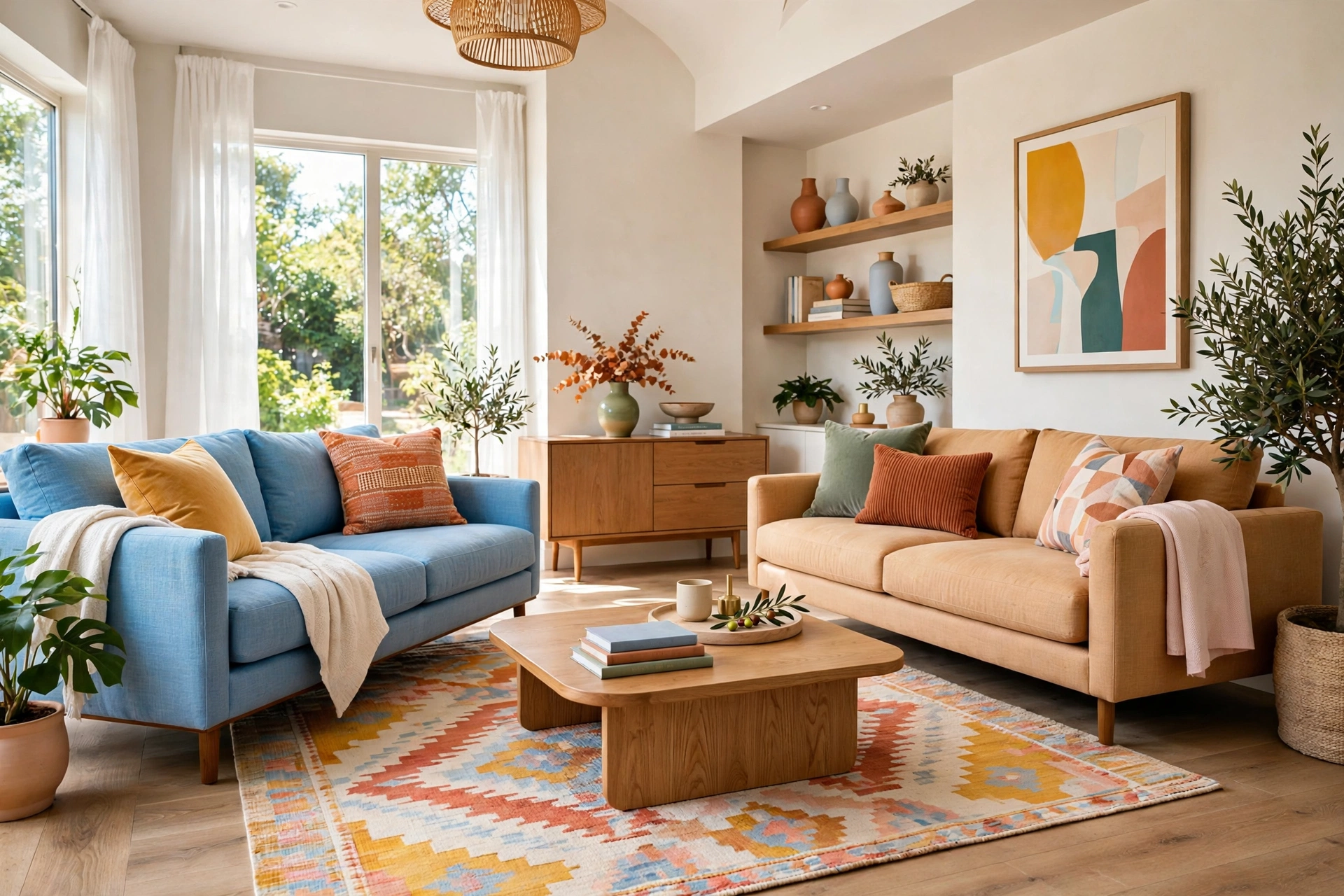
A coffee table sits between people, which means its styling has a job no shelf arrangement has: it must not interrupt the humans. Designers keep the visual center of the table low — books, trays, low bowls — and push any height to one end or one corner, the way a centerpiece sits at the end of a dining table rather than the middle. The middle of the coffee table is shared territory; it should feel open.
Test it the way designers do: sit on the sofa and look at someone sitting opposite. If you are peering around an object to see their face, that object is too tall or too central. Move it to the table’s far end, or replace it with something lower. This single check separates tables that look good in photographs from tables that work in real rooms — and the second kind always photographs well too.
9. Follow the Two-Thirds Rule
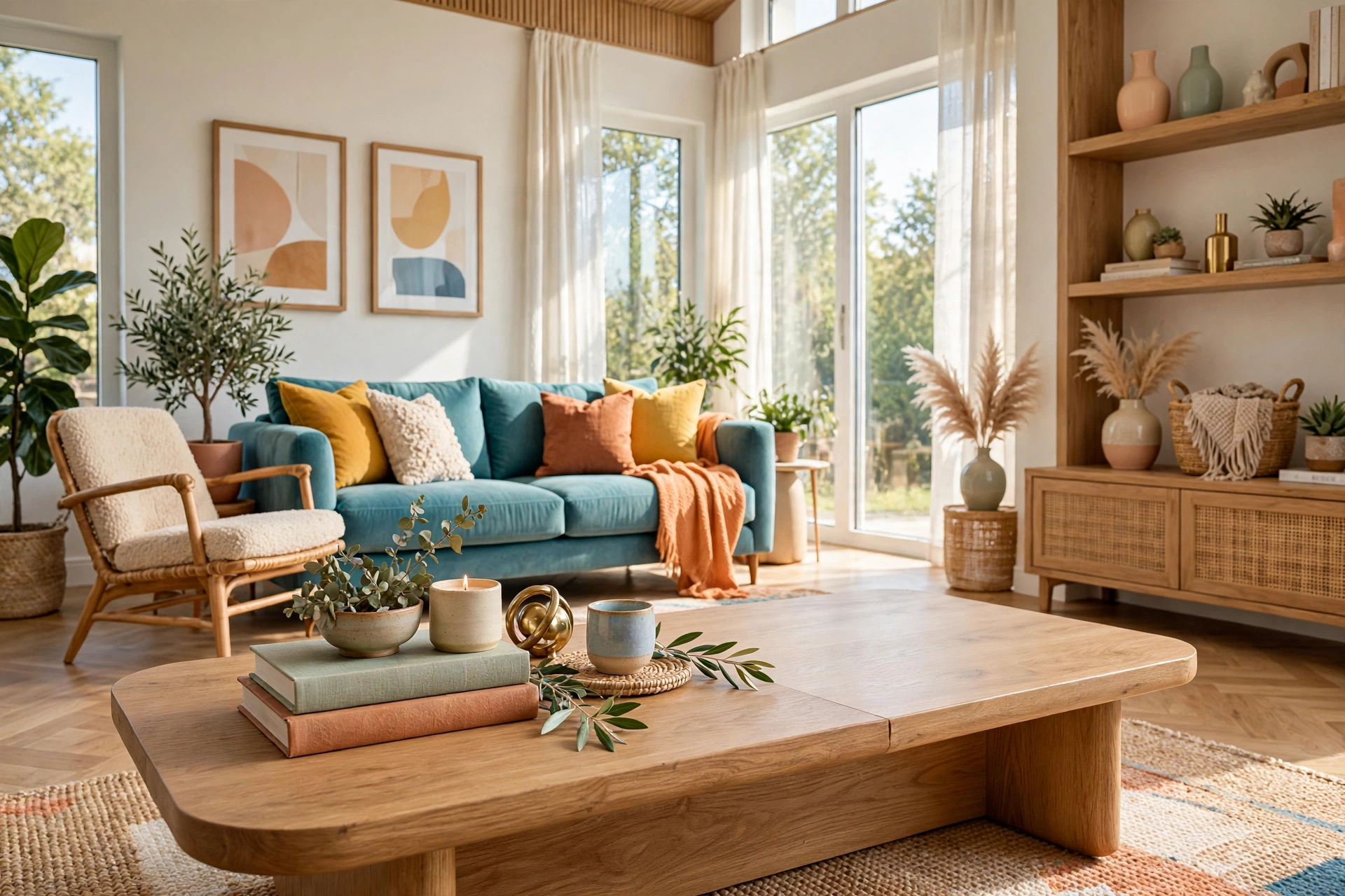
Here is the proportioning rule designers use on every surface: style roughly two-thirds of it and leave one-third deliberately empty. The empty third is not wasted space — it is breathing room, the visual pause that makes the styled two-thirds look intentional instead of crowded. It is also where real life happens: the coffee cup, the laptop, the board game.
On a rectangular table, that usually means the vignette lives on one end and the middle-to-far end stays clear. On a round table, it means a composed cluster slightly off-center with open space around it. Resist the urge to fill the empty zone with “just one more small thing” — that one more thing is always the one that tips a vignette into clutter. Empty space is a design decision, and it is free.
10. Add One Personal Object
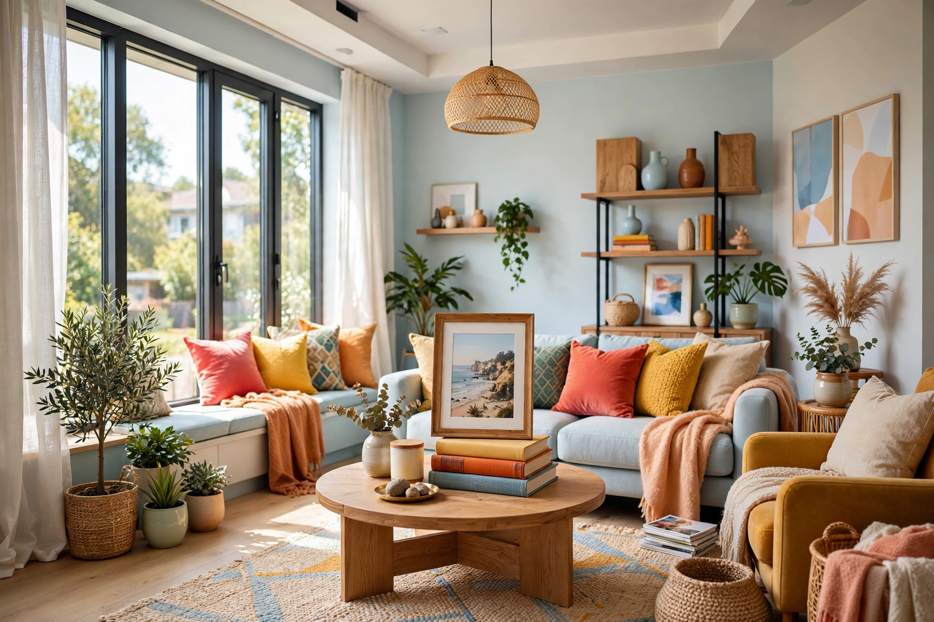
The final layer is the one no store can sell you: something with a story. A small sculpture from a trip, a framed photo, a vintage camera, your grandmother’s brass bowl — one personal object is what makes the table feel like yours instead of a showroom’s. Designers actively hunt for these in clients’ homes before buying anything new, because personality is the one styling element money cannot fake.
Keep it to one. Two personal objects compete for attention and start reading as a display shelf; one sits comfortably inside the composition as an accent. Give it a place of honor — on top of the book stack is the classic spot — where the eye lands on it naturally. If guests ask about it, your table has done its real job: it started a conversation.
11. Style With the Seasons in Mind
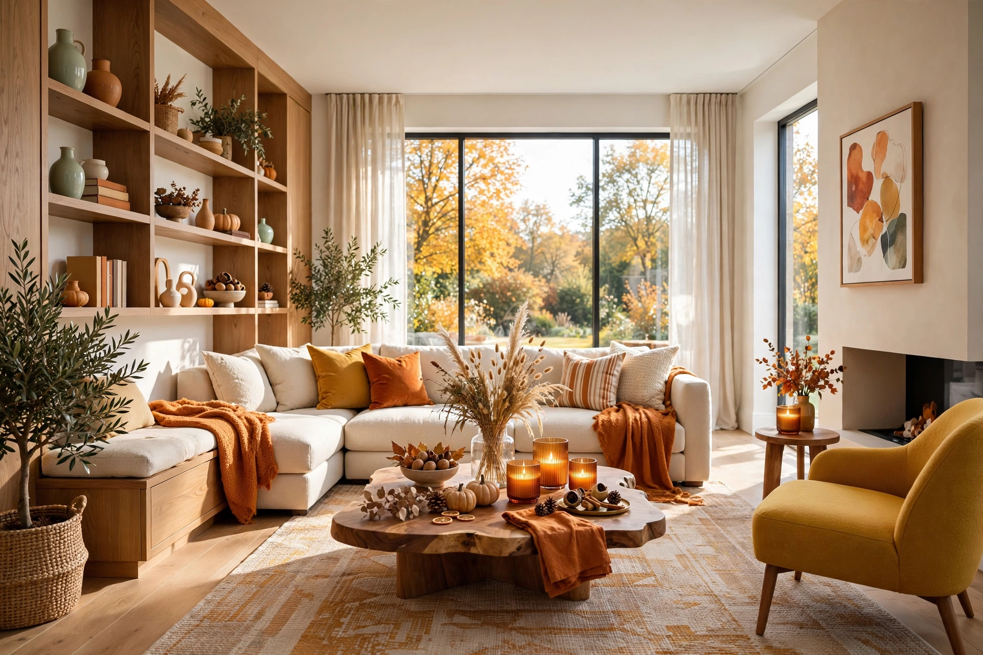
Designers rarely restyle a coffee table from scratch — they rotate a few seasonal accents through a stable base. The tray, the books, the candle holders stay put year-round; what changes is the living element and one or two small pieces. Pinecones and a plaid runner in winter, fresh tulips and a pastel ceramic in spring, a bowl of citrus and woven textures in summer, dried grasses and amber glass in fall. If you want a full seasonal playbook for the rest of the room, our guide to living room color schemes shows how palettes shift through the year too.
Keep a small bin of seasonal swap-ins in a closet and the refresh takes ten minutes. The base vignette is the investment — good tray, good books, good holders — and the seasonal layer is the fun. This is also the most budget-friendly styling there is: nature and the discount aisle supply the accents, and nothing in the core arrangement ever needs replacing.
💡 Pro Tip: Photograph your table once per season when it looks its best. The photos become a personal lookbook — when you are uninspired next October, you will have proof of what worked instead of starting from a blank table and a vague memory.
12. Match the Styling to Your Room’s Style
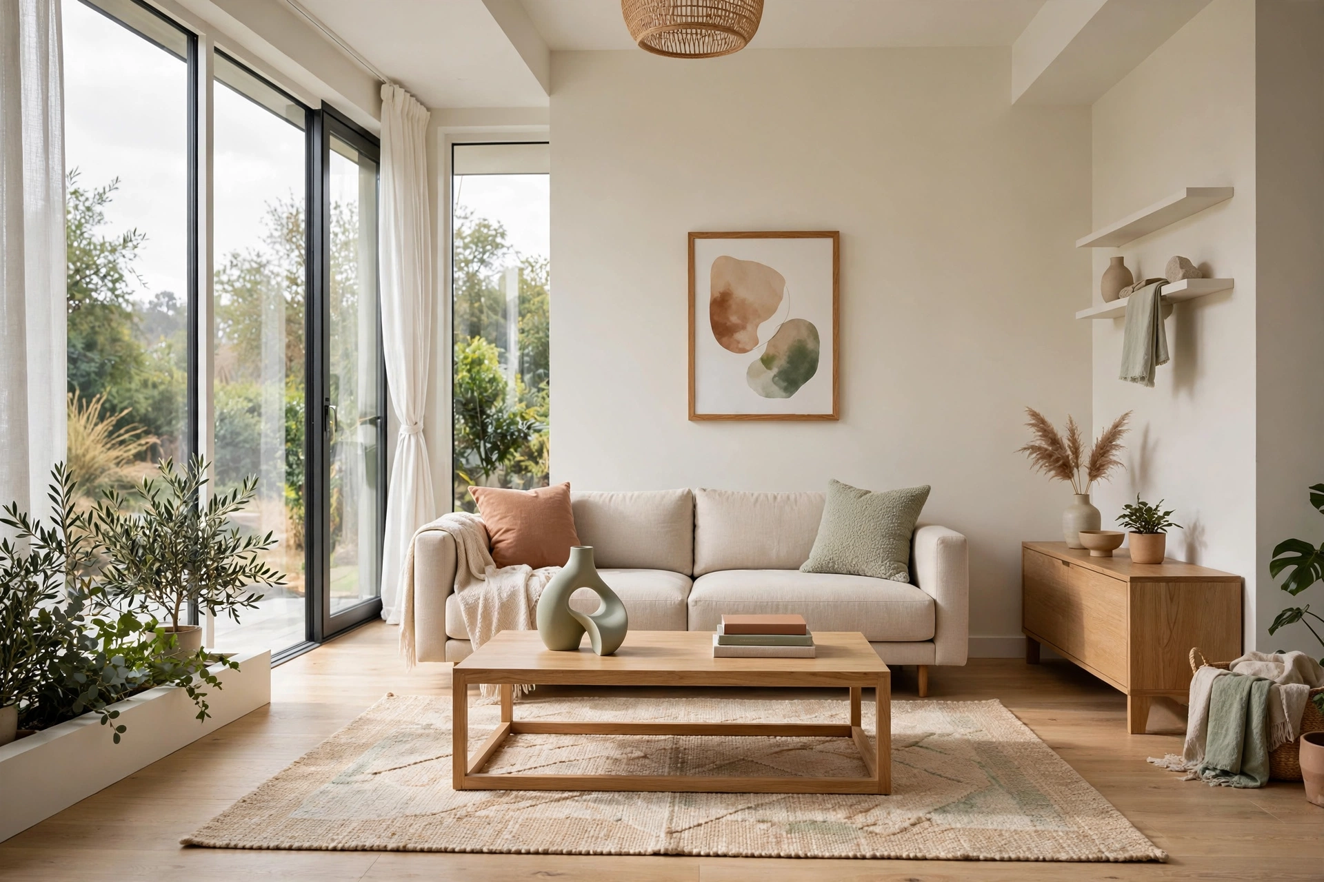
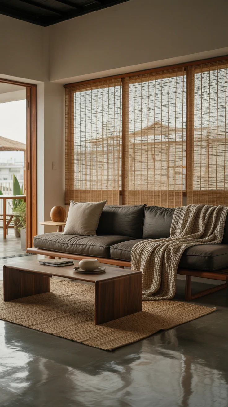
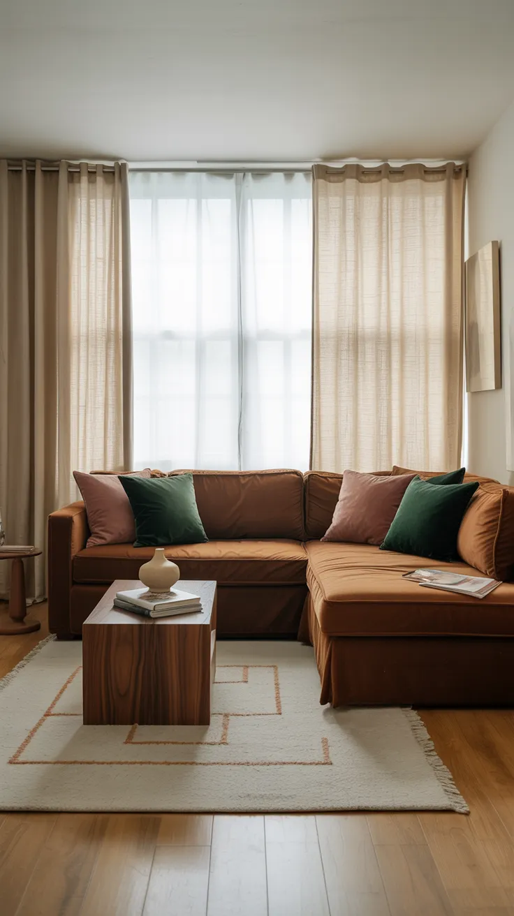
A coffee table vignette should speak the same design language as the room around it. In a minimalist space, that means fewer objects, cleaner lines, and a restrained palette — one sculptural piece and a single book stack. In a bohemian room, it means layered textiles, global textures, and joyful abundance. The table is not a separate decorating project; it is the room’s thesis statement in miniature.
The easiest way to check the match is the squint test: squint at the whole room so details blur and only color and texture remain. If the table area blends into the room’s overall impression, the styling belongs. If it jumps out as a separate island — too formal for a casual room, too rustic for a polished one — adjust one or two pieces toward the room’s language. Cohesion reads as calm, and calm is what designer rooms feel like.
13. Group Decor in Odd Numbers
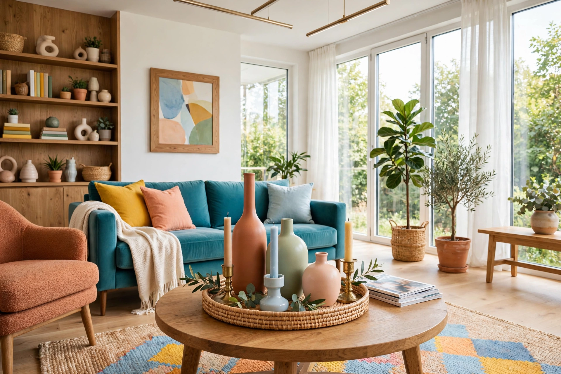
This is one of the oldest tricks in the styling book and it never stops working: objects grouped in odd numbers — three, five — look collected and natural, while even groupings look staged and symmetrical. The asymmetry of an odd group gives the eye somewhere to travel, which is exactly what makes a vignette feel dynamic instead of static.
Apply it at two scales. Within the tray, aim for three main elements: the book stack, the candle cluster, the small object. On the table as a whole, let the tray plus one or two outside pieces make the odd count. Three is the magic number for most coffee tables — five starts to crowd anything under forty inches wide. When something on your table feels “off” but you cannot name it, count the groupings; an even number is usually the culprit.
14. Make Room for Real Life
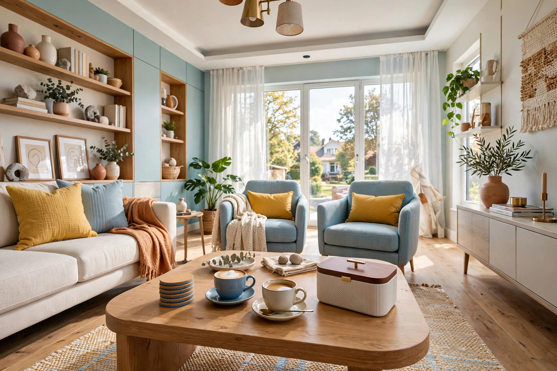
The most beautiful coffee table styling in the world fails if the table cannot hold a coffee cup. Designers plan for function first: coasters that are actually reachable, a clear landing zone for drinks, a lidded box or lidded basket that swallows the remotes, and a surface that wipes clean. A table that works gets used; a table that is all display gets resented.
Build the function into the composition rather than apologizing for it. A stack of beautiful coasters is decor. A lidded box in a great material is decor. The remote control corralled in a small brass bowl is, if not decor, at least civilized. Leave that deliberate empty third of the surface we talked about — it is the table’s working zone, and a vignette designed around real life always looks better than one designed around a photograph.
📌 Important: If kids or pets share the living room, style accordingly: skip the tall fragile vase, choose washable tray materials, and keep anything breakable or top-heavy off the table entirely. A designer table that survives Tuesday is better than a perfect one that lasts until Thursday.
15. Photograph It and Edit Ruthlessly
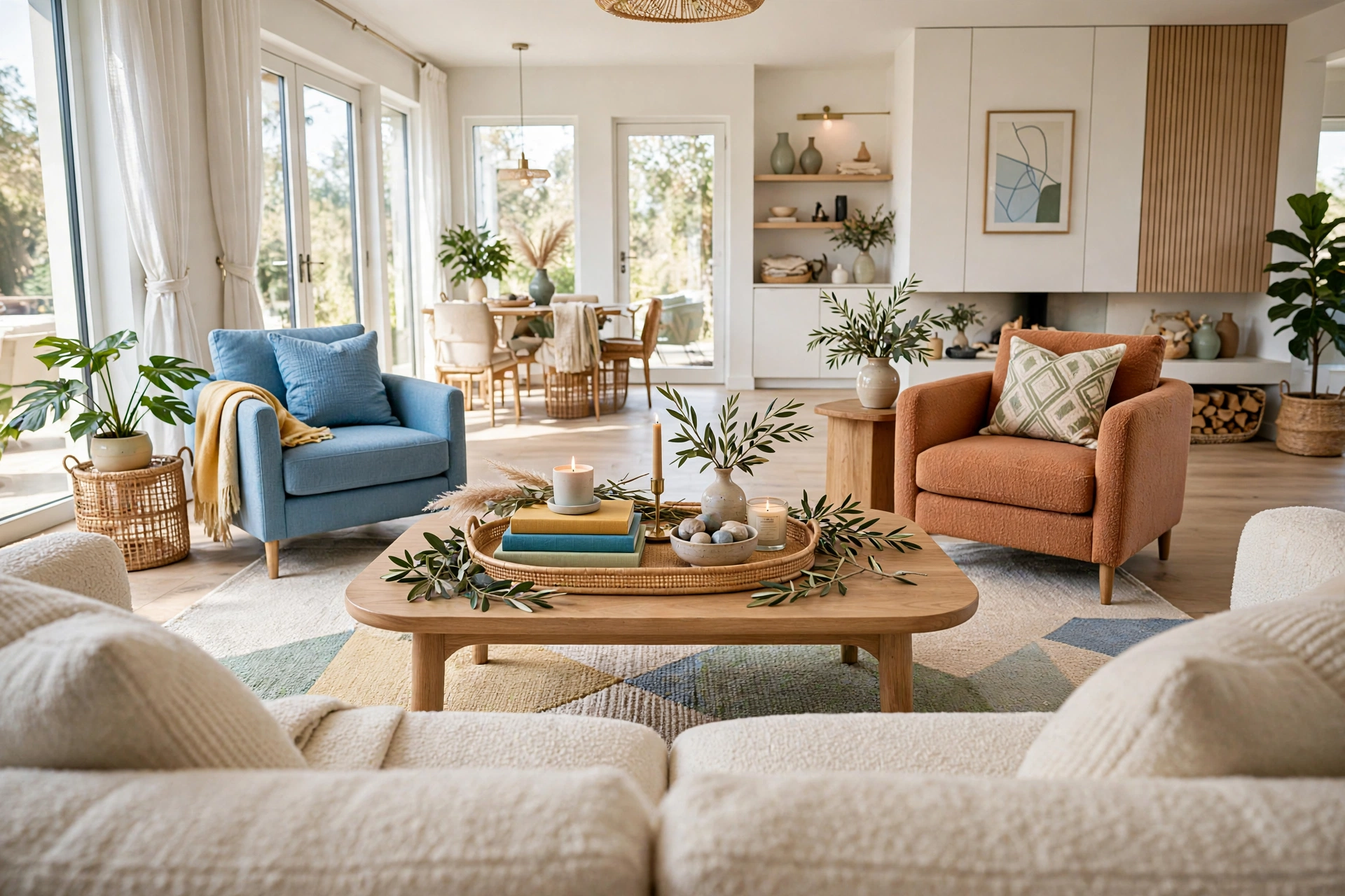
The final designer step is the edit, and the tool is your phone camera. Photograph the table from the sofa’s viewpoint and study the photo — the camera is ruthlessly honest in a way your eyes, which have been staring at the arrangement for an hour, are not. You will instantly see the cord peeking out, the object that is slightly too far left, the cluster that reads as one blob.
Then remove one thing. Designers almost always take away the last item they added — it is the classic “take one thing off before you leave the house” rule applied to interiors. Live with the edited version for a day before deciding it needs anything back. Nine times out of ten, the table looks better with less, and the thing you removed finds a happier home on a shelf. Done well, this whole process costs less than a takeout dinner — our budget living room makeover guide proves how far small, deliberate changes can stretch.
Quick Comparison: Coffee Table Styling by Budget and Effort
Coffee Table Styling Quick-Start Checklist
- ✅ Clear the table completely and wipe it down before placing a single object
- ✅ Anchor the vignette with a tray covering one-third to half of the surface
- ✅ Build three heights: one tall element, medium pieces, and low fillers
- ✅ Stack two or three large books, offset slightly, with one small topper
- ✅ Add something living — fresh stems, a small plant, or seasonal fruit
- ✅ Leave one-third of the surface empty for drinks and real life
- ✅ Photograph the result from the sofa and remove one item before calling it done
Common Coffee Table Styling Mistakes
Mistake 1: Overcrowding the Surface
The number one styling sin is covering every square inch. A crowded table has no focal point — the eye bounces around and registers the whole thing as clutter, no matter how beautiful the individual pieces are. If you cannot set down a coffee cup without moving something, you have styled past the point of function. Take away a third of the objects and watch the remaining ones suddenly look expensive.
Mistake 2: Keeping Everything at One Height
A table full of low, flat objects reads as a parking lot; a table with one towering object and nothing else reads as a lighthouse. Height variation is what makes a vignette feel composed — without the tall-medium-low pyramid, even lovely objects look randomly placed. Add one taller element and one low filler to any flat arrangement and the whole thing snaps into focus.
Mistake 3: Forgetting the Table Has a Job
A coffee table that cannot hold drinks, feet-up moments, or the remote is a sculpture, not furniture — and sculptures belong on pedestals. The classic failure is styling to the very edge with no landing zone, so the first movie night destroys the arrangement. Design the empty working third in from the start, and choose pieces that survive being nudged.
Mistake 4: Buying Everything as a Matching Set
Matching accessory sets — the tray, candle, and vase all from the same collection — produce the showroom look: polished, coordinated, and completely devoid of personality. Designers mix sources deliberately because contrast reads as collected and matching reads as purchased. Keep at most two pieces from any one set and let the rest come from elsewhere.
Mistake 5: Ignoring Scale
Tiny trinkets scattered on a huge table look lost; oversized objects on a small table look like they are holding it hostage. Scale every piece to the table: on a large table, go bigger and group more boldly; on a small one, choose fewer, finer pieces and let negative space do the work. When in doubt, photograph it — scale mistakes are obvious in photos and invisible in person.
Frequently Asked Questions
1. What should I put on my coffee table?
Start with the designer formula: a tray to anchor the arrangement, a stack of two or three large books, one candle or lantern for height, something living like fresh stems or a small plant, and one personal object. That is five elements that cover structure, height, life, and personality — everything else is optional.
2. How many items should be on a coffee table?
Aim for three to five groupings rather than counting individual objects — a tray vignette, a book stack, and one outside piece is the classic three. Style about two-thirds of the surface and leave one-third empty for drinks and daily use. If you cannot set down a cup without rearranging, you have too many.
3. How do I style a coffee table without it looking cluttered?
Use a tray to corral small items into one visual unit, group objects in odd numbers, vary heights so the eye has a clear path, and leave deliberate empty space. The two-thirds rule is the fastest clutter cure: if more than two-thirds of the surface is styled, remove things until the breathing room returns.
4. What is the height rule for coffee table decor?
Keep the tallest element under twelve inches so it never blocks faces or the television across the table. Build three layers — tall, medium, and low — with the height pushed toward one end rather than the center. Test it seated: if you peer around an object to see the person opposite, it is too tall or too central.
5. Should my coffee table decor match the rest of the room?
It should speak the same design language, not match piece for piece. A minimalist room wants fewer, cleaner objects; a bohemian room wants layered texture. Match the mood and palette, not the exact finishes — the table should feel like the room’s thesis statement in miniature, not a separate project.
6. How do I style a small coffee table?
Edit harder: one tray or one book stack, one small living element like a bud vase, and one candle — three groupings maximum. Choose finer, smaller-scale pieces and let empty space carry the composition. A small table styled sparsely looks intentional; a small table crowded with tiny objects looks cluttered.
7. How often should I change my coffee table styling?
Keep the base — tray, books, candle holders — in place year-round and rotate the seasonal accents: stems, fruit, small textiles, one decorative object. A ten-minute swap each season keeps the table feeling fresh without restyling from scratch. Photograph each season’s best version as a personal lookbook for next year.
Conclusion
Styling a coffee table like an interior designer is not about expensive objects — it is about a repeatable method. Anchor with a tray, build three heights, mix materials, add something living and one personal piece, protect the sightlines, and then photograph and edit. Those six moves cover ninety percent of what makes professional styling look professional, and none of them requires a design degree or a designer budget.
Start with what you own. Pull the books off the shelf, raid the kitchen for a bowl, cut stems from the yard, and give yourself one unhurried hour with a clear table. Style two-thirds, leave one-third for real life, take the photo, remove one thing — and then sit down with your coffee exactly where it belongs. The room will feel finished in a way no new purchase could deliver, because this time, it was finished on purpose.