10 Neutral Bathroom Ideas That Look Expensive Without Trying
Neutral bathrooms have a reputation problem. People associate them with bland, generic, cookie-cutter spaces that lack the courage to commit to anything interesting. And some neutral bathrooms absolutely deserve that criticism. But the neutral bathroom done correctly — with genuine attention to material quality, tonal variation, and textural depth — creates something that the bold, dramatic bathroom often struggles to achieve: a space that feels genuinely calm, genuinely beautiful, and genuinely timeless every single day you use it.
I renovated my bathroom in a palette of warm cream, honed travertine, and aged brass three years ago. Every visitor assumes I spent significantly more than I did. The secret wasn’t the budget — it was the commitment to neutrals chosen and layered with real intention. These 10 ideas cover everything I’ve learned about making neutrals genuinely extraordinary.
Why Neutral Bathrooms Work So Well
The neutral bathroom’s greatest strength is its relationship with light. Pale, warm, tonal surfaces reflect and amplify whatever natural and artificial light enters the room — making the space feel brighter, larger, and more open than the same room decorated in deeper, more saturated tones. In a bathroom, which is often one of the rooms with the least generous natural light situation, that light-amplifying quality is genuinely valuable rather than merely aesthetic.
Neutral bathroom color ideas also have an inherent timelessness that bolder choices rarely achieve. The bathroom tiled in a statement color that felt exciting in year one sometimes feels tiring by year three and actively unwanted by year five. The bathroom built on a palette of warm cream, honed stone, and natural wood looks as beautiful in its tenth year as its first — because the neutrals have no trend attachment to betray.
1. Warm Beige — The Neutral With Soul
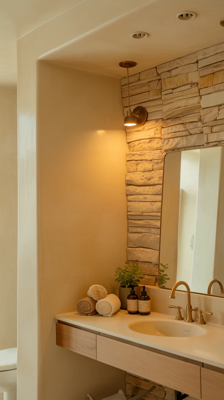
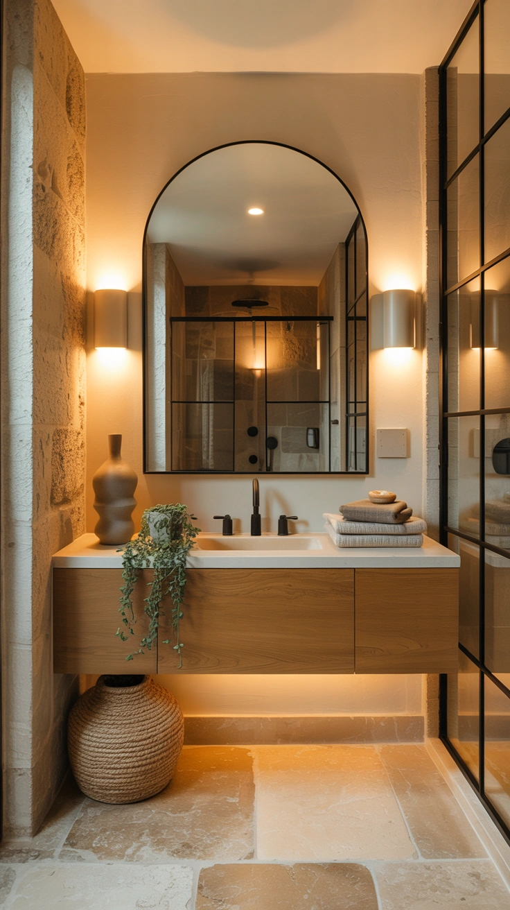
The beige bathroom has had something of a rehabilitation in recent years — and it genuinely deserves it. The beige of the 1990s was flat, uninspired, and applied without understanding. The beige bathroom of contemporary design is a different proposition entirely: warm, layered, rich in material quality, and anchored by a specific understanding of how warm neutral tones interact with natural light and organic materials.
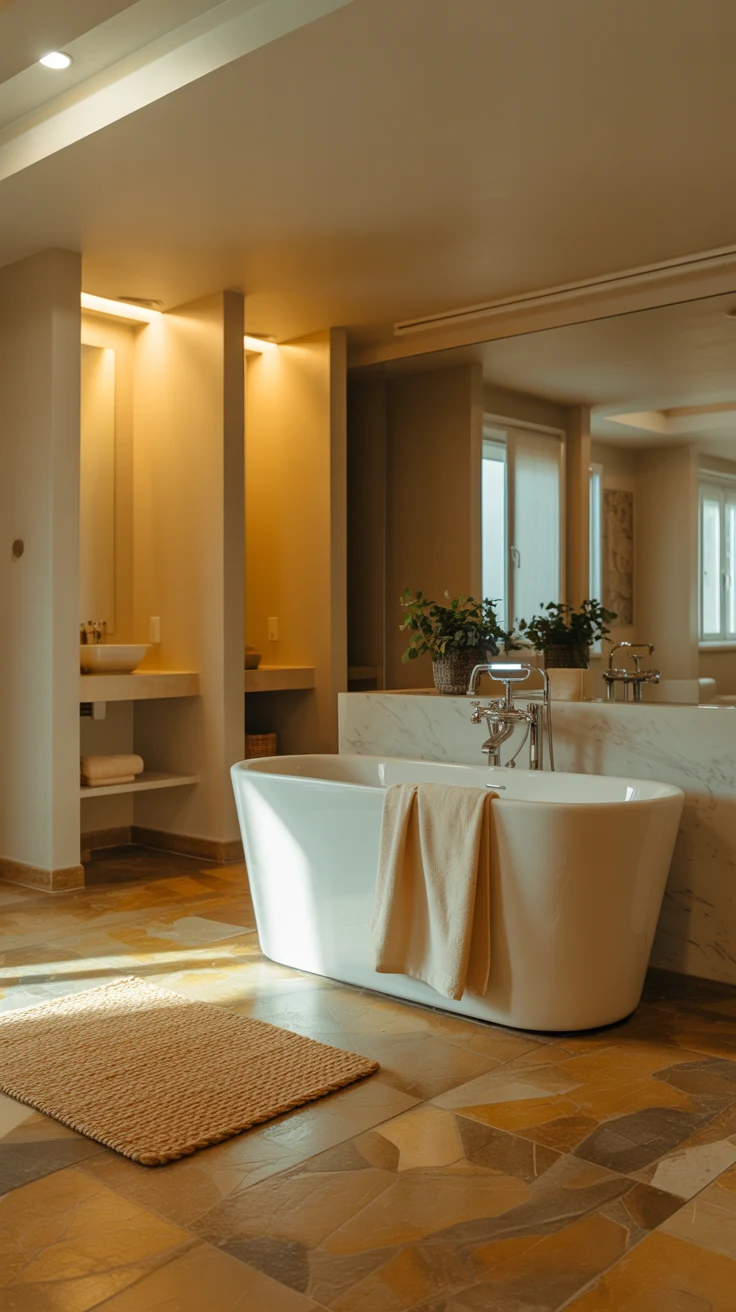
A beige bathroom works when the beige in question has genuine warmth — a slight golden, sandy, or terracotta undertone rather than a dead, grayish version of the tone. Pair warm beige walls with travertine or limestone tile in a slightly deeper variation of the same warm tone. Add natural wood accents — a teak shelf, an oak vanity — and aged brass fixtures. The result is a bathroom of extraordinary warmth and coherence that feels genuinely luxurious without a single bold decision.
Warm beige bathroom combinations:
- Warm beige walls with honed limestone tile
- Beige travertine from floor to wall in one continuous tone
- Beige plaster finish with natural wood vanity and brass fixtures
- Sandy beige tile with cream grout and warm oak shelving
- Pale warm beige with terracotta accent accessories
2. The Gray Neutral Bathroom Done Right
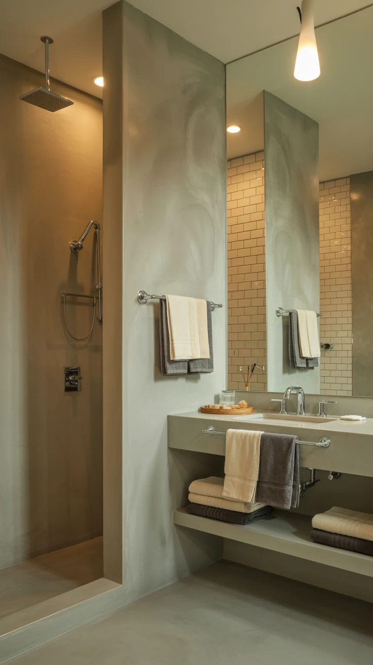
The gray neutral bathroom is where the most design mistakes happen — because gray is the most undertone-sensitive neutral available, and getting it wrong produces bathrooms that feel cold, clinical, and somehow always slightly damp-looking regardless of how clean they actually are. The key to getting gray right in a bathroom is warmth, and specifically, choosing a gray with enough warm or greige undertone to prevent it from reading as cold under artificial lighting.
A warm charcoal with brownish undertones creates a sophisticated, moody bathroom that feels enveloping rather than cold. A soft gray with a slight green or sage undertone creates a bathroom with a calming, nature-adjacent quality that’s deeply appealing. And a very pale warm gray — almost white but with enough gray to prevent starkness — creates one of the most versatile neutral bathroom foundations available, pairing beautifully with almost any material and any fixture finish.
3. Neutral Bathroom Decor — Texture as the Primary Interest
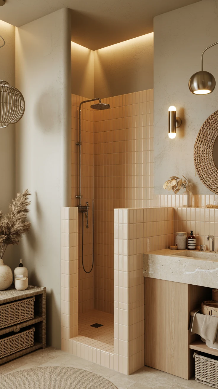
Here’s the neutral bathroom decor principle that separates bathrooms that feel genuinely designed from those that feel generically inoffensive: when you remove color as the primary source of visual interest, texture must fill that role completely. A neutral bathroom without textural variation is flat, dull, and forgettable. A neutral bathroom with rich, varied, carefully layered texture is one of the most sophisticated design environments imaginable.
This means choosing materials with inherent textural quality rather than defaulting to smooth, glossy surfaces throughout. Honed stone rather than polished — it catches light differently and has an organic, matte quality that feels authentically luxurious. Fluted or ribbed tiles that add three-dimensional depth to the shower wall. A limewash or Venetian plaster wall finish with subtle organic movement. Towels in a waffle or honeycomb weave rather than standard smooth terry. Each textural choice adds a layer of visual and tactile richness that keeps the neutral palette genuinely interesting.
4. Beige Bathroom — The Travertine Direction
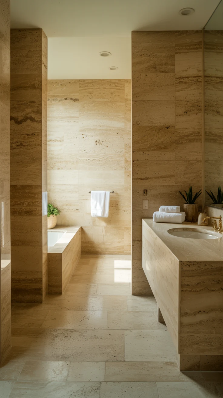
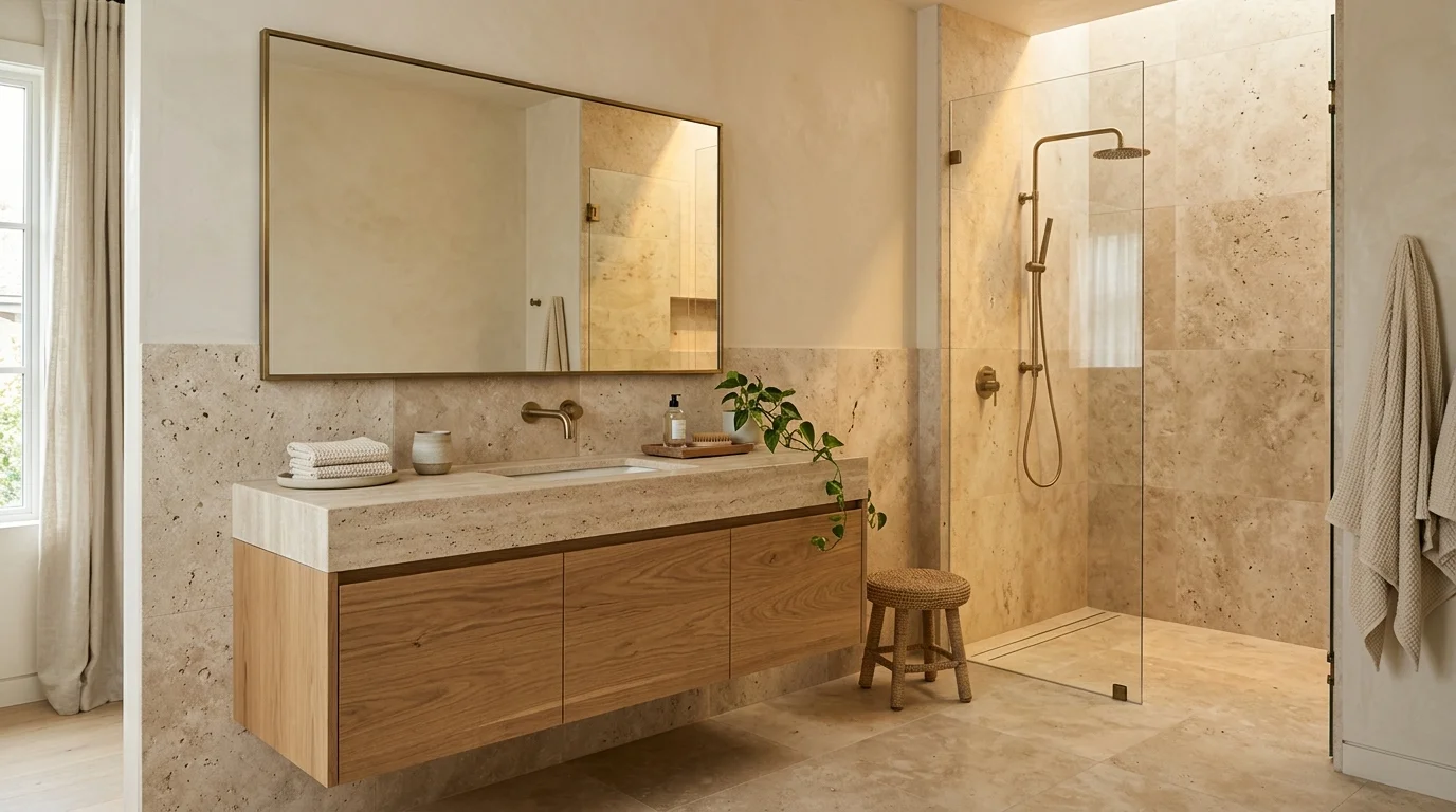
If there’s one material that defines the beige bathroom at its most sophisticated and most genuinely beautiful, it’s travertine. This naturally occurring limestone has been used in architecture and interior design for centuries — and its characteristic warm beige tone, natural variation, and distinctive void-and-fill surface texture create bathrooms of extraordinary character that no manufactured tile can replicate.
Travertine floor to wall in a neutral bathroom creates a seamless, immersive quality that makes the room feel like it was carved from a single continuous piece of warm stone. The natural variation in the material — each tile slightly different in tone and marking — provides visual interest that keeps the eye engaged without introducing any color or pattern. And travertine’s behavior in light is genuinely extraordinary: morning sun makes it glow golden, afternoon light reveals its cooler gray depths, and evening lamp light brings out a warm, sandy quality that’s deeply beautiful.
5. Small Bathroom Ideas Neutral Color
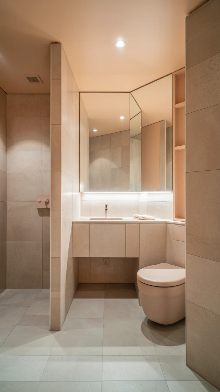
Here’s the small bathroom ideas neutral color reality that most compact bathrooms overlook: a well-chosen neutral palette in a small bathroom doesn’t just look good — it actively makes the room feel larger. Pale, warm neutrals reflect light and create visual continuity that makes the eye travel through the space rather than stopping at surface changes. And tonal consistency — where floor, walls, and ceiling all sit within the same color family — eliminates the visual boundaries that fragment a small room into even smaller-feeling zones.
In a small bathroom, the neutral palette works hardest when applied with complete consistency. The same tone on the walls continuing onto the ceiling. The floor tile in a slightly warmer or deeper version of the same neutral family. Grout in a color that closely matches the tile rather than contrasting against it. These decisions compound into a spatial effect that makes a genuinely compact bathroom feel significantly more generous than its actual dimensions.
Small bathroom neutral strategies:
- Tonal ceiling — same tone as walls, slightly lighter
- Matching grout — eliminates the tile grid that fragments small spaces
- Large format tile — fewer grout lines, more visual continuity
- Wall-mounted fixtures — reveals floor for visual openness
- One material throughout — floor to wall in a single neutral tile
6. Calm Modern Bathroom — The Organic Modern Direction
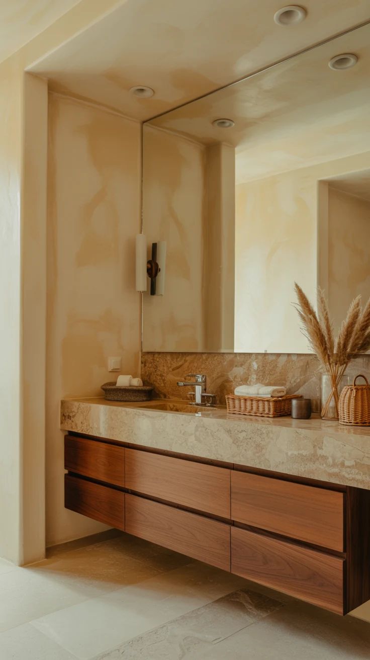
The calm modern bathroom direction that’s producing some of the most beautiful neutral bathrooms in contemporary design right now is organic modern — clean architectural lines with warm natural materials, earthy neutral tones, and a deliberate quality of considered restraint throughout. It’s the design direction that answered the question everyone was asking about pure minimalism: what if it could be warm as well as clean?
An organic modern neutral bathroom has a floating walnut vanity with visible grain, warm beige or cream plaster walls with subtle organic texture, a honed limestone or travertine floor, and aged bronze or brushed brass fixtures. The structure is contemporary and precise. The materials are natural and warm. And the palette is entirely neutral — but so richly textured and so carefully considered that “neutral” feels like completely the wrong word for it.
7. Neutral Bathroom Inspiration — The Tonal Layering Technique
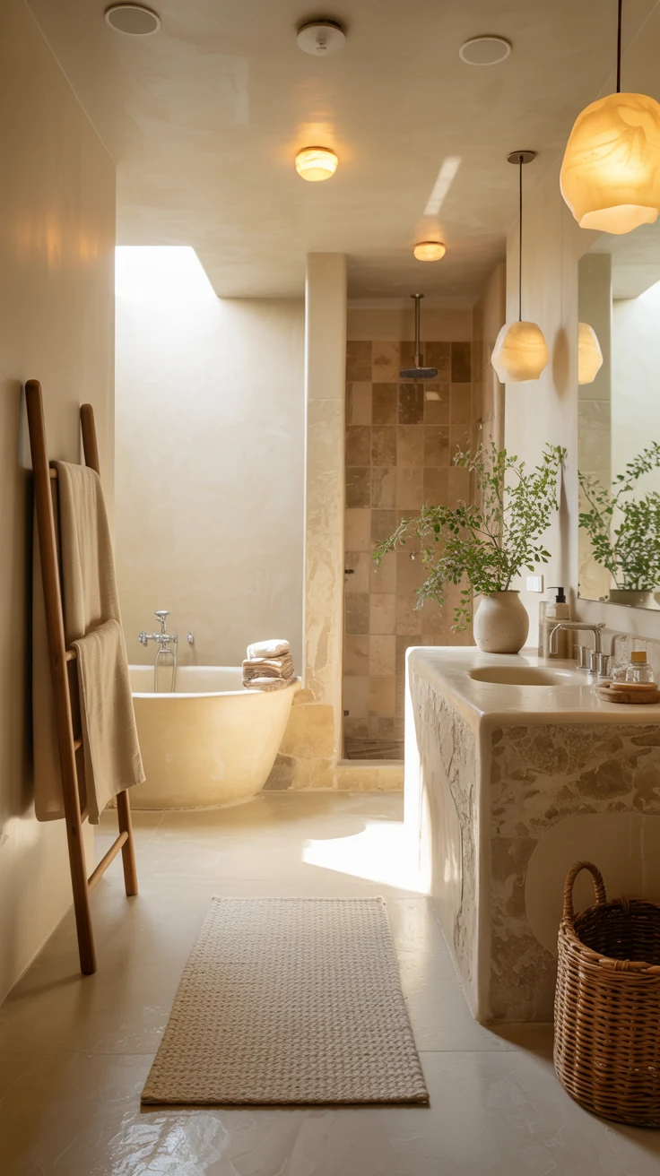
Here’s the neutral bathroom inspiration principle that makes the difference between a palette that feels sophisticated and one that feels flat: tonal layering. A neutral bathroom built on a single flat tone — one beige applied uniformly to every surface — will always feel dull regardless of how beautiful the individual tone is. A neutral bathroom that layers multiple tones within the same color family — from the palest cream on the ceiling to a slightly warmer ivory on the walls to a deeper sand on the floor — has depth, dimension, and genuine visual interest.
This tonal layering approach treats the neutral palette as a gradient rather than a flat field. The palest tones go highest — ceiling and upper walls — to maximize the sense of light and height. The warmest, deepest tones go lowest — floor and lower walls — to ground the space visually and create a sense of stability. The result feels simultaneously cohesive and rich, which is exactly the quality that distinguishes a neutral bathroom of genuine design ambition from one that simply avoided a decision.
8. Neutral Bathroom Color Ideas — Material Over Paint
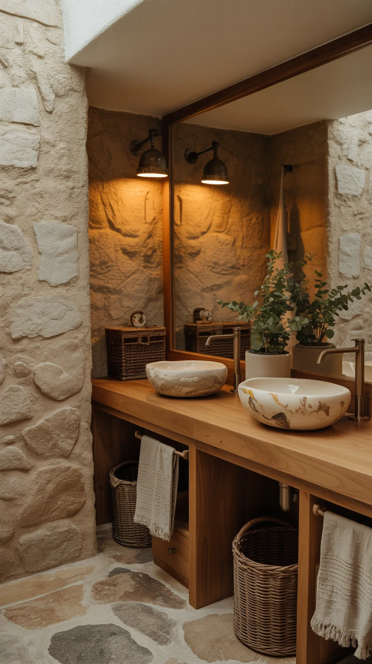
Here’s a neutral bathroom color ideas insight that transforms how you approach the palette decision: in the most beautiful neutral bathrooms, the color doesn’t come primarily from paint — it comes from the natural tones of the materials themselves. The warm beige of honed travertine. The soft gray of polished concrete. The sandy warmth of oak veneer. The creamy white of a ceramic vessel basin. These material colors are richer, more complex, and more beautiful than any painted wall tone — because they have natural variation, depth, and authenticity that paint can only approximate.
When you let the materials determine the neutral palette rather than choosing a paint color first, the bathroom has an inherent coherence that top-down color selection rarely achieves. The travertine floor determines the tone family. The vanity wood adds warmth. The plaster wall finish adds texture in a complementary tone. Everything belongs to each other naturally — because it was all chosen in response to the same material logic rather than applied from a predetermined color decision.
9. Bathroom Design Neutral — Hardware and Fixtures
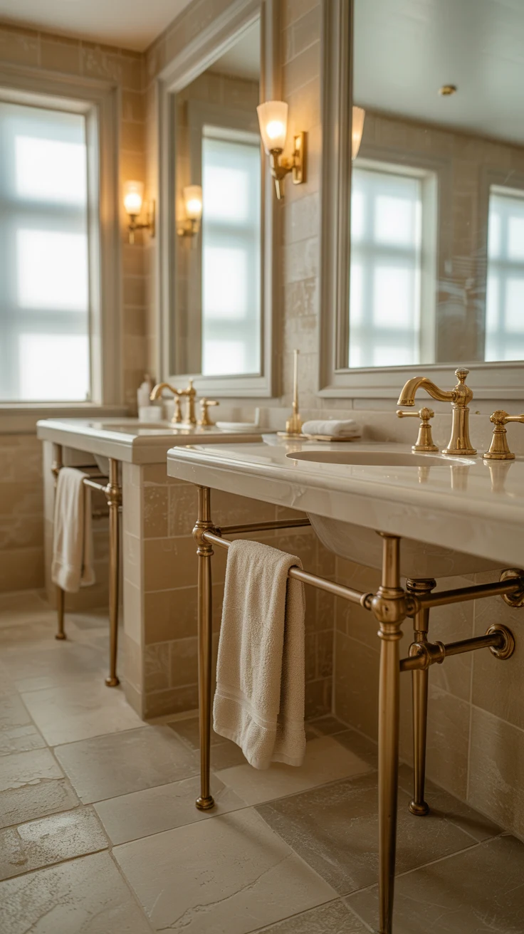
Here’s the bathroom design neutral detail that most renovations get wrong: the fixture and hardware finish. In a neutral bathroom, where there’s no bold color or pattern to draw the eye, the metal finishes on taps, towel rails, shower fittings, and cabinet handles are dramatically more visible and dramatically more important than in more decorated spaces. They’re the room’s jewelry — and the wrong choice undermines the entire palette.
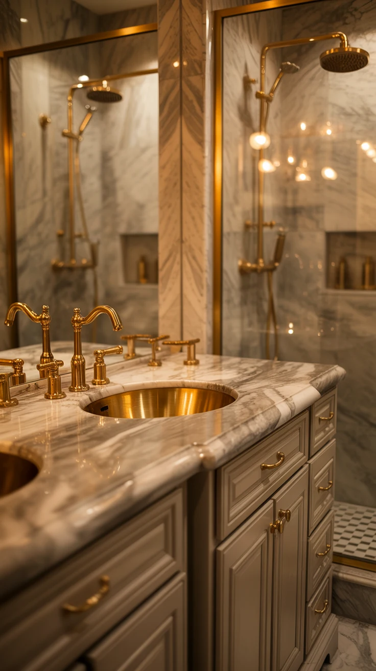
Warm neutrals — beige, cream, travertine, warm stone — pair most beautifully with warm metal finishes. Aged brass, brushed gold, antique bronze, and matte warm gold all amplify the warmth of a beige or cream neutral bathroom and contribute a quality of considered luxury that cool metals cannot provide in the same palette. Cool neutrals — gray stone, cool white, slate — pair best with brushed nickel, polished chrome, or matte black. The rule is simple: match the temperature of your fixture finish to the temperature of your neutral palette, and the entire room coheres.
Fixture finish pairings by palette temperature:
- Warm beige or cream palette — aged brass, brushed gold, antique bronze
- Cool gray or slate palette — brushed nickel, matte black, polished chrome
- Warm white or ivory palette — either warm metal or matte black depending on desired character
- Travertine or natural stone — aged brass is the definitive choice
- Concrete or industrial neutral — matte black is the most cohesive option
10. Neutral Bathroom Inspo — The Accessories That Complete It
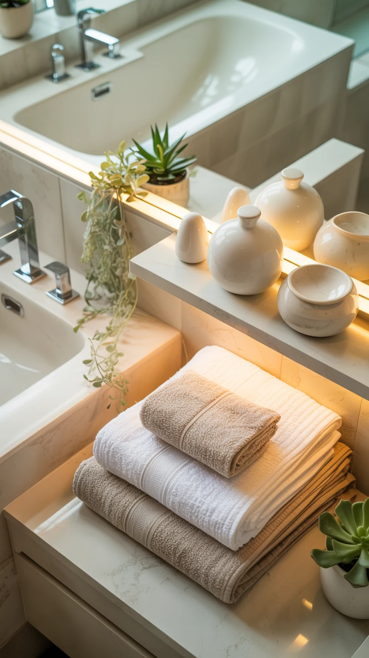
The final neutral bathroom inspo element is the one that turns a beautifully designed bathroom into a beautifully lived-in one: accessories chosen with the same level of tonal discipline as every other decision in the room. In a neutral bathroom, the accessories are visible, close-range, and surprisingly impactful — and a collection of mismatched, randomly chosen bathroom accessories can undermine even the most beautifully considered tile and fixture choices.
Choose accessories in a consistent material family that complements the neutral palette. Handthrown ceramic accessories in earthy, neutral tones — soap dish, toothbrush holder, small storage pot — add organic warmth and handmade character. A wooden tray in a warm-toned timber corrals daily essentials on the vanity surface while adding natural material warmth. White or cream towels in a quality cotton or waffle weave coordinate with the palette while adding a hotel-quality layered textile element. And one well-chosen plant — a small potted succulent, a trailing pothos, or a compact tropical — adds the organic life that completes the neutral bathroom’s atmosphere completely.
Conclusion
Every neutral bathroom idea in this list is built on one conviction: a neutral palette, applied with genuine intelligence and genuine material quality, consistently produces bathrooms of extraordinary beauty and extraordinary longevity. From the warm beige bathroom built on layered travertine tones, to the organic modern neutral with its walnut vanity and plaster walls, to the small bathroom that uses tonal consistency to create a sense of space far beyond its actual dimensions — every direction here delivers.
The neutral bathroom isn’t the safe choice. It’s the choice that rewards the most careful thinking, the most disciplined material selection, and the most patient, considered approach to tonal layering. It’s the bathroom that looks better every year rather than dating with every passing trend cycle. And it’s the bathroom that makes you feel genuinely calm every single morning — which, when you think about it, is the most important thing a bathroom can do.
Start with the material palette rather than a paint color. Let the neutrals tell you what they want to be paired with. And commit to the tonal layering with genuine confidence. Because the neutral bathroom that results from that approach will surprise you completely — and anyone who visits will spend considerably longer than necessary complimenting a bathroom they can’t quite explain why they love so much.
Frequently Asked Questions
1. What colors work best for a neutral bathroom?
Warm cream, beige, ivory, soft taupe, warm gray, and sandy tones work beautifully. The key is choosing neutrals with compatible undertones so the room feels cohesive rather than flat.
2. How can I make a neutral bathroom look less boring?
Use texture and tonal variation instead of relying on bold colors. Combine honed stone, plaster, fluted or ribbed tile, natural wood, woven towels, handmade ceramics, and subtly different neutral shades.
3. Is travertine a good choice for a neutral bathroom?
Yes. Travertine adds natural warmth, variation, and texture while maintaining a neutral palette. Using it across the floor and selected walls can create a seamless, immersive appearance.
4. How do I make a small neutral bathroom look bigger?
Use pale warm neutrals consistently across the walls and ceiling, choose large-format tiles with matching grout, and consider wall-mounted fixtures to keep more of the floor visually open.
5. What wood works well in a neutral bathroom?
Natural oak, walnut, and teak can add warmth and organic character. A visible natural grain works particularly well with cream, beige, travertine, and other warm neutral materials.
6. What metal finish looks best with warm neutral bathroom colors?
Aged brass, brushed gold, and antique bronze work especially well with warm beige, cream, travertine, and natural stone. The important principle is matching the temperature of the metal to the temperature of the neutral palette.
7. How can I make a neutral bathroom feel luxurious?
Start with high-quality natural materials rather than focusing only on paint color. Layer warm stone, natural wood, textured walls, coordinated hardware, quality towels, and carefully chosen accessories to create a sophisticated and timeless result.