How To Coordinate Bedding Like a Designer — Without Overthinking It
A beautifully coordinated bed is one of those things that looks effortless and is slightly mysterious until you understand the principles behind it. How does a hotel bed manage to look so perfectly composed with multiple layers, different fabrics, and varying tones — all working together without any of it feeling random or accidental? And why does the attempt to replicate that at home so frequently end up with a bed that looks like it couldn’t make up its mind? The answer is not about buying expensive bedding sets or having a naturally good eye. It’s about understanding a handful of specific coordination principles that anyone can apply immediately, to any bed, with bedding they already own. I spent years making this mistake — buying beautiful individual pieces that didn’t quite work together — before understanding what was actually creating the disconnect. These 17 tips will save you years of slightly-off bedding arrangements.
1. Start With One Anchor Piece
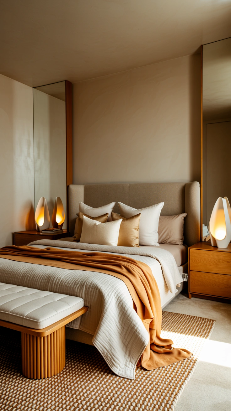
Every beautifully coordinated bed begins with one anchor piece — the primary bedding element around which everything else is chosen and organised. Without a clear anchor, bedding coordination becomes a guessing game of which pieces might work together. With one, every subsequent decision has a clear reference point.
The anchor is almost always the duvet cover — the largest, most visually prominent piece of bedding on the bed. Choose this first, with genuine care, in the colour and material that you want to define the bed’s overall character. Every other piece — pillowcases, shams, throws, cushions — is then chosen to coordinate with this anchor rather than independently. This anchor-first approach eliminates the most common bedding coordination problem: a collection of beautiful individual pieces that don’t speak to each other.
2. The Tonal Palette Principle
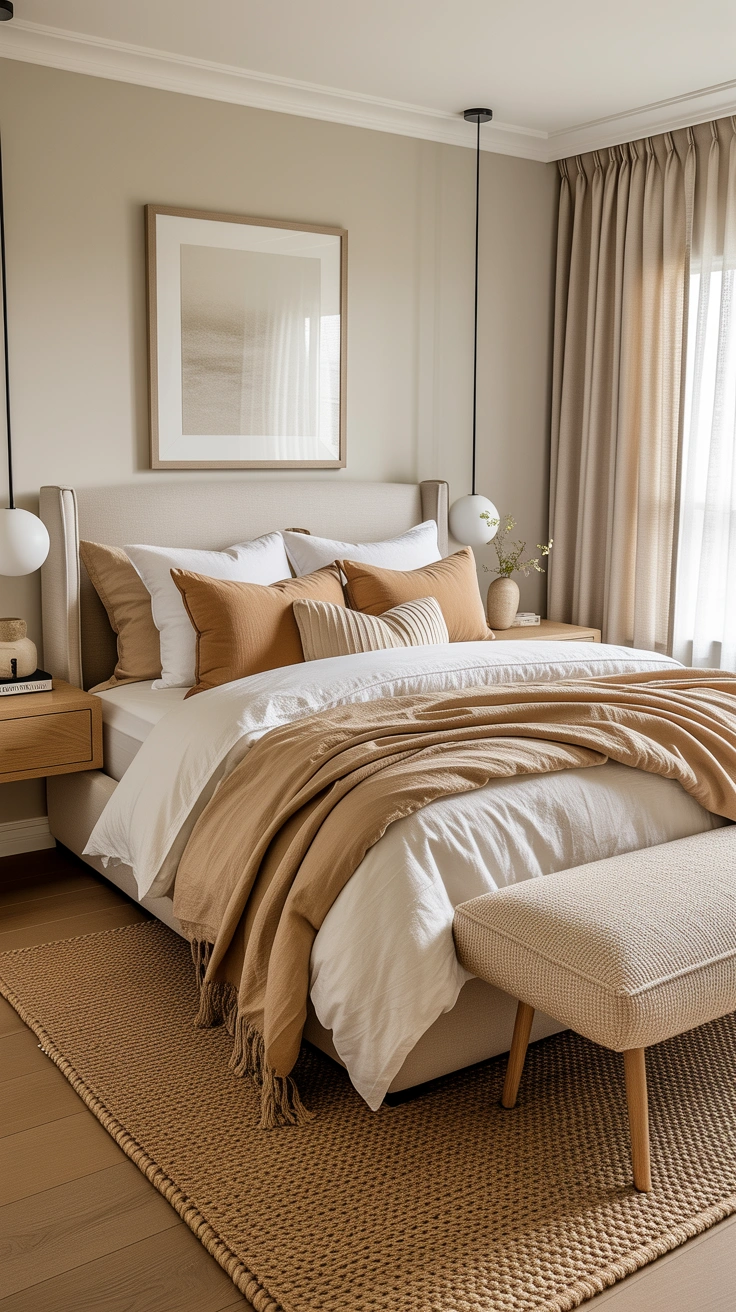
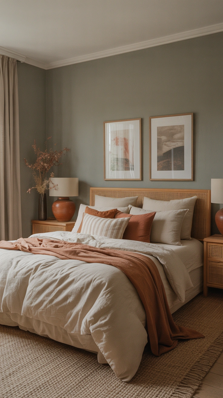
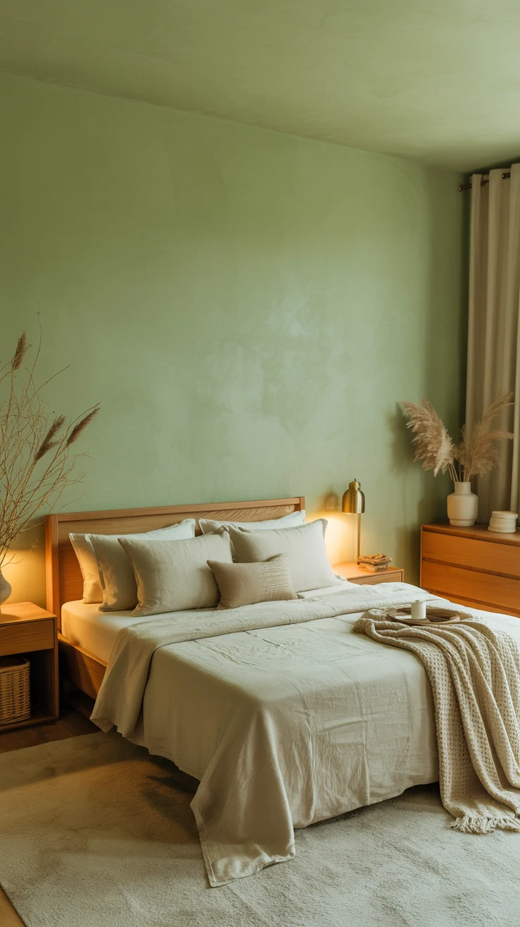
The most reliable and most consistently beautiful bedding coordination approach is tonal — using multiple shades within the same colour family rather than multiple different colours. A bed dressed entirely within the warm neutral family (white, cream, oatmeal, camel, warm grey) creates a layered, sophisticated result that always looks considered and always looks calm.
The tonal palette works because it provides natural variation and visual depth without colour contrast — the different tones creating complexity within cohesion. An all-white bed with a cream throw and oatmeal cushions reads as layered and rich rather than monotone. An all-white bed in identical white everywhere reads as flat. The variations in tone are what create the visual interest.
3. Pattern Mixing — The Scale Rule

Pattern mixing in bedding is one of the most feared coordination challenges — and one of the most manageable once the single governing principle is understood: vary the scale of patterns significantly between any two patterned pieces, and they will almost always work together.
A small geometric pattern on the pillowcases alongside a large botanical pattern on the duvet cover. A fine stripe on the fitted sheet beneath a large-scale linen weave duvet. A small check accent cushion alongside a bold abstract throw. The different scales create visual hierarchy — one pattern is clearly dominant, the other is supporting — and that hierarchy is what prevents pattern combinations from looking chaotic.
4. The Three-Colour Maximum

Bedding coordination that spans more than three colours simultaneously almost always becomes visually complex in a way that reads as busy rather than composed. The three-colour maximum is the practical limit for a coordinated bed that looks designed rather than assembled from whatever was available.
Choose your three tones before you buy anything — a primary tone (the duvet), a secondary tone (shams or pillow cases), and an accent tone (cushions or throw). Every piece then fits into one of these three positions. This doesn’t mean every piece must be a flat solid colour — patterns are fine as long as they’re drawn from within the three-tone palette rather than introducing additional colours.
5. Texture Is as Important as Colour
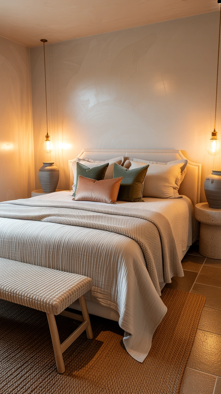
Two pieces in exactly the same colour but in different textures create a bed of far greater visual richness and interest than two pieces in coordinating colours but identical textures. Texture variation — the interplay of smooth, rough, matte, sheen, woven, and plush surfaces — is the dimension of bedding coordination that most people neglect and that makes the most visible difference.
Smooth linen duvet beside a chunky knit throw. Velvet cushions alongside cotton pillowcases. A waffle-weave blanket beneath a simple flat duvet. These texture combinations create a tactile and visual complexity that makes the bed look layered and designed from every angle and under every lighting condition. FYI — a bed dressed entirely in the same material, however beautiful that material might be, will always look flatter than one with genuinely varied textures.
6. The Layering Sequence

A beautifully coordinated bed is built in a specific sequence — and understanding that sequence makes the process both easier and more consistently beautiful. Each layer has a defined role in the overall composition, and placing them in the right order creates the specific hotel-quality visual completeness that random layering never achieves.
The Correct Bedding Layering Order:
- Fitted sheet — the invisible foundation
- Flat sheet (optional but recommended) — lies flat, folded back over duvet at top
- Duvet in its cover — the main visual layer, shaken full and smooth
- European shams — stand upright against the headboard, two for a double, two for a king
- Standard pillowcases — placed in front of the shams
- Accent or decorative cushions — one or two at the front of the arrangement
- Throw — folded precisely at the foot of the bed
Each layer appears in front of and slightly lower than the previous one — creating depth from headboard to foot.
7. White and Neutrals as Foundation
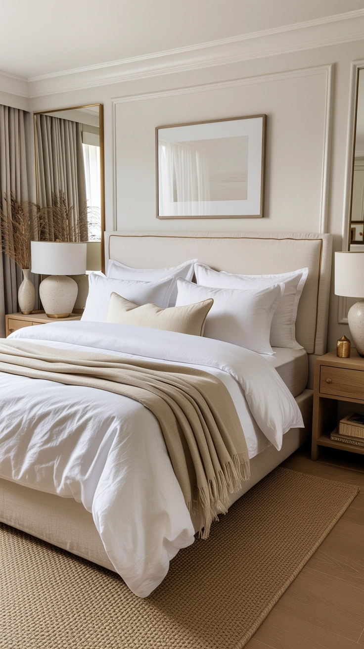
White and warm neutral bedding serves as the most flexible foundation for any coordination approach — because pure white or warm cream bedding coordinates with every accent colour, every pattern, and every material without friction. It is the design equivalent of a blank canvas.
A white or warm cream duvet cover as the primary piece creates the most versatile foundation for changing and updating accent pieces seasonally without replacing the main bedding investment. White bedding also has the specific quality of always looking clean, fresh, and hotel-standard when properly cared for — and it ages gracefully, never feeling dated in the way that colour-trend bedding sometimes does.
8. The Cushion Number and Arrangement

The decorative cushions on a bed create the front layer of the bedding composition — the final, most visible element that completes the arrangement. How many and how they’re arranged determines whether the bed looks generously styled or simply cluttered.
Two to four decorative cushions work best on most bed sizes — one or two on a single or double, two to four on a king. Position them in front of the standard pillows, from largest to smallest front to back. Odd numbers (three) create a more dynamic composition than even numbers (two or four). The cushion tones and materials should coordinate with the overall palette without being identical to the surrounding pieces.
9. The Throw — Placement Matters
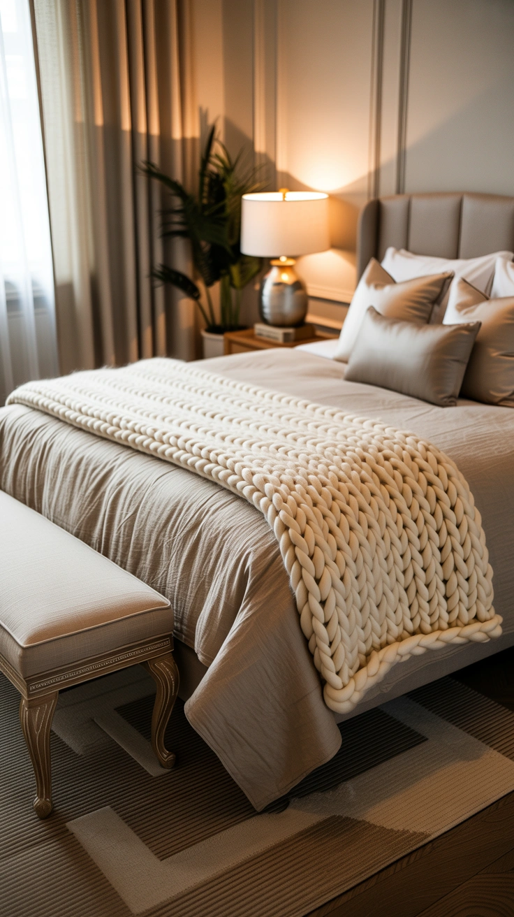
A throw or blanket at the foot of the bed is the element that creates the bed’s finished quality — but only when it’s placed with genuine precision. A casually tossed throw looks careless. A precisely folded and placed throw looks like a deliberate design decision.
Fold the throw into a neat rectangle approximately one third the width of the bed. Lay it across the foot, centered on the width, with the fold facing toward the foot of the bed. Smooth it completely flat. The throw should appear placed rather than arrived — the specific quality that distinguishes a styled bed from a used one. The material of the throw should provide textural contrast to the duvet beneath it.
10. Mixing Bedding From Different Sets
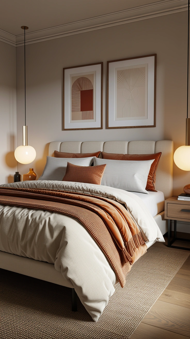
Most beautiful beds are not assembled from a single matching set — they’re composed from pieces from different sources that have been chosen to work together. Understanding how to mix bedding from different sets is the skill that creates genuine coordination rather than the matched-set-look that often reads as generic.
The principles are the same: tonal palette consistency, texture variation, scale-varied patterns, and the three-colour maximum. A duvet from one brand in warm cream linen. Pillow cases from another brand in the same warm cream but a slightly different texture. A throw from a third source in a deeper caramel. A cushion in warm rust as the accent. None of these pieces came from the same set — but they coordinate beautifully because they share a clear palette and a clear material language.
11. Seasonal Coordination Updates

A bed that coordinates perfectly in one season may feel slightly wrong in another — because the natural light quality, room temperature, and emotional register of different seasons calls for different bedding weights, textures, and tones. Seasonal bedding updates keep the coordination feeling current and genuinely appropriate to the time of year.
Seasonal Bedding Palette Guide:
- Spring — fresh whites and pale pastels, lighter textures, floral accents
- Summer — crisp white and cool linen, minimal layers, organic cotton
- Autumn — warm caramel, ochre, and rust tones, chunky knit throws, velvet accents
- Winter — deep neutrals, heavyweight wool throws, faux fur accents, maximum layering
These seasonal shifts don’t require replacing all bedding — swapping the throw, the accent cushions, and perhaps the duvet cover creates a completely different seasonal feel while the foundation pieces remain constant.
12. The Pillowcase Hierarchy
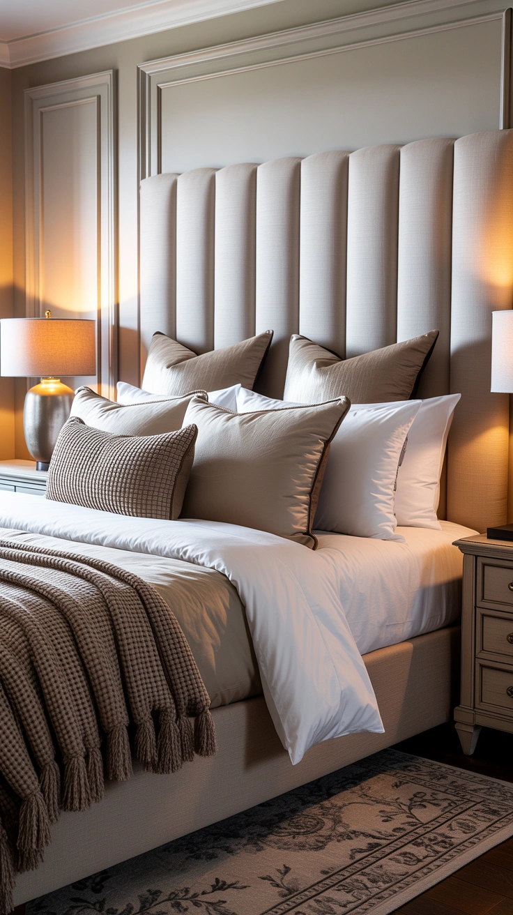
Standard sleeping pillowcases and decorative shams serve different functions in the bedding arrangement — and understanding their hierarchy prevents the visual flattening that comes from treating all pillow coverings as interchangeable.
European shams (the large square pillows) stand upright against the headboard as the background layer — their scale creating depth and height behind everything in front of them. Standard pillowcases lie flat in front of the shams. Decorative cushions sit in front of the standard pillows. This front-to-back depth creates the specific visual architecture of a beautifully made bed — each layer slightly lower and slightly closer to the viewer than the one behind it.
13. Pattern on Solids, Solid on Pattern

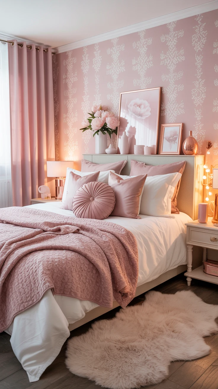
A reliable coordination rule for mixing patterns and solids in bedding: if the duvet cover is patterned, make the accent cushions and throw solid or near-solid. If the duvet cover is solid, the accent cushions and throw can carry pattern and visual interest. This principle prevents the bed from becoming visually overloaded at any one element.
A patterned duvet needs solid-toned pillowcases, a plain throw, and one or two solid cushions in tones drawn from the pattern’s palette. A solid duvet benefits from a patterned or textured throw, and cushions with some surface interest — embroidery, texture, or subtle pattern. The visual energy of the bed should be carried by either the main layer or the accent layers — not both simultaneously.
14. The Linen Quality Effect

The quality of bedding materials affects coordination as much as colour or pattern — because high-quality linen and cotton have a specific organic character and weight that coordinates naturally with other quality natural materials. Synthetic bedding in the same colours can never quite replicate the coordination quality that natural fabrics achieve.
Natural linen, cotton, and cotton-linen blends create the most beautiful and most naturally coordinating bedding — their textures and weights sharing a common organic honesty that makes coordination almost automatic. Investing in a smaller number of high-quality natural pieces creates a better-coordinated bed than a larger number of lower-quality synthetic alternatives, even when the colours are theoretically identical.
15. Headboard as Coordination Reference
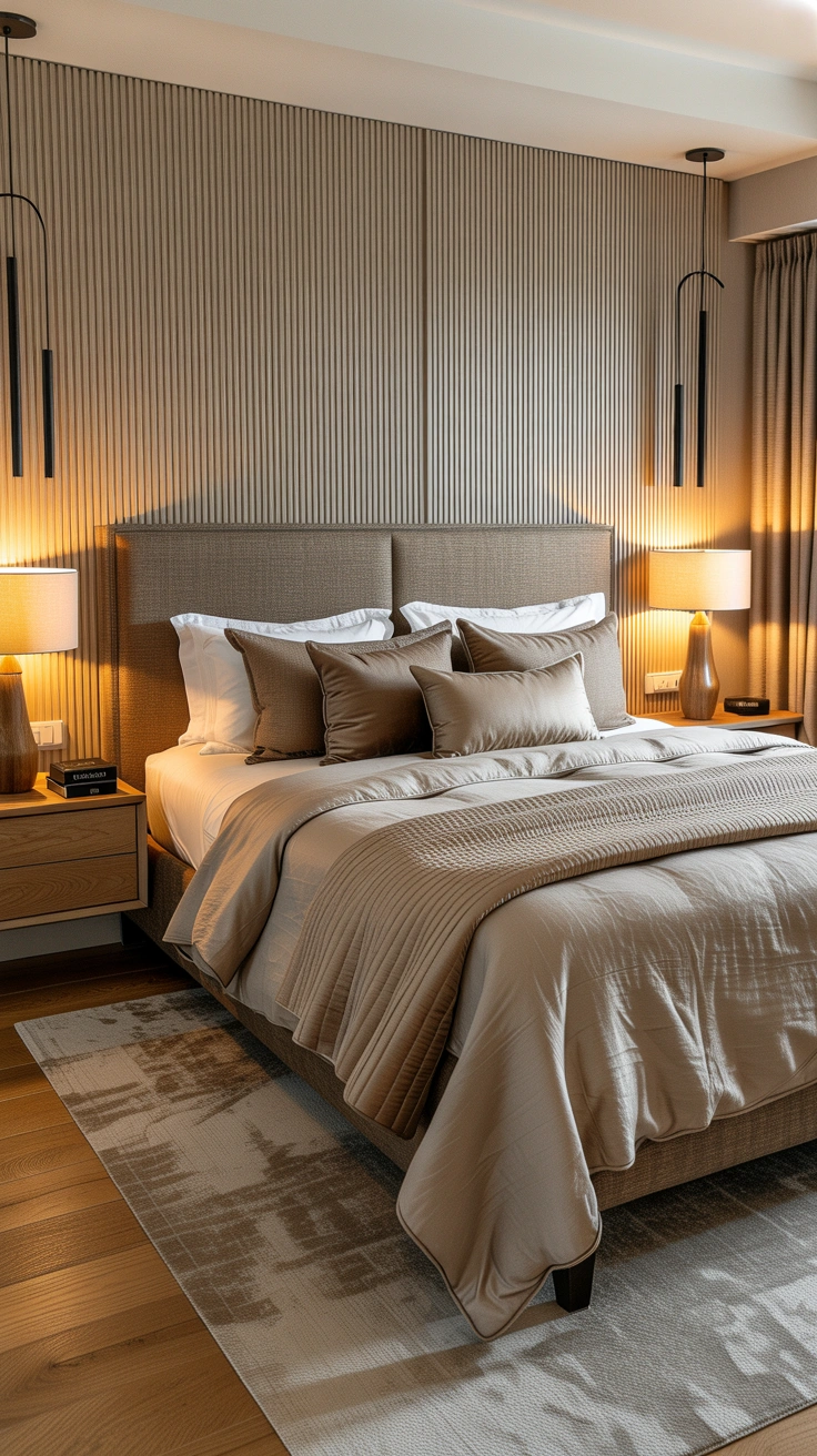
The headboard behind the bed is part of the overall bedroom composition and should be considered as a coordination reference for the bedding in front of it. A linen upholstered headboard in warm cream coordinates naturally with linen bedding in similar or complementary tones. A dark velvet headboard creates an opportunity for bedding that contrasts or coordinates with that depth.
Bedding that is chosen without reference to the headboard frequently creates a visual disconnection between the two elements — the headboard and bedding appearing to belong to different rooms rather than composing a unified bed focal point. Use the headboard’s colour and material as one of the primary coordination references when choosing bedding pieces.
16. The Morning Arrangement Reset

A beautifully coordinated bed is only beautiful when it’s arranged — and establishing a daily arrangement habit that takes two minutes is what maintains the bed’s designed quality throughout the day and throughout the year.
Shake the duvet full each morning before replacing it. Position the European shams upright and centred. Place standard pillows in front. Position accent cushions precisely. Fold and place the throw at the foot. This two-minute sequence, performed every morning, maintains the bed as the room’s primary beautiful object throughout the day — which is exactly the visual role a well-coordinated bed is supposed to play.
17. Trust the Tonal Pull
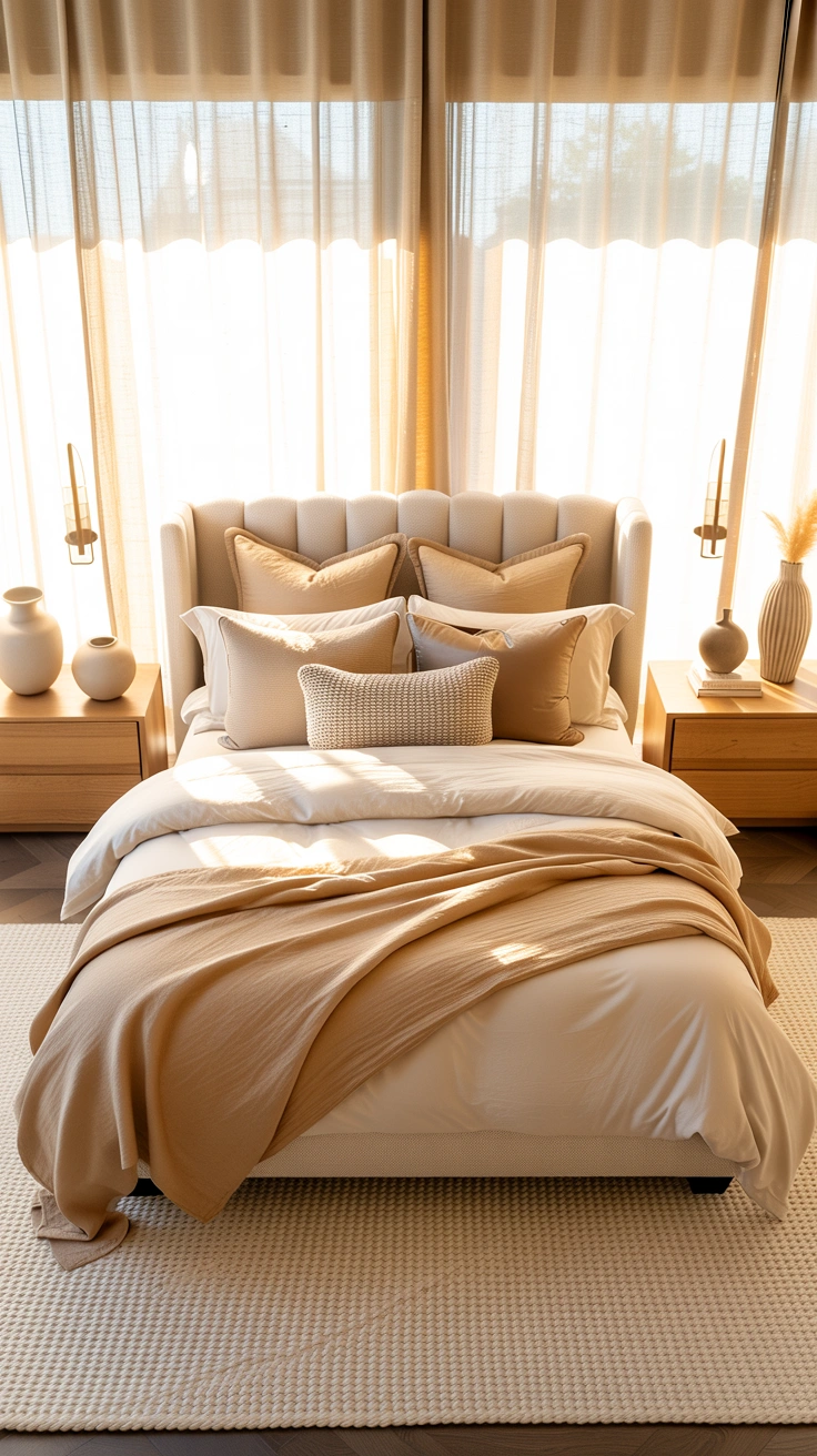
IMO, the most important and least technical bedding coordination principle is this: trust the tonal pull. When you pick up a pillow case or throw and something in you responds to it positively — when it just feels right alongside the other pieces — that response is usually correct. The principles in this guide explain why certain combinations work; but the ability to feel the tonal pull of a combination is what you’re training with every conscious coordination decision you make.
The more deliberately you apply these principles, the more instinctive the coordination process becomes — until one day you pick up a throw in a shop and know immediately whether it belongs to your bed without having to think about why. That’s the goal. Not just a beautifully coordinated bed right now, but the taste that makes every future bedding decision feel effortless.
Conclusion
Seventeen principles that build bedding coordination from the ground up — the anchor piece, tonal palettes, pattern mixing through scale variation, the three-colour maximum, texture contrast, the correct layering sequence, white as a foundation, cushion arrangement, throw placement, mixing pieces from different sets, seasonal updates, the pillowcase hierarchy, pattern and solid balance, the quality effect of natural materials, headboard coordination, the daily reset, and the tonal pull that eventually becomes instinct.
Bedding coordination is a learnable skill — not an innate gift. Every principle here can be applied today, to whatever bedding you already own, with immediate and visible results. The beautifully coordinated bed you’ve been admiring in other people’s rooms is genuinely within reach.
Make the bed this morning using these principles. Then stand back and see what you’ve created. That specific satisfaction is entirely and completely worth it.