Small Space Decorating for Beginners: The 5 Rules That Change Everything
Introduction
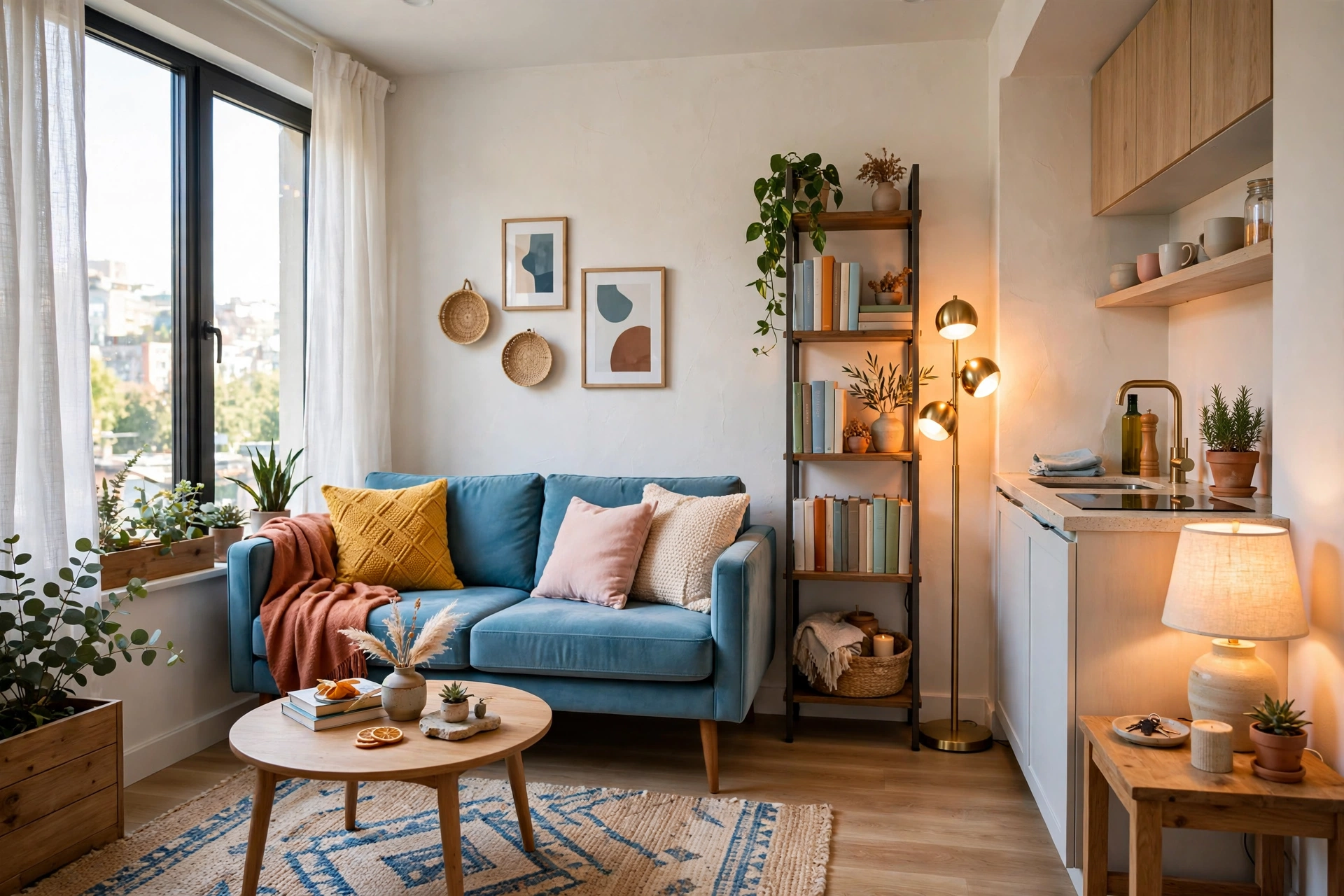
Walking into your first small apartment, you probably feel two things at once: excitement about finally having your own place, and a quiet panic about how your furniture will ever fit into a space that looks impossibly smaller than it did on the listing. Every beginner small space decorator feels this. The good news is that decorating a small space is not about owning less or settling for less — it is about knowing a handful of rules that designers use to make 400 square feet feel like 800.
Most beginners make the same handful of mistakes: they push every piece of furniture flat against the walls, they choose furniture that is too small (which paradoxically makes the room feel more cramped), and they treat lighting, mirrors, and vertical space as afterthoughts. Fix those five areas — scale, walls, light, height, and zoning — and the whole room transforms. These are not expensive overhauls. Most of these rules cost nothing, or under fifty dollars, to put into practice.
This guide walks you through the five beginner-friendly rules of small space decorating, one at a time, with concrete before-and-after style examples you can copy this weekend. Whether you are furnishing a studio apartment, a dorm-style bedroom, or a compact living room, these rules work everywhere small rooms exist. Let’s start with the rule almost every beginner gets backwards.
1. Rule #1: Choose Fewer, Bigger Pieces (Not More, Smaller Ones)
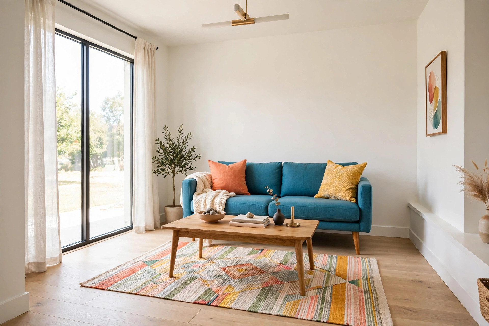
Beginners almost always furnish a small room with lots of tiny pieces: a little chair here, a narrow console there, a petite coffee table, four small plant stands. It feels logical — small room, small furniture — but the result is visual clutter. A dozen small objects make the brain read the room as “crowded,” while three properly sized pieces make it read as “composed.” The counterintuitive designer rule is this: in a small room, go bigger with fewer pieces.
Pick one hero piece per zone and let it anchor the space. In a living area, that might be a full-size sofa instead of two tiny loveseats. In a bedroom, a properly proportioned queen bed with a simple frame beats a daybed flanked by three wobbly nightstands. Large pieces create long, clean sightlines, and long sightlines are what make a small space feel generous. This is the same principle behind choosing full-size art instead of a scatter of tiny frames — scale signals confidence, and the eye follows it.
A practical way to apply this on a budget: audit what you already own and remove the smallest third. That wobbly side table you never use, the narrow shoe rack overflowing by the door, the tiny accent chair that is too uncomfortable to sit in — each one you remove gives the remaining pieces room to breathe. Then, when you do buy, buy the largest version that fits the zone comfortably, and choose multifunctional pieces: a storage ottoman instead of a coffee table plus a storage bin, a sofa bed instead of a sofa plus a guest mattress. Our guide to 20 small space furniture ideas that do double duty is full of these two-jobs-in-one picks.
📌 Important: “Bigger” does not mean bulky. Choose pieces with exposed legs, slim profiles, and light visual weight — a big sofa on tall tapered legs reads lighter than a small chunky recliner. The footprint can be generous as long as light and floor flow underneath it.
2. Rule #2: Pull Furniture Away From the Walls
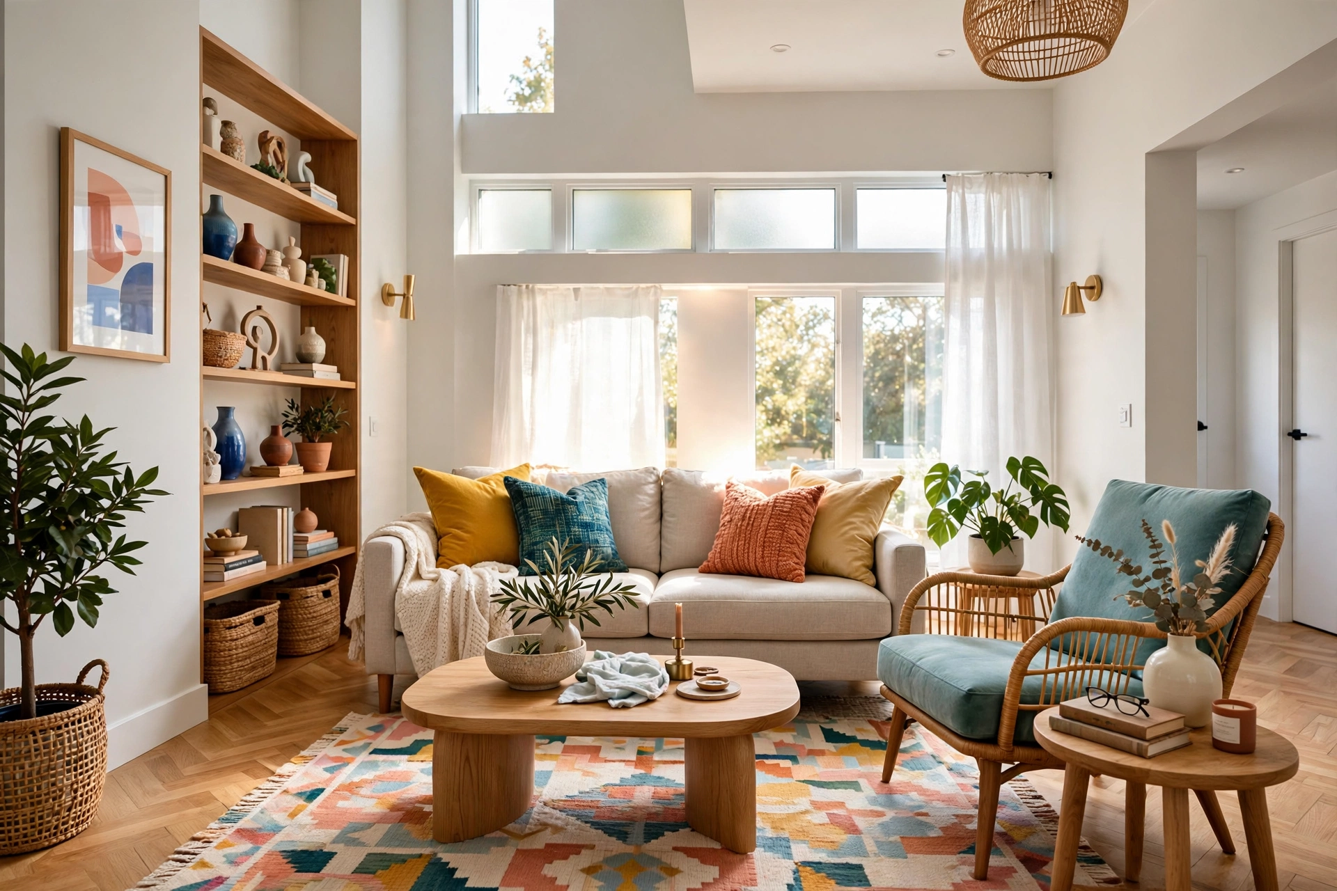
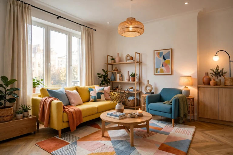
This is the rule that shocks beginners the most. When every inch feels precious, the instinct is to shove the sofa, bed, and bookshelf tight against the walls to “save space.” But furniture glued to the walls creates dead corners and a cramped, boxed-in feeling. Pulling key pieces even four to six inches off the wall lets light and air flow behind them, and that visible sliver of breathing room tricks the eye into perceiving depth where there was none.
Try it as an experiment this weekend: pull your sofa off the wall by a hand’s width, angle your reading chair slightly into the room instead of wedging it in a corner, and float your desk a few inches from the wall so cables and light can move behind it. Stand in the doorway and compare. The room will not feel smaller — it will feel layered, which reads as larger. Designers call this “breathing room,” and it is free.
The same principle applies to beds and dining setups. A bed pulled a few inches from the wall with a slim headboard looks intentional; a bed shoved into the corner with pillows piled against bare wall looks temporary. If you are working with a truly tight layout where every inch counts, prioritize the pieces you see first when entering the room — the eye judges spaciousness in the first three seconds, and breathing room around the entry sightline does most of the work. Small adjustments compound: six inches behind the sofa, three behind the bookshelf, a chair angled instead of squared — each gap adds a layer of depth the brain adds up as “bigger.”
💡 Pro Tip: If you truly cannot spare the inches, fake the effect: place a narrow console table behind the sofa with a lamp and a small plant on it. The table creates a visual gap between sofa and wall, giving you the depth cue without losing any real floor space.
3. Rule #3: Light It Like a Designer (Three Sources Minimum)
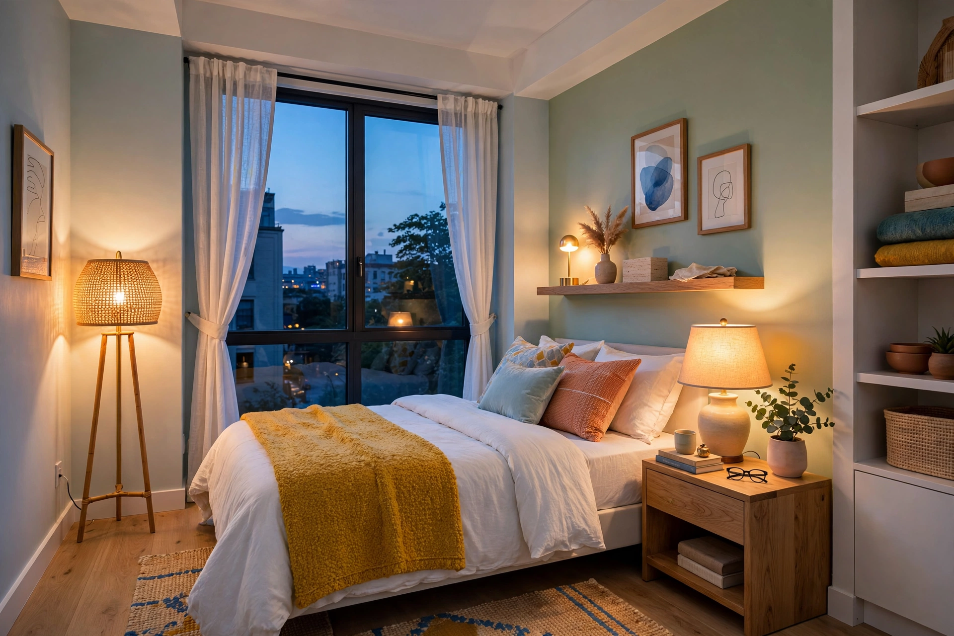
Beginners light a small room with one ceiling fixture — usually a harsh overhead that flattens everything and makes the space feel like an interrogation room. Designers light every room, regardless of size, with at least three sources at three heights: an ambient source (overhead or floor lamp), a task source (table or desk lamp), and an accent source (a small lamp, candles, or LED strips). The layered glow eliminates the dark corners where small rooms visually “shrink.”
The transformation is dramatic in a tiny bedroom or studio: swap the single overhead for a warm floor lamp in the corner, a small table lamp on the nightstand, and a string of warm LED lights along a shelf. Suddenly the room has mood, zones, and depth — three rooms’ worth of atmosphere in one. Always choose warm-white bulbs (2700–3000K); cool daylight bulbs make small spaces feel clinical and smaller. And put at least one lamp on a dimmer or a smart plug so the evening mood is one tap away.
Pairing lighting with reflective surfaces multiplies the effect, which is why designers lean so hard on mirrors in compact rooms. A lamp placed in front of or beside a mirror doubles its glow, and a large mirror opposite a window can effectively duplicate your daylight — one of the cheapest ways to brighten a dark rental. If you want to go deeper on placement and sizing, our guide to the best mirrors for small spaces that make rooms look bigger walks through fifteen designer-approved mirror moves room by room.
One more lighting habit separates beginners from designers: light the corners. Dark corners are where a small room’s boundaries disappear into shadow, and the brain reads “dark corner” as “wall closing in.” A five-dollar LED puck light inside a bookshelf, a small uplight behind a plant, or a candle cluster on a side table pushes the visual boundary of the room outward. Walk your room at night and find the two darkest corners — those are the two spots where one more small light source will buy you the most perceived space.
4. Rule #4: Decorate Upward — Use Every Inch of Vertical Space
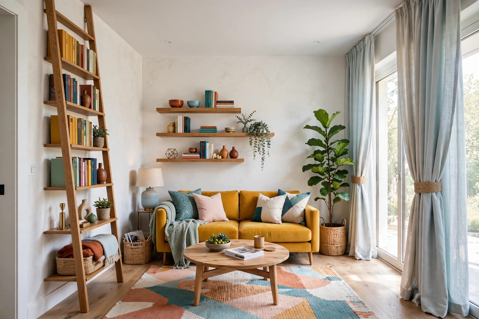
Beginners decorate in a single horizontal band: furniture height and eye level, with bare walls above and cluttered floors below. But in a small room, the walls are square footage you are not paying extra for — going vertical is the cheapest way to “add” space. Floor-to-ceiling curtains hung near the ceiling (not at the window frame) draw the eye up and make ceilings feel taller. Tall, narrow bookshelves use the same floor footprint as short ones while tripling storage. A gallery wall that climbs toward the ceiling turns dead wall into a feature.
Start with the three highest-impact vertical moves. First, mount your curtain rod four to six inches below the ceiling and let curtains fall to the floor — this one change can make a standard eight-foot ceiling feel like nine. Second, add one tall piece (a ladder shelf, a floor-to-ceiling bookcase, or a tall plant) to pull the eye upward. Third, use wall-mounted storage — floating shelves, pegboards, wall hooks — to get everyday items off the floor and counters, where clutter shrinks a room fastest. Vertical thinking is also the backbone of zone division: a tall open shelf can separate a sleeping area from a living area without blocking light, a trick we break down in how to divide a studio apartment into zones without walls.
The beginner mistake to avoid here is stopping at eye level out of habit. Next time you look at a bare wall above a dresser or desk, ask what that wall could hold: a shelf for books, hooks for bags, a pegboard for supplies, art hung higher than feels natural. In kitchens and bathrooms — the smallest rooms in most apartments — vertical storage is transformative: a magnetic knife strip, an over-toilet shelf, or a shower caddy that climbs the wall can free an entire counter. Think of your walls as floor space that happens to be vertical, and suddenly a 400-square-foot apartment has far more usable area than its footprint suggests.
⚠️ Warning: Renters, check your lease before drilling — but do not skip vertical storage over it. Damage-free options like tall tension-pole shelves, over-door organizers, adhesive hooks rated for the weight, and leaning ladder shelves give you 90% of the vertical benefit with zero holes.
5. Rule #5: Give Every Corner a Job (Zone Your Space)
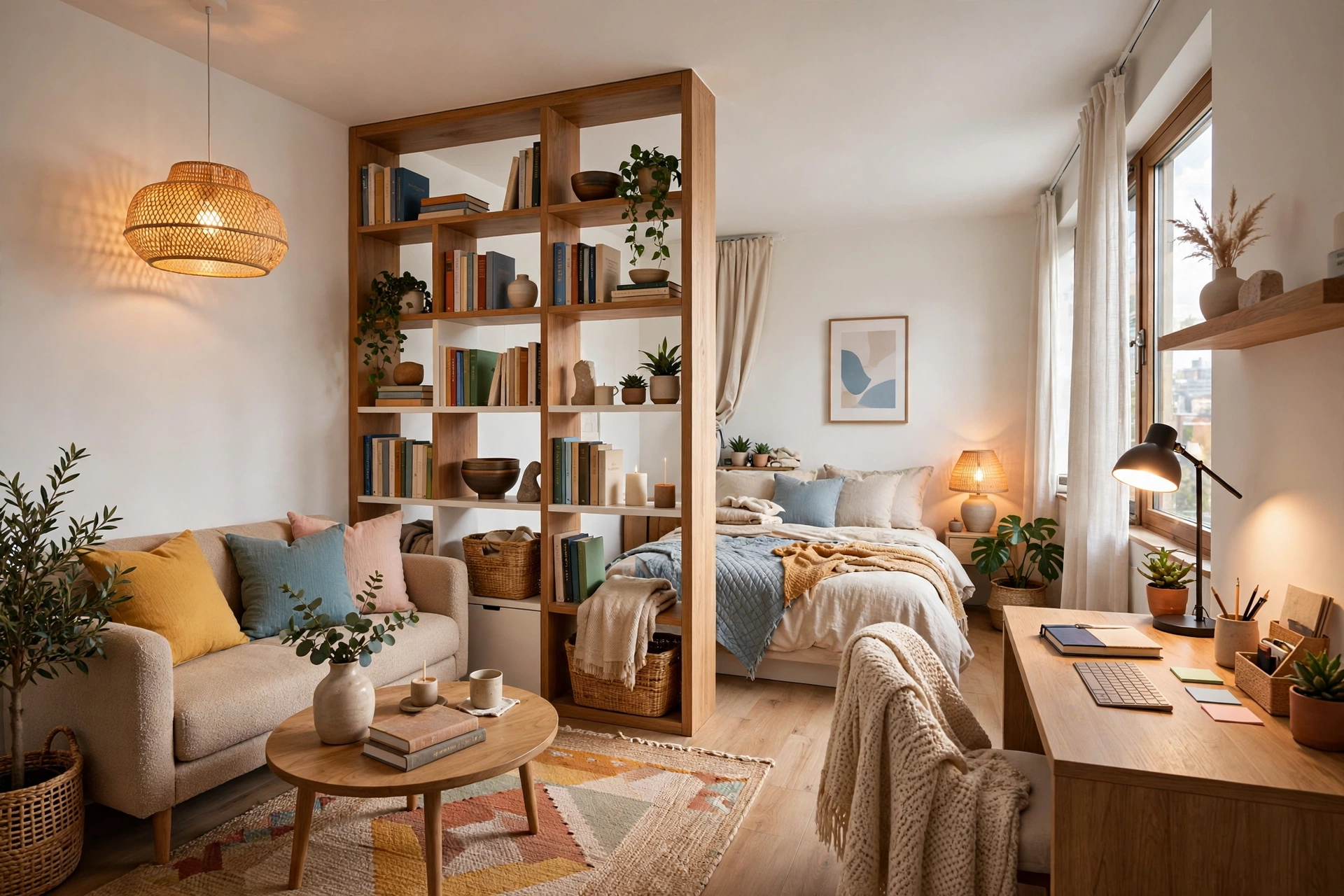
A small room without zones feels like one confusing box where you sleep, eat, work, and scroll in the same square meters. Beginners try to make the whole room do everything, which makes it feel chaotic. The designer fix is zoning: assign every area a single clear purpose — a sleep zone, a work zone, a lounge zone, an entry zone — even if each zone is just one corner. When each corner has a job, the room reads as several intentional spaces instead of one cramped one, and it feels bigger because the brain processes “rooms,” not square feet.
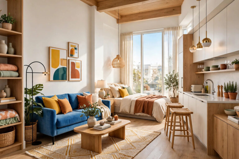
You do not need walls to zone. A rug defines a lounge zone instantly. A small desk plus a task lamp defines a work zone. A room divider screen, an open bookshelf, or even the back of a sofa turned perpendicular to the bed can separate sleep from living in a studio. Lighting helps too: the work zone gets the bright task lamp, the lounge zone gets the warm floor lamp. If your apartment feels like one long tunnel, start with just two zones — rest and activity — and build from there.
Zoning also solves the number-one beginner complaint: “my place never feels finished.” A room where every corner has a job looks intentional even with inexpensive furniture, because intention is what the eye reads as design. Label your zones mentally — entry, lounge, work, sleep, dining — and decorate each one as its own tiny room with its own light source and its own anchor piece. Five small finished zones will always look more polished than one large unfinished box, and each zone becomes a manageable weekend project instead of an overwhelming whole-apartment overhaul.
💡 Pro Tip: Rugs are the fastest zoning tool beginners have. A 5×7 rug under the sofa and coffee table instantly declares “living room” even in a studio. Just make sure the rug is big enough — a too-small rug floating in the middle of the floor chops the room up and makes it feel smaller, which breaks Rule #1.
Quick Comparison: The 5 Rules by Cost and Effort
Small Space Quick-Start Checklist
- ✅ Walk the room and list what each corner is actually used for today
- ✅ Pull the sofa and main pieces 4–6 inches off the walls
- ✅ Count your light sources — add lamps until you have three at different heights
- ✅ Swap cool-white bulbs for warm-white (2700–3000K)
- ✅ Hang curtains high and wide, floor-length
- ✅ Add one tall vertical element (shelf, plant, or bookcase)
- ✅ Define zones with a rug, lamp, or divider — one job per corner
Common Small Space Decorating Mistakes
Mistake 1: Buying all small-scale furniture
A room full of miniature pieces reads as cluttered, not cozy. One full-size sofa and one proper coffee table will always look calmer — and larger — than six tiny pieces doing the same job.
Mistake 2: Leaving the overhead light as the only source
A single ceiling fixture creates harsh shadows and dead corners. Layer floor, table, and accent lighting to erase the dark pockets where small rooms visually shrink.
Mistake 3: Hanging curtains at the window frame
A rod mounted right at the frame chops the wall in half and makes windows look smaller. Mount it near the ceiling and extend it past the frame so the window reads grand.
Mistake 4: Ignoring the walls above eye level
Bare upper walls waste your cheapest square footage. Tall shelves, high art, and vertical storage add function and draw the eye up, which makes ceilings feel taller.
Mistake 5: Letting one room try to do everything
When the bed, desk, dining table, and TV all share one undifferentiated space, nothing feels intentional. Give every corner a single job and the whole apartment will feel like more rooms.
Frequently Asked Questions
1. Where should a beginner start decorating a small space?
Start with layout, not shopping. Pull furniture off the walls, define zones with what you already own, and fix your lighting before buying anything. Most small rooms improve dramatically with rearranging alone — spend money only after the free moves are done.
2. What is the biggest mistake beginners make in small rooms?
Pushing everything against the walls and filling the room with lots of tiny furniture. Both instincts feel space-saving but do the opposite: they create dead corners and visual clutter. Fewer, larger pieces with breathing room around them is the fix.
3. How can I make a small rental look bigger without drilling?
Use the renter-friendly toolkit: tall leaning shelves, tension rods hung near the ceiling for curtains, adhesive hooks, over-door organizers, large mirrors leaned against walls, and rugs to define zones. You can get nearly the full effect of these five rules with zero holes.
4. What colors work best for small spaces?
Light, warm neutrals on large surfaces (walls, sofa, rug) keep a small room airy, while deeper accent colors in small doses — pillows, art, one painted furniture piece — add personality without closing the room in. Consistency matters more than any single shade.
5. How many light sources does a small room need?
At minimum three, at three different heights: ambient (overhead or floor lamp), task (desk or table lamp), and accent (shelf LEDs, candles, or a small lamp). Warm-white bulbs around 2700–3000K keep the glow cozy rather than clinical.
6. Should I use a big rug or a small rug in a tiny room?
Go bigger than you think. A rug that fits under the front legs of all the main furniture unifies the zone and makes the floor feel continuous, which reads as larger. A small floating rug chops the floor into pieces and shrinks the room visually.
7. Can these rules work in a studio apartment?
Absolutely — studios benefit the most, because zoning is what turns one box into believable “rooms.” Combine Rule #5 (zoning) with Rule #4 (vertical dividers like open shelves) and Rule #3 (different lighting per zone), and a studio starts to feel like a one-bedroom.
Conclusion
Small space decorating is not a talent — it is a short list of rules applied consistently. Choose fewer, bigger pieces. Pull furniture off the walls. Light in layers. Decorate upward. Give every corner a job. Each rule is simple on its own, but together they change how a room reads: from cramped box to composed, layered home.
Start this weekend with the free moves: rearrange, re-hang, and re-light what you already own. Then add one vertical piece and one proper zone at a time. If you want to keep going, our guides to small space furniture ideas that do double duty and how to make a small room look bigger with 15 designer tricks are the natural next steps. Your small space was never the problem — the rules just had not been applied yet.