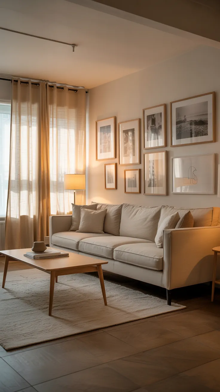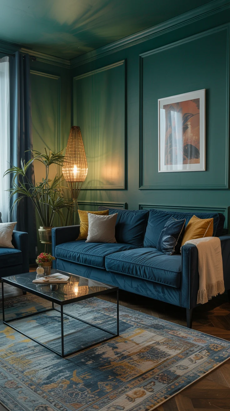
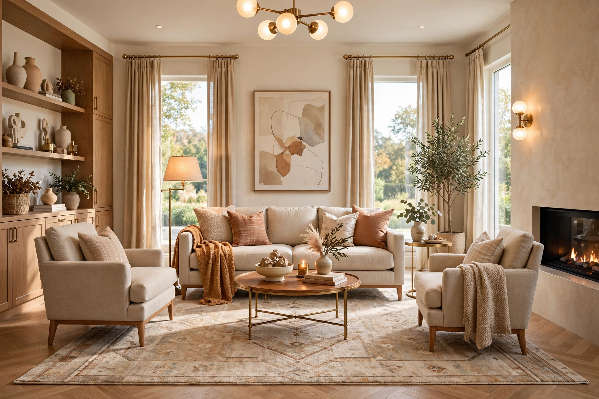
8 Decorating Mistakes That Make Your Living Room Look Cheap
Introduction
There is a frustrating kind of living room — the one where every piece of furniture was chosen with care, real money was spent, and yet the whole space reads as a little… off. Guests cannot quite name it. Photos never look as good as the rooms they admire online. And the owner is left wondering what invisible thing separates an expensive-looking room from a cheap-looking one, when the receipt totals are nearly the same.
Here is the truth designers will tell you: expensive-looking rooms are almost never about expensive things. They are about avoiding a short list of common decorating mistakes — mistakes that cost nothing to make and almost nothing to fix. A too-small rug, one lonely overhead light, curtains hung too low, walls of visual clutter — these small decisions quietly drag a room’s perceived value down, and they show up in living rooms at every budget.
The good news is that every one of these living room decorating mistakes is fixable, most of them in a single weekend and several of them for free. Below are the eight offenders that show up again and again in real homes, why each one makes a room look cheap, and exactly how to fix it. Fix three of them and your living room will feel like it doubled in price.
1. Choosing a Rug That’s Too Small
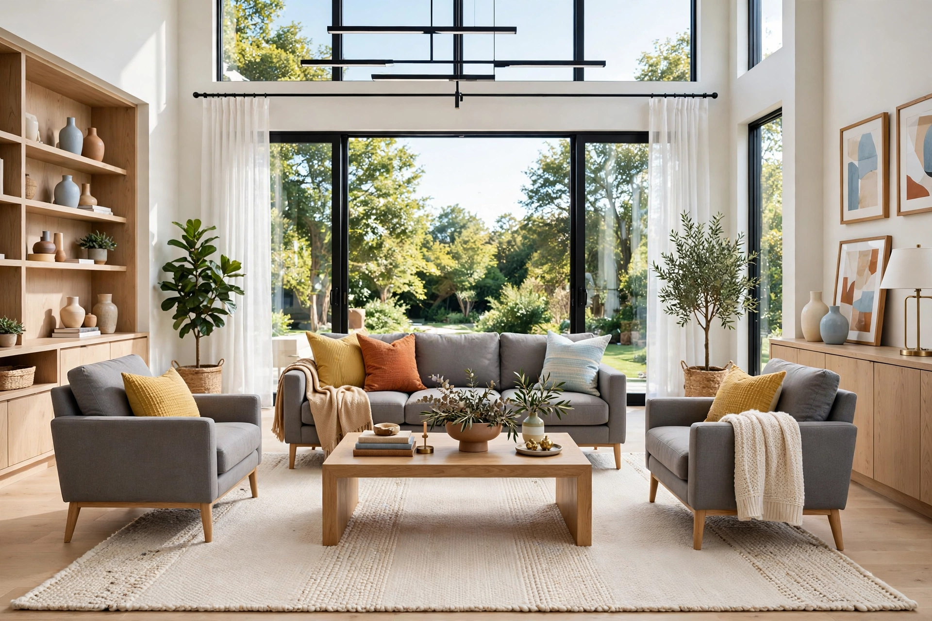
The single most common living room decorating mistake is also the one with the biggest visual penalty: a rug that is too small. A tiny rug floating in the middle of the floor chops the room into fragments — bare floor here, rug there, bare floor again — and every piece of furniture looks like it is drifting apart with no anchor. The eye reads fragmentation as disorder, and disorder reads as cheap, no matter how nice the sofa is.
The golden rule is simple: at minimum, the front legs of the sofa and every chair should rest on the rug. In most living rooms that means an 8×10 rug, not the 5×7 that looked enormous in the showroom. A rug that is too big always looks intentional; a rug that is too small looks like a bath mat that got lost. For the full method, our guide to choosing the right rug size walks through every measurement in order, from the front-legs rule to door clearance.
There is also a budget workaround worth knowing: if the correctly sized rug is out of reach right now, layer a large, inexpensive flat-weave base — jute or a simple cotton weave — in the right size, and place your smaller, prettier rug centered on top. From above it reads as one generous rug, the seating gets anchored, and you can separate the layers later. The one thing you should never do is buy the smaller rug in the “correct” pattern hoping it will be fine. It will not be fine — it will be the first thing the eye notices, and not in a good way.
💡 Pro Tip: Map the size with painter’s tape before you buy. Tape out the rectangle of the size you are considering, place the furniture relative to it, and live with it for a day. The tape costs almost nothing and answers every sizing question physically.
2. Pushing All the Furniture Against the Walls
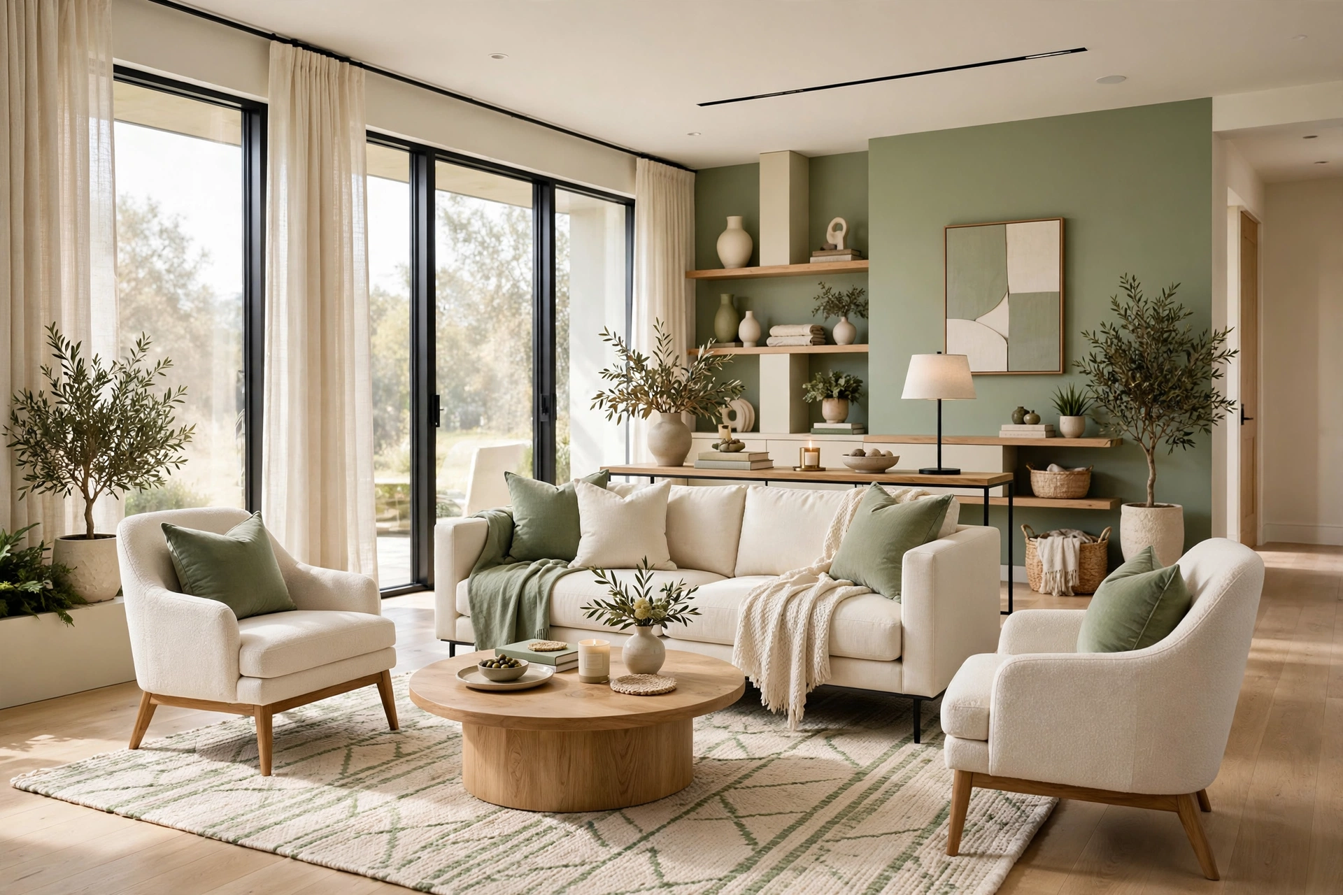
When a room feels tight, the instinct is to shove everything flat against the walls to “open up the middle.” The result is the opposite: a hollow center ringed by a row of seats reads as smaller, makes conversation worse because everyone faces the perimeter, and looks like a waiting room — the universal signal of a room nobody designed.
Pull the sofa even six to twelve inches off the wall and angle the chairs slightly inward, and the arrangement instantly gains depth and intention. The gap behind the sofa is not wasted space: it can carry the room’s walking lane, a slim console table, or a floor lamp. Rooms feel generous not when they are large, but when you can move through them without disturbing anyone, which is the heart of good living room furniture arrangement — seats facing each other at talking distance with clear paths flowing behind them, never through the conversation zone.
This applies even in rooms where floating feels impossible. In a narrow living room, pulling the sofa off the wall by just three or four inches still breaks the boxed-in outline and gives you room to run a floor lamp or a slim plant behind it. In a room where the sofa must stay against the wall for traffic reasons, angle the chairs inward instead — the inward angle alone shifts the room from “audience” to “gathering.” The principle is the same everywhere: furniture grouped with breathing room looks chosen; furniture flattened against the perimeter looks surrendered.
3. Relying on a Single Overhead Light
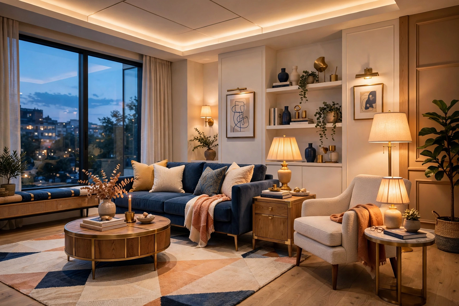
If your living room has exactly one light source — the ceiling fixture — that single fact is doing more damage to the room’s atmosphere than almost any furniture choice. One overhead light blasts straight down with no nuance, flattening everything, casting harsh shadows, and making evenings feel cold and institutional. It is the fastest way to make even expensive furniture look flat.
Designers build light in three layers: ambient (general light), task (a reading lamp where you actually read), and accent (low, warm light that adds depth). You do not need an electrician: one floor lamp near the main seat and one table lamp on a side table transform a room after dark for the price of two lamps. Use warm-white bulbs everywhere — 2700 to 3000K — and make sure every visible bulb matches, because mixing cool daylight with warm ones makes a room feel subtly wrong in a way nobody can name.
The evening test tells you everything: after dark, turn on every light in the room and stand in the doorway. If the room feels flat, cold, or glaringly bright in one spot and dead in the corners, you are seeing a single-layer lighting plan. Add a dimmer or a smart plug to your main lamp and you gain something no furniture purchase can give you — control over the room’s mood. Rooms that glow in layers look expensive in every photograph; rooms lit by one ceiling fixture look like offices, no matter what sits under them.
📌 Important: The most flattering light in a room almost always comes from lamps at eye level or below, not from the ceiling. If your room only has the overhead on in the evening, that is the first thing to change — before buying a single new decor item.
4. Cluttering Every Surface With Small Decor

A dozen small objects scattered across shelves, mantels, and side tables do not read as “styled” — they read as clutter, and clutter reads as cheap. Every tiny frame, trinket, and candle competes for attention, the eye finds nowhere to rest, and the whole room feels restless. The cruel irony is that many people buy more small decor trying to make a room feel finished, when the clutter is exactly what keeps it from feeling finished.
The fix is the edit, not the shopping cart. Group what stays in odd numbers — three or five — vary the heights, and leave breathing room: a crowded shelf looks like storage, a curated one looks like design. Remove half the small objects and you will be shocked at how much more expensive the remaining pieces look. If you want to learn the method properly, see how to style a coffee table — the two-thirds rule (style two-thirds of the surface, leave one-third deliberately empty) works on every surface in the room.
Apply the same ruthlessness to open shelving, which is where clutter multiplies fastest. One row of books with a small object on top beats a shelf crammed edge to edge every time, and negative space between groupings is what makes each object look chosen rather than stored. Box up the overflow for a month instead of donating it immediately — when the room feels calmer and nothing is missed, you will have your answer about what actually belonged there.
⚠️ Warning: Never try to fill a large empty wall or shelf with lots of small items. One generous piece always looks more expensive than ten tiny ones filling the same space. Scale up, not out.
5. Using Too Many Competing Colors With No Plan
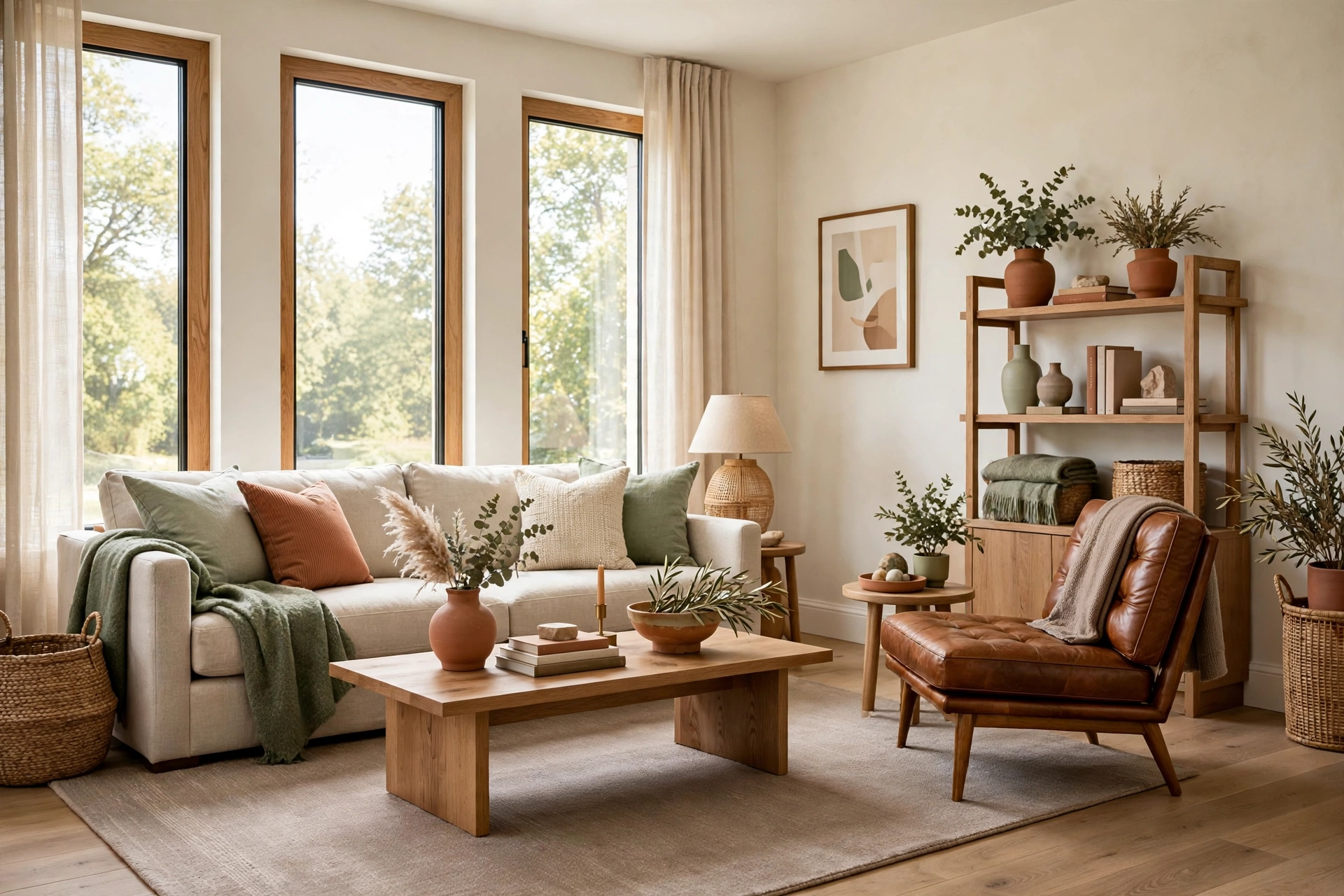
A room where the rug is one color story, the curtains another, the cushions a third, and the art a fourth feels chaotic no matter how pretty each piece is alone. Competing colors with no hierarchy make the eye work constantly, and a room that exhausts the eye feels stressful rather than stylish — which the brain files under “cheap,” even when nothing in it was inexpensive.
The antidote is a simple proportion system. The 60-30-10 color rule gives every color a job: about 60 percent of the room in one dominant shade (walls, big furniture), 30 percent in a supporting shade (rug, curtains, large upholstery), and 10 percent in an accent (cushions, art, small objects). Browse our roundup of living room color schemes to find a proven palette, then assign every piece you own to its layer. When every color has a budget, the room reads as intentional instead of accidental.
Watch especially for accent creep, the quiet killer of calm palettes. It starts innocently — terracotta cushions that lead to a terracotta throw, then terracotta art, then a terracotta rug — until the 10 percent layer has ballooned to 30 percent and the hierarchy collapses. The discipline is simple: once you have three to five small touches of your accent, stop buying that color. An accent that appears in exactly three places, at different heights, reads as a scheme; one that appears everywhere reads as a habit.
6. Leaving Walls Bare or Hanging Art Wrong
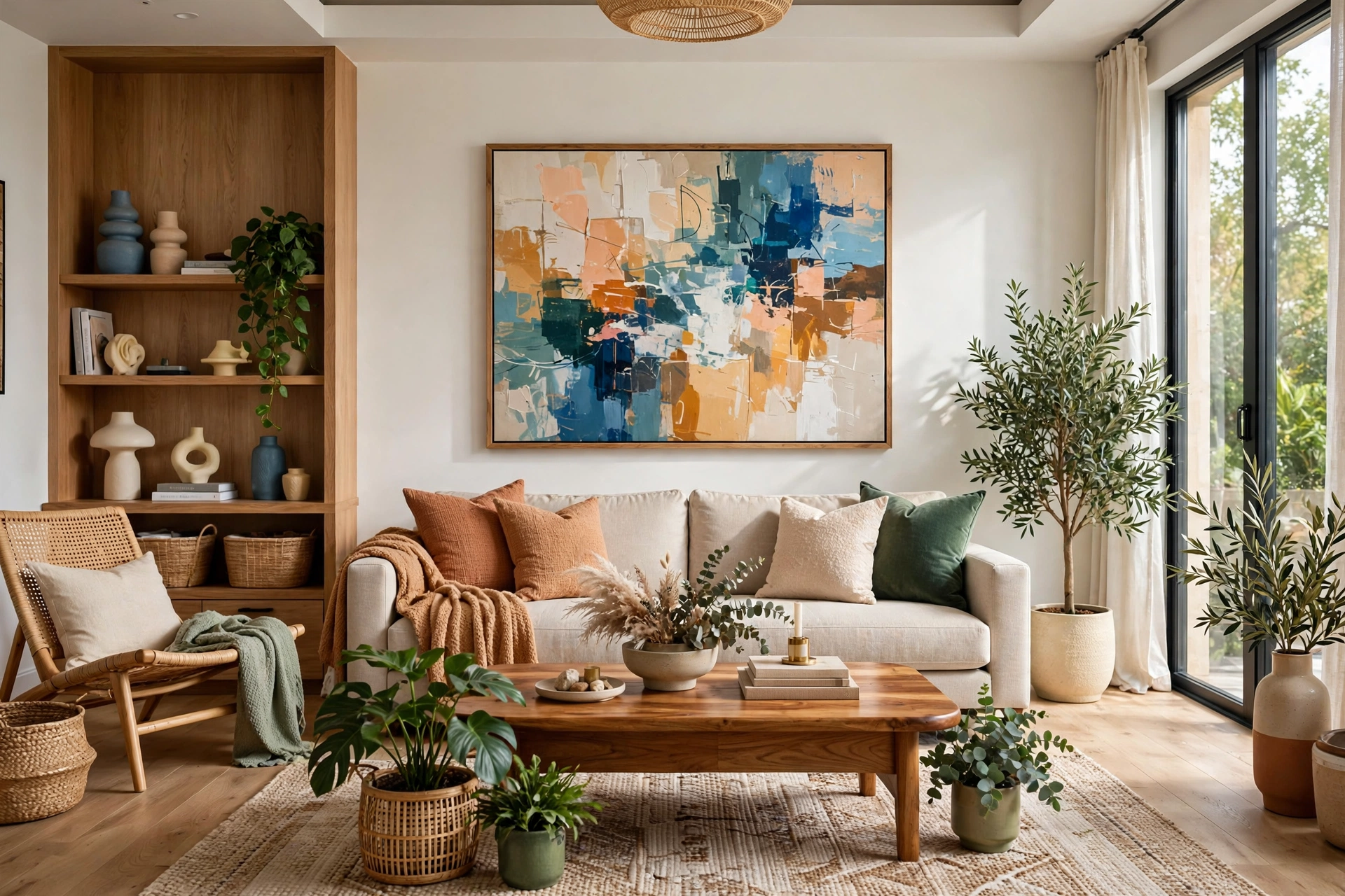
Bare walls are the hallmark of a room that was never finished — and unfinished reads as cheap faster than almost anything else. But the near-bare wall is not much better: one postage-stamp frame floating alone on a big wall, or a gallery hung so high it is closer to the ceiling than the sofa, signals the same thing.
Scale is the whole game. One large piece beats five small ones every time — a single generous piece of art over the sofa creates a confident focal point, while tiny art on a big wall just emphasizes how big the wall is. And hang it right: the center of the piece should sit around 57 to 60 inches from the floor, roughly at eye level, close enough to the furniture below that the two read as one composition. Art that floats a foot above the sofa looks disconnected; art that sits in relationship with the furniture looks designed.
If you are starting from truly bare walls, resist the urge to buy small art to “fill in” — it is the fastest route back to the postage-stamp problem. Save for one large piece instead, or go the budget route: a large empty frame around a favorite textile, an oversized print from a public-domain collection, or a big mirror that doubles the light. One confident gesture on the wall does more for perceived value than a dozen cautious ones, and unified framing — the same frame style across pieces — makes even mixed art look like a deliberate collection.
7. Hanging Curtains Too Short, Too Low, or Not at All
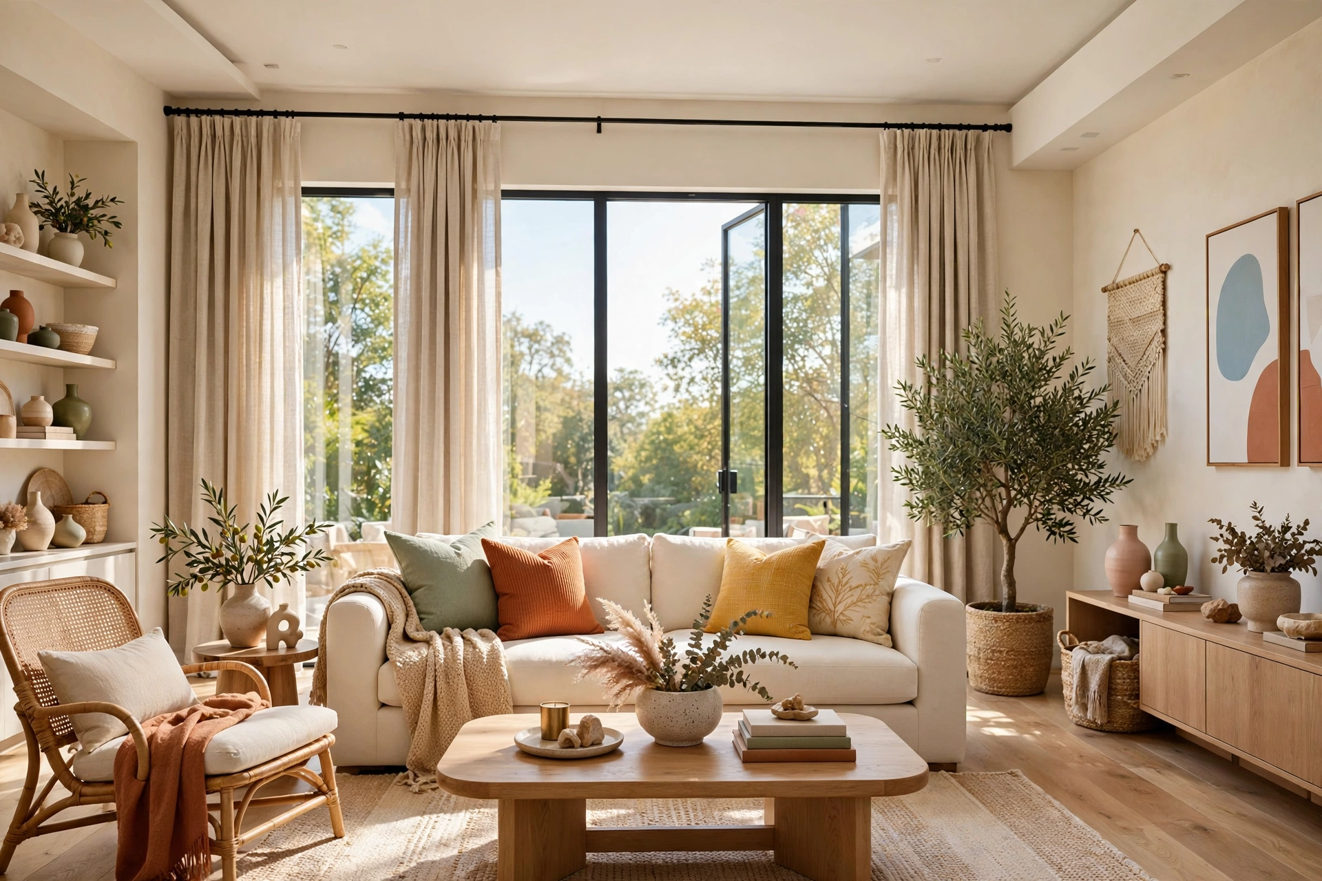
Curtains are one of the highest-impact elements in a living room, and one of the most commonly botched. Panels that stop at the windowsill, a rod mounted right at the frame, or bare windows with nothing softening them all make a room feel unfinished and boxy — like the decorating stopped one step short. Short curtains in particular visually chop the wall in half and make ceilings look lower than they are.
The designer formula never changes: mount the rod high and wide — near the ceiling and several inches beyond the frame on both sides — and let the panels just kiss the floor. High-and-wide makes windows look bigger, ceilings look taller, and the whole room look more finished. Two budget panels plus no-sew hem tape and one afternoon is all it takes; this single change is one of the cheapest ways to make a room look instantly more expensive. It is a staple move in every living room makeover on a budget for exactly that reason.
Do not forget the hardware, either. A dated, sagging, or too-narrow rod undermines the whole effect — the rod should extend well past the window so the panels stack on the wall, not over the glass, when open. A can of matte black or brass spray paint turns a tired rod into a modern one in minutes. And iron or steam the panels after hanging: crisp, wrinkle-free fabric reads as tailored, while crushed panels read as an afterthought no matter how well they were hung.
💡 Pro Tip: When in doubt, buy curtains longer than you think you need. Hemming a too-long panel is easy; stretching a too-short one is impossible. Floor-grazing length is non-negotiable — anything shorter reads as a mistake.
8. Getting the Furniture Scale Wrong
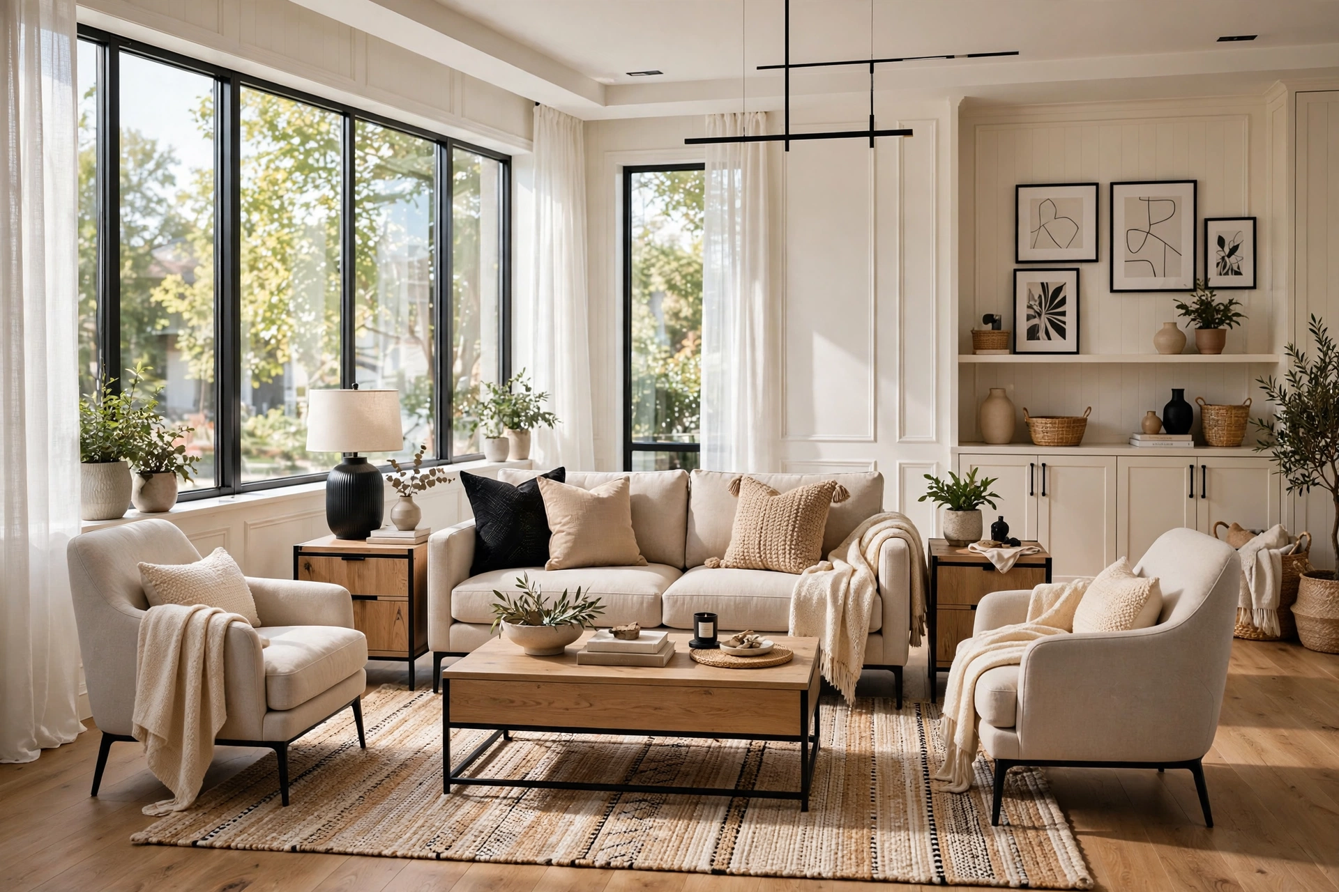
Scale is the invisible force that makes or breaks a room. A bulky oversized recliner crammed next to a dainty side table, a massive sectional swallowing a small room, or a tiny loveseat lost against a vast empty wall — when the sizes are wrong, nothing else can compensate, and the room looks like its furniture was chosen one piece at a time with no plan. Mismatched scale is one of the most reliable “cheap” signals there is.
Before buying anything, measure the room and the wall it will live on, and shop with the numbers on your phone. The classic proportions help: a sofa roughly two-thirds the width of the wall behind it, a coffee table about two-thirds the sofa’s length, side tables within a couple of inches of the sofa arm’s height. And be honest about the room’s size — a grand showroom piece in a modest room looks like a mistake, while right-sized pieces in a small room look deliberate and curated.
The doorway squint test is your final referee. Stand in the doorway, squint so the details blur, and check the masses: does one piece dominate everything else, or do the weights feel balanced across the room? A single oversized piece creates a visual boulder the eye cannot get past; balanced masses let the gaze travel. When the blurred impression feels even, the scale is right — and right-scale rooms always photograph better, which is why they read as more expensive in every listing photo you have ever admired.
Quick Comparison: These 8 Living Room Mistakes by Cost and Effort to Fix
Living Room Reset Quick-Start Checklist
- ✅ Tape-test your rug size and confirm the front legs of all seating can sit on it
- ✅ Pull the sofa 6–12 inches off the wall and angle chairs slightly inward
- ✅ Add two lamps at different heights and switch all bulbs to matching warm white
- ✅ Remove half the small decor and regroup what stays in odd-numbered clusters
- ✅ Assign every color to the 60-30-10 layers; move strays to one accent family
- ✅ Hang the rod high and wide, hem curtains to kiss the floor
- ✅ Hang art at 57–60 inches center height, in relationship with the furniture below
More Sneaky Living Room Mistakes to Watch For
Mistake 1: Letting Cords and Cables Show
A tangle of black cords behind the TV or trailing across the floor undermines every other decorating decision in the room. The camera notices cords before it notices anything else, and so do guests. Bundle cables with ties, run them behind furniture or along baseboards with a cord cover, and hide the power strip entirely. Ten dollars and twenty minutes erases one of the cheapest-looking details in the house.
Mistake 2: Mixing Bulb Colors
One warm lamp and one cool daylight bulb in the same room create a subtle visual dissonance that nobody can name but everyone feels. The mixed light makes colors look slightly wrong across the whole space, which reads as careless. Check every bulb in the room — including the ones in lamps you rarely turn on — and standardize on warm white throughout.
Mistake 3: Ignoring the Dead Corners
An empty, unlit corner reads as a room that ran out of ideas, and it drags the perceived finish of the whole space down. You do not need more furniture: a floor lamp, a tall plant, or a small chair pulled into the corner with a throw finishes it. Light the corner and the room instantly feels larger and more complete.
Mistake 4: Decorating for the Doorway View Last
Guests and photographs judge your room from the doorway, not from the middle of the sofa. If the first view is a jumble of cords, a bare wall, and furniture backs, that is the impression that sticks. Stand in the doorway after every change and judge from there. The doorway view is the room’s first impression, and it is worth designing deliberately.
Frequently Asked Questions
1. What is the biggest living room decorating mistake?
The too-small rug. It is the most common error and carries the largest visual penalty, because it fragments the floor and disconnects the furniture. Sizing the rug correctly — front legs of all seating on it, roughly 12 to 18 inches of bare floor around it — is the single highest-impact fix in most living rooms.
2. Why does my living room look cheap even though I spent a lot?
Almost always because of proportion and light rather than price. Too-small rugs, single overhead lighting, short curtains, and cluttered surfaces all read as “cheap” regardless of what the pieces cost. Fixing the mistakes on this list usually transforms the room without buying a single new piece of furniture.
3. How can I make my living room look expensive on a budget?
Layer the lighting, size the rug correctly, hang curtains high and floor-length, declutter surfaces into odd-numbered groupings, and unify the palette with the 60-30-10 rule. These five moves cost little — rearranging and editing are free — and they are responsible for most of the difference between a budget room and an expensive-looking one.
4. Should all my living room furniture match?
No — matching sets are actually one of the things that can make a room look cheap, like a showroom floor rather than a collected home. Cohesion matters more than matching: pieces in the same style family, with a consistent palette and mixed textures, always look more expensive than a furniture set bought in one box.
5. How high should I hang curtains in the living room?
Mount the rod 4 to 6 inches below the ceiling (or halfway between the window frame and ceiling in rooms with very tall ceilings), extend it 3 to 6 inches beyond the frame on each side, and let the panels just kiss the floor. This makes windows look larger and ceilings taller.
6. What color makes a living room look most expensive?
Warm, layered neutrals with one deep accent — ivory, oatmeal, and caramel with a touch of forest green or navy — read as luxurious at any budget because they are forgiving and flattering in lamplight. The scheme matters less than the discipline: three colors in 60-30-10 proportions, with the accent repeated in at least three places.
7. How many decor items should be on a coffee table?
Style roughly two-thirds of the surface and leave one-third deliberately empty — a tray anchoring three elements (books, a candle, something living) plus one small piece outside the tray is the classic formula. Fewer, larger objects always look more expensive than a scatter of small ones.
Conclusion
Expensive-looking living rooms are not bought — they are edited. The eight mistakes above share one trait: none of them is about money. They are about proportion, light, and intention, and every one of them is fixable with a tape measure, a weekend, and the willingness to move things around and take things away.
Start with the free fixes today — pull the sofa off the wall, angle the chairs, remove half the small decor — then work through the rest one weekend at a time. By the time you have fixed three or four, your living room will photograph better, feel calmer, and read as the expensive room it always could be.