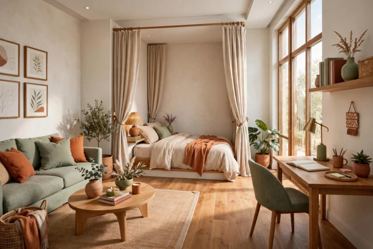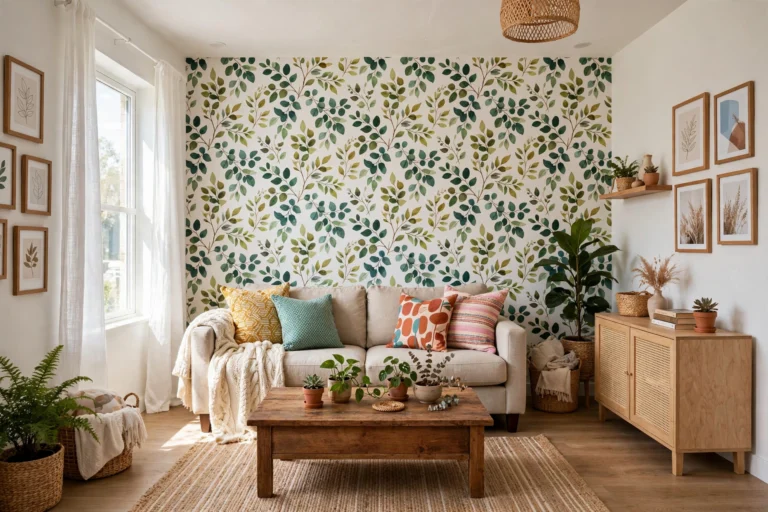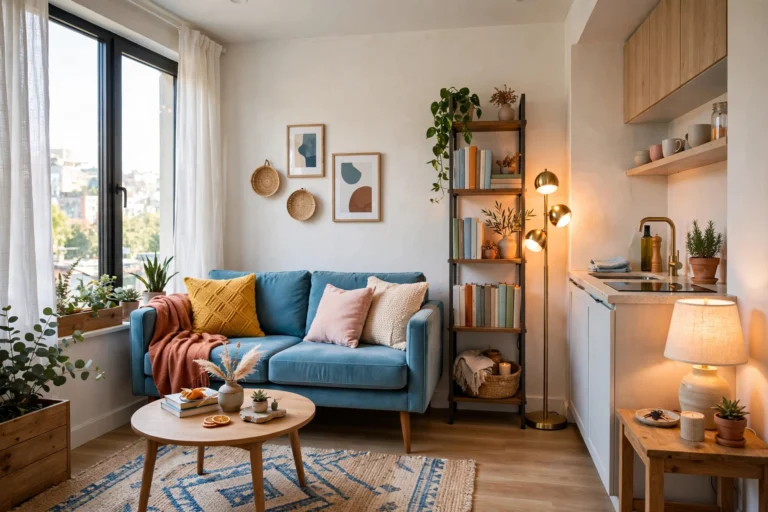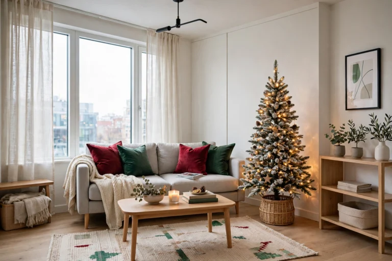
What is the 60-30-10 Color Rule and How to Use It in a Small Room
Introduction
Walk into any room that feels effortlessly “designed” and you will notice something subtle: the colors are not fighting each other. The walls, the sofa, the rug, and the cushions all seem to belong to one calm family, with just enough contrast to keep things interesting. That harmony is rarely an accident. Behind most professionally styled rooms sits a simple formula called the 60-30-10 color rule — a proportioning trick that tells you exactly how much of each color a room should hold.
The rule is beautifully simple: 60 percent of the room goes to a dominant color (usually the walls), 30 percent to a secondary color (large furniture, rugs, curtains), and 10 percent to an accent color (cushions, art, small decor). Together, those three layers give the eye variety without visual chaos — and in a small room, that calm is what makes the space feel larger. When every color has a job and a budget, the room reads as intentional instead of cluttered, and intentional rooms always feel bigger.
This guide breaks the rule down piece by piece and shows you how to adapt it for compact spaces: how to choose your three colors, how to distribute them across walls, furniture, and decor, and how to apply the same thinking to bedrooms, living rooms, and open-plan studios. Whether you are starting from a blank white rental or rescuing a room that feels like a box of mismatched crayons, the 60-30-10 framework gives you a plan you can execute this weekend — mostly through textiles and styling alone.
1. What the 60-30-10 Rule Actually Means
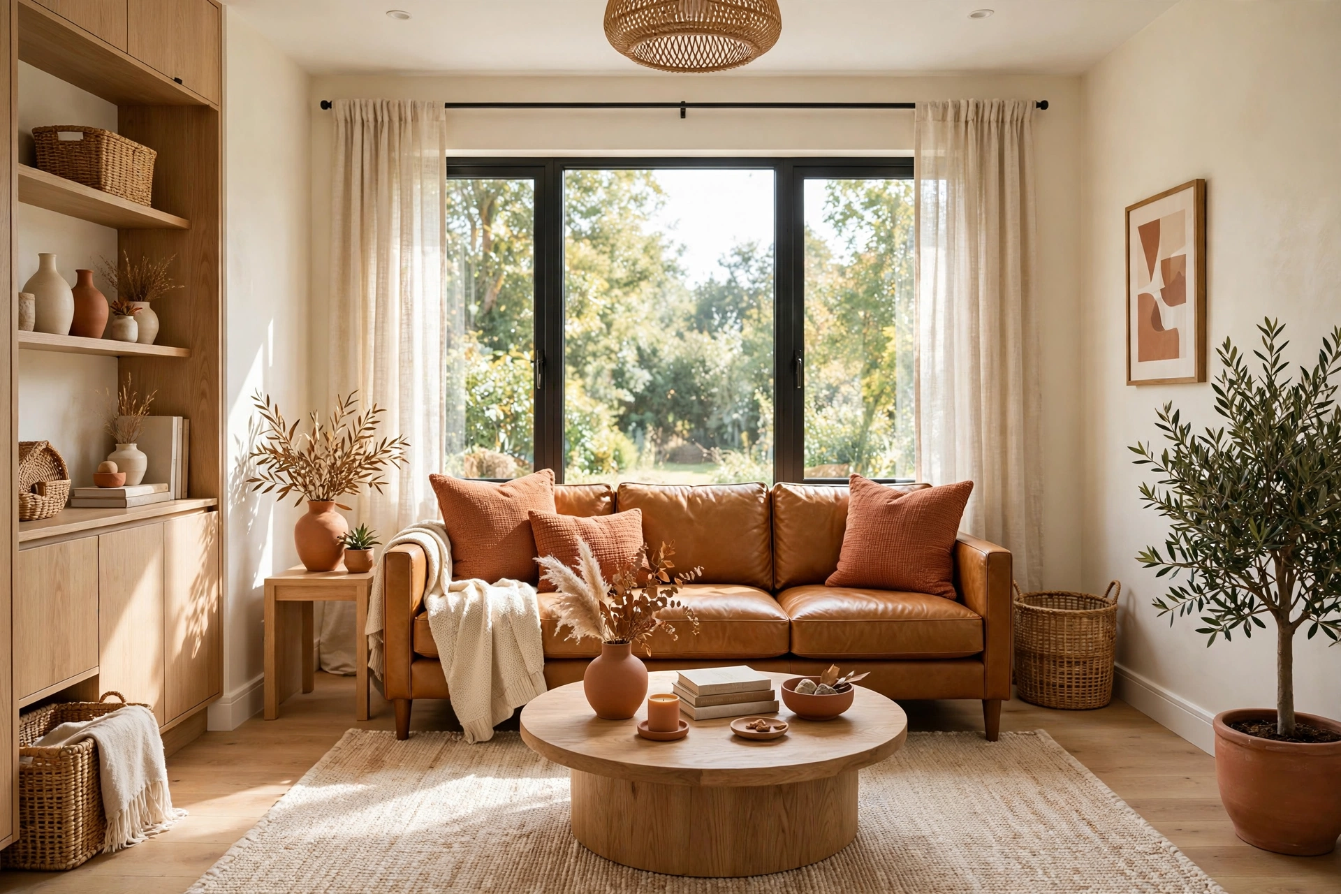
At its core, the 60-30-10 rule is a ratio, not a recipe. It says the most balanced rooms devote about 60 percent of their visible color to one dominant shade, 30 percent to a supporting shade, and 10 percent to an accent shade that adds energy. Think of it the way a designer thinks: the 60 is the background everything sits against, the 30 is the middle layer that adds depth and comfort, and the 10 is the jewelry — small, bright, and placed with intention.
The ratio works because of perception. When colors appear in roughly these proportions, the brain reads the room as stable: one clear leader, one partner, one spark. When the proportions are off — five colors at 20 percent each — the eye has no hierarchy to rest on and registers the room as busy. Busy reads as small, which is why the rule matters doubly in compact spaces. One clarification: these percentages describe visual weight, not measured square footage. What matters is the view from the doorway — the first impression should show a clear dominant tone, a supporting tone, and a controlled pop of accent.
2. The 60: Choose a Light, Airy Dominant Color
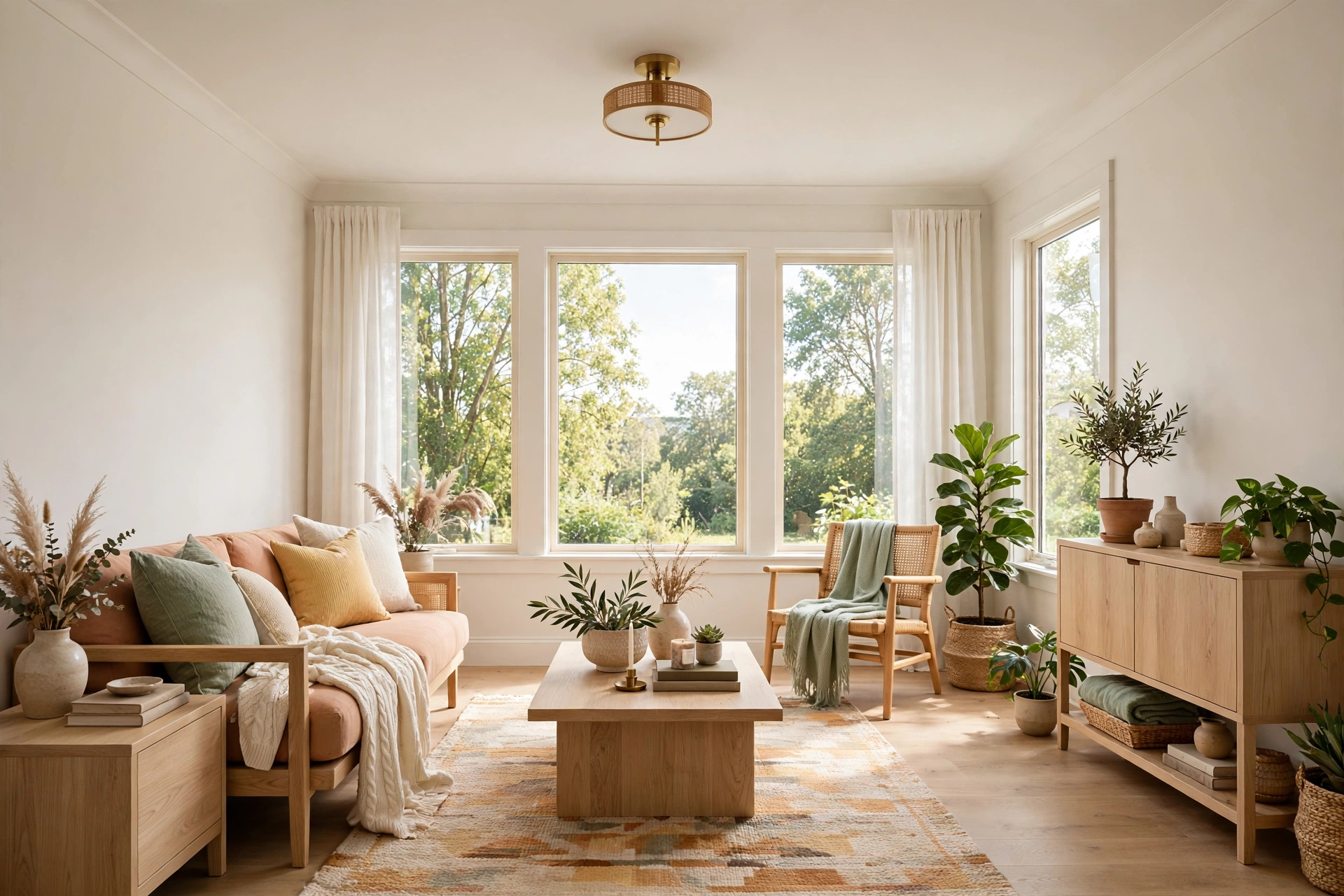
The 60 percent layer is your room’s foundation, and in a small room it does the heaviest lifting. Walls, and usually the ceiling, occupy this share, so the color you choose here sets the entire mood. The classic small-space move is a light, luminous dominant color: warm white, soft greige, pale sage, or powdery blue. These shades reflect daylight, push the walls visually outward, and give the other 40 percent a calm backdrop to shine against.
Think about light direction when choosing. A north-facing room gets cool, bluish daylight, so a warm-leaning dominant (creamy white, warm greige) balances it; a sun-flooded south-facing room can handle a cooler dominant without feeling chilly. Hold large paint swatches against the wall and check them morning, noon, and lamplight — undertones shift dramatically through the day, and the 60 is too big a commitment to guess at. Renters who cannot paint still own their 60: in a white-walled rental, shift the dominant toward warm neutrals through the largest surfaces you control — a big area rug, wall-to-wall curtains, pale slipcovers. Our guide to the best tricks for how to make a small room look bigger shows how one continuous tone across walls, trim, and ceiling erases the visual boundaries that chop a small room into pieces.
💡 Pro Tip: If your room has a feature you want to downplay — a bulky radiator, an awkward soffit, a dated door — dress it in your dominant 60 color. Matching it to the background makes it visually recede, the same camouflage principle designers use on oversized furniture.
3. The 30: Pick a Secondary Color That Bridges Everything
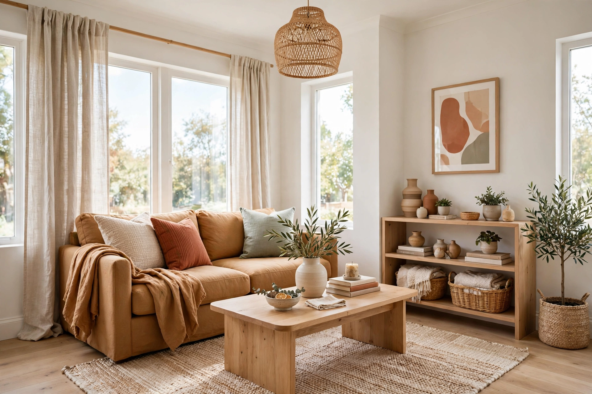
The 30 percent layer is where the room gets its personality without losing its calm: typically your large upholstery, area rug, curtains, and biggest wood furniture. The secondary color should relate to the dominant — close enough to feel like family, different enough to add depth. Warm white walls pair beautifully with caramel, oatmeal, or soft taupe; pale blue-grey walls love navy, slate, or warm wood tones.
Think of the 30 as the translator between the quiet 60 and the lively 10. A common designer move is to pull the secondary color from a patterned rug or a favorite piece of art, then repeat it in the sofa, curtains, or bedding. Because it covers a substantial share, the 30 is also where texture earns its keep: a linen-look sofa, a woven rug, and wood furniture in the same tonal family add richness without a single new hue. In small rooms, keep the contrast between the 60 and the 30 gentle — a dark sofa against pale walls is a visual boulder whose hard edge stops the eye cold. Save contrast for the 10 percent, where a little goes a long way.
4. The 10: Let Your Accent Color Carry the Personality
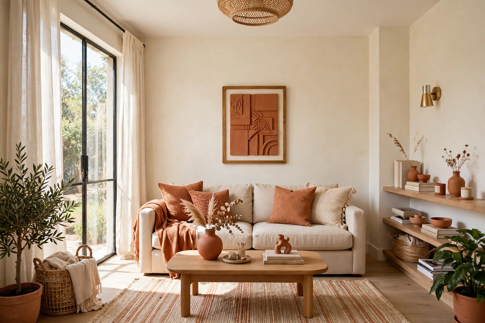
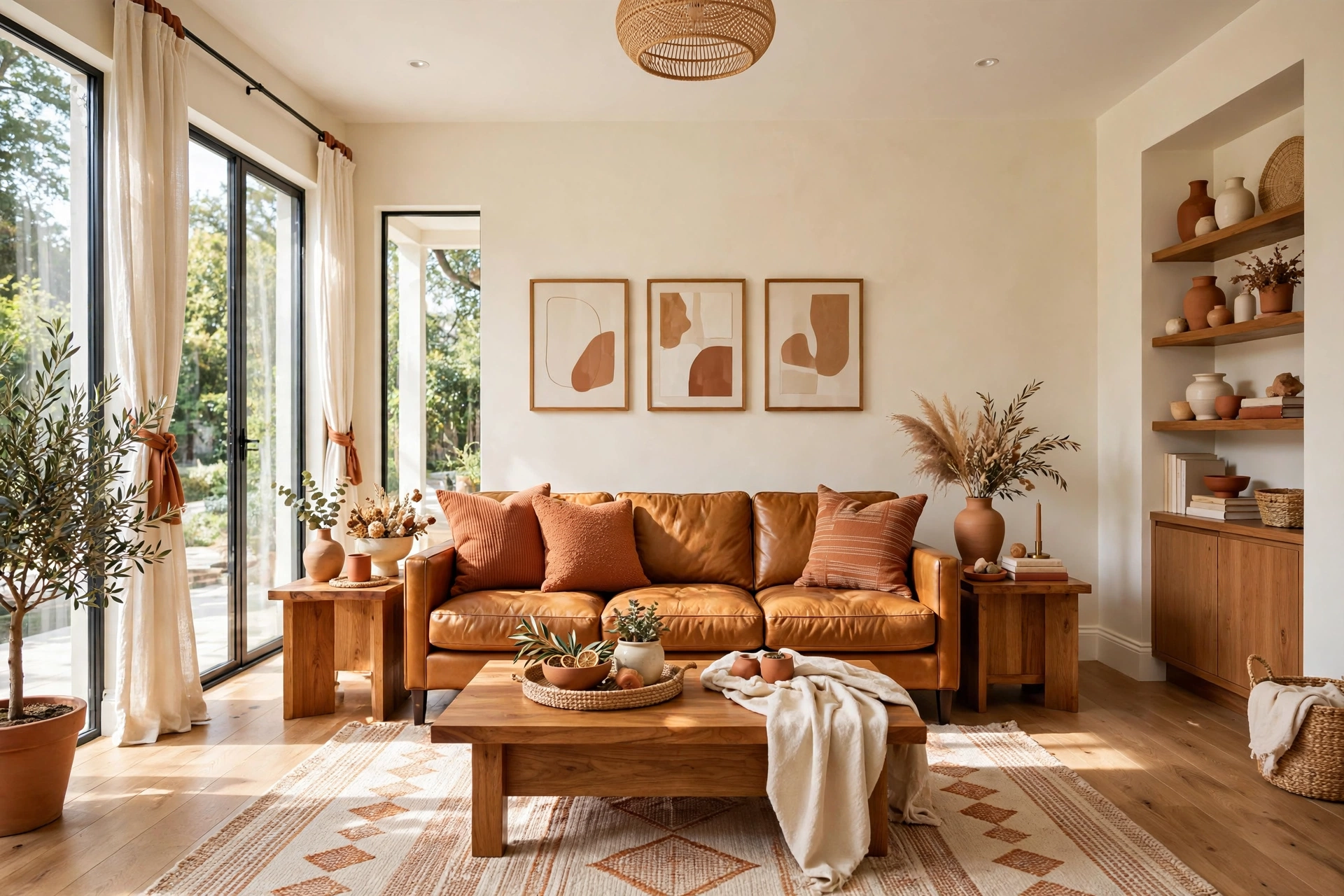
The 10 percent layer is the fun one: the cushions, the throw, one piece of art, a vase, a plant pot, a lamp base. Because it is small, it can be bold — this is where saturated color, playful pattern, and metallic shine belong. A room with warm white walls and caramel upholstery comes alive with 10 percent terracotta, emerald, or ochre. The accent is the room’s exclamation point, and one exclamation point per room is plenty.
Restraint is the whole game. The classic beginner mistake is letting the accent creep: the terracotta cushions multiply into terracotta curtains, a terracotta rug, terracotta art — and suddenly the 10 has become 30, the hierarchy collapses, and the room feels busy. Buy accent pieces deliberately, place them where the eye naturally lands, and stop at three to five small touches. The accent layer is also the cheapest to change, which makes it your seasonal refresh engine — a “new room” twice a year for the price of two pillow covers. Our favorite low-cost refresh ideas for apartment decorating on a budget lean on exactly this trick: small, swappable accent pieces that transform a room for very little money.
5. Build Your Palette Around One Inspiration Piece
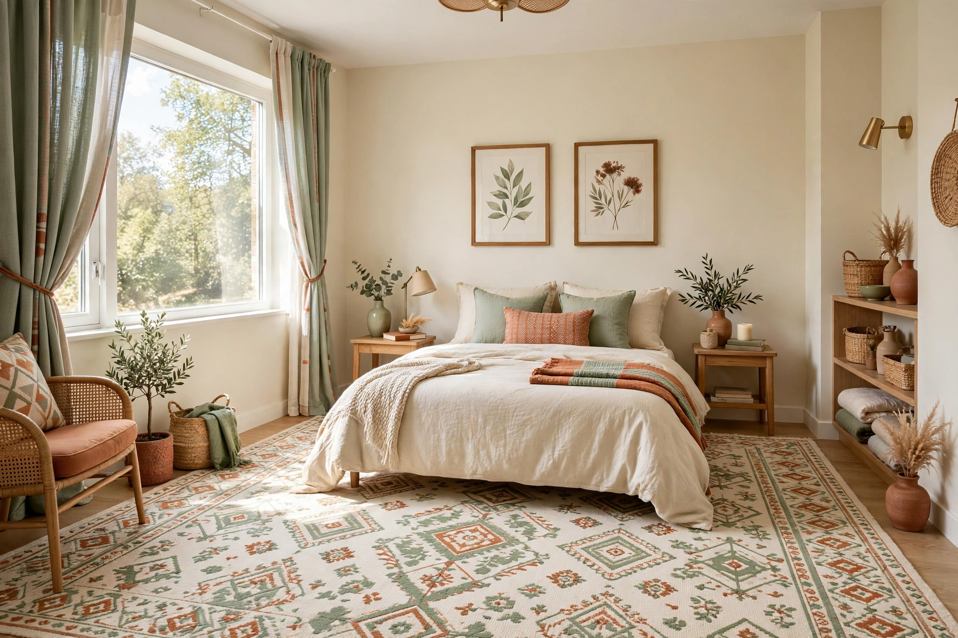
If choosing three colors from scratch feels paralyzing, cheat the way designers do: start from one piece you love and let it dictate the palette. A patterned rug, a favorite painting, a gorgeous duvet cover — pull your three colors directly from it. The rug’s background color becomes your 60, its main motif color becomes your 30, and its smallest, brightest color becomes your 10. The piece guarantees the colors already harmonize, because they were designed to sit together.
This also solves the most common palette problem in small rooms: colors that technically match but emotionally clash. When all three colors come from one source, they share undertones and saturation — warm with warm, dusty with dusty — and the room gets that “collected over time” feeling automatically. If you do not have an inspiration piece yet, make one: buy a single cushion cover in a pattern you love and let it become your palette’s founding document. Even in a rental with landlord-white walls, an inspiration textile gives your 30 and 10 layers a coherent story, and coherence is what separates a styled room from a storage unit.
📌 Important: An inspiration piece only works if it stays the star. Do not introduce a second patterned piece in different colors — two pattern stories in one small room will fight, and the room will feel cluttered no matter how carefully you placed everything else.
6. Test Colors in Your Room’s Real Light Before You Commit
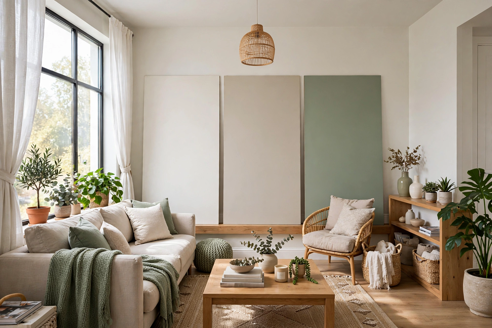
The 60-30-10 rule only works if your three colors actually look like themselves in your room — and colors are notorious shape-shifters. A greige that looked perfect under the store’s fluorescent tubes can read pink under your warm lamps and grey in morning daylight. The fix is unglamorous but essential: test every major color in the actual room, in the actual light, for a full day.
For paint, buy sample pots and paint large boards — at least two feet square — and move them around the room through the day: window wall, darkest corner, beside the sofa. For textiles, order swatches or buy from stores with generous returns, and drape the fabric over the furniture in daylight and again under evening lamps. This discipline pays off most in the 60 layer, the biggest commitment and the hardest to change — but do not skip it for the 30 either, since a sofa is a five-year decision. If you are choosing a mirror to brighten the room while you test, our guide to the best mirrors for small spaces covers the placements that multiply daylight, which also helps you judge colors more accurately.
7. Use Neutrals for the 60 When You Want Maximum Flexibility
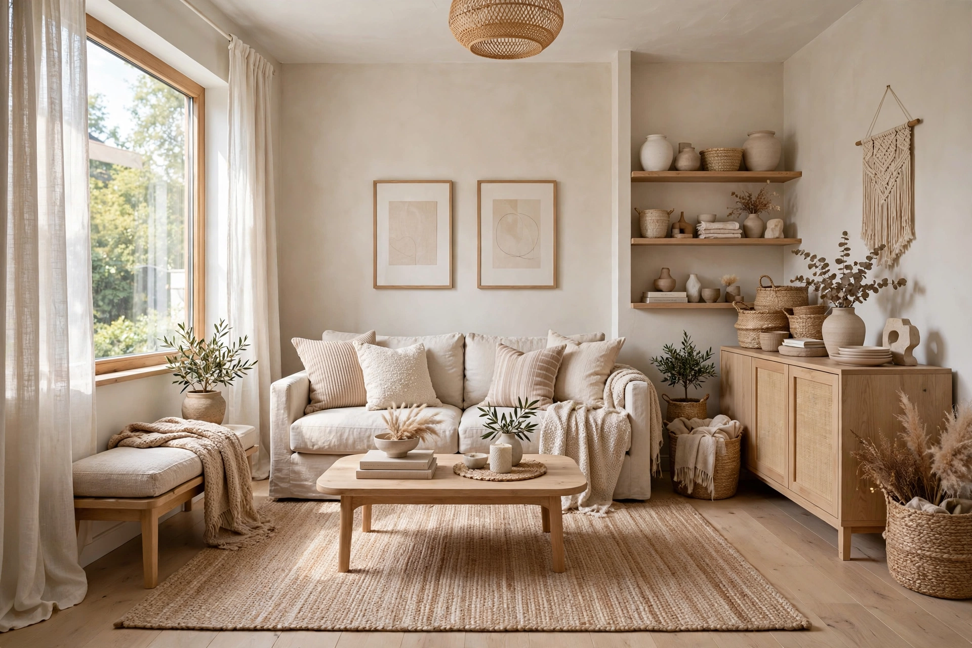
Most designers default to neutrals for the dominant layer for one reason: a neutral 60 never fights your future choices. Warm white, greige, soft taupe, or pale warm grey accept any 30 and any 10 — so you can redecorate the room’s personality for years just by swapping the smaller layers. In a small space, where repainting is disruptive and furniture turnover is expensive, that flexibility is worth real money.
Neutral does not mean boring. A neutral 60 comes alive through variation within the family: warm white walls, natural linen curtains, an oatmeal rug with a subtle pattern, wood tones carrying the warmth. The eye reads all of these as “the 60” because they share a tonal family, but the mix of textures — smooth paint, nubby linen, woven jute, grained wood — keeps the room rich and layered. Texture is how neutral rooms avoid flatness. The one neutral to handle with care in small rooms is cool, stark grey: in a dim or north-facing room it can read clinical, while in a sun-drenched room it usually sings. When in doubt, push grey warm — greige over grey.
8. Let Textiles Carry the 30 for Easy Seasonal Changes
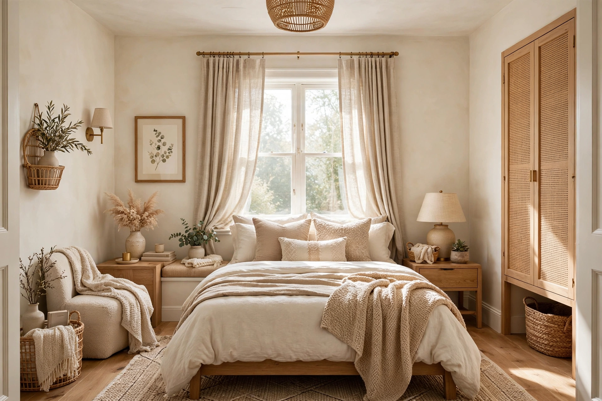
Here is a refinement small-space decorators swear by: keep the 60 architectural (walls, ceiling, big rugs) but let textiles carry as much of the 30 as possible. Curtains, bedding, sofa slipcovers, and large throws in your secondary color give you a 30 layer you can partially swap with the seasons — linen-look in summer, chunky knits in winter — without replacing furniture. The room’s structure stays constant while its mood shifts.
This is especially powerful in bedrooms, where the bed is roughly half of everything visible. Changing the duvet cover, throw, and cushion covers effectively repaints the 30 layer in an afternoon. It also protects your wallet on the biggest purchases: a neutral sofa outlasts every trend cycle while the color story comes from the swappable layers around it. If you want a full walkthrough of bedroom-specific moves, our guide to make a small bedroom feel bigger pairs these textile swaps with layout and lighting tricks for maximum effect. When tempted by a bold-colored sofa, remember you would be locking in a 30 for a decade — bold is safer in the 10, where a cushion cover commits you to one season.
9. Repeat Your 10% Accent in At Least Three Places
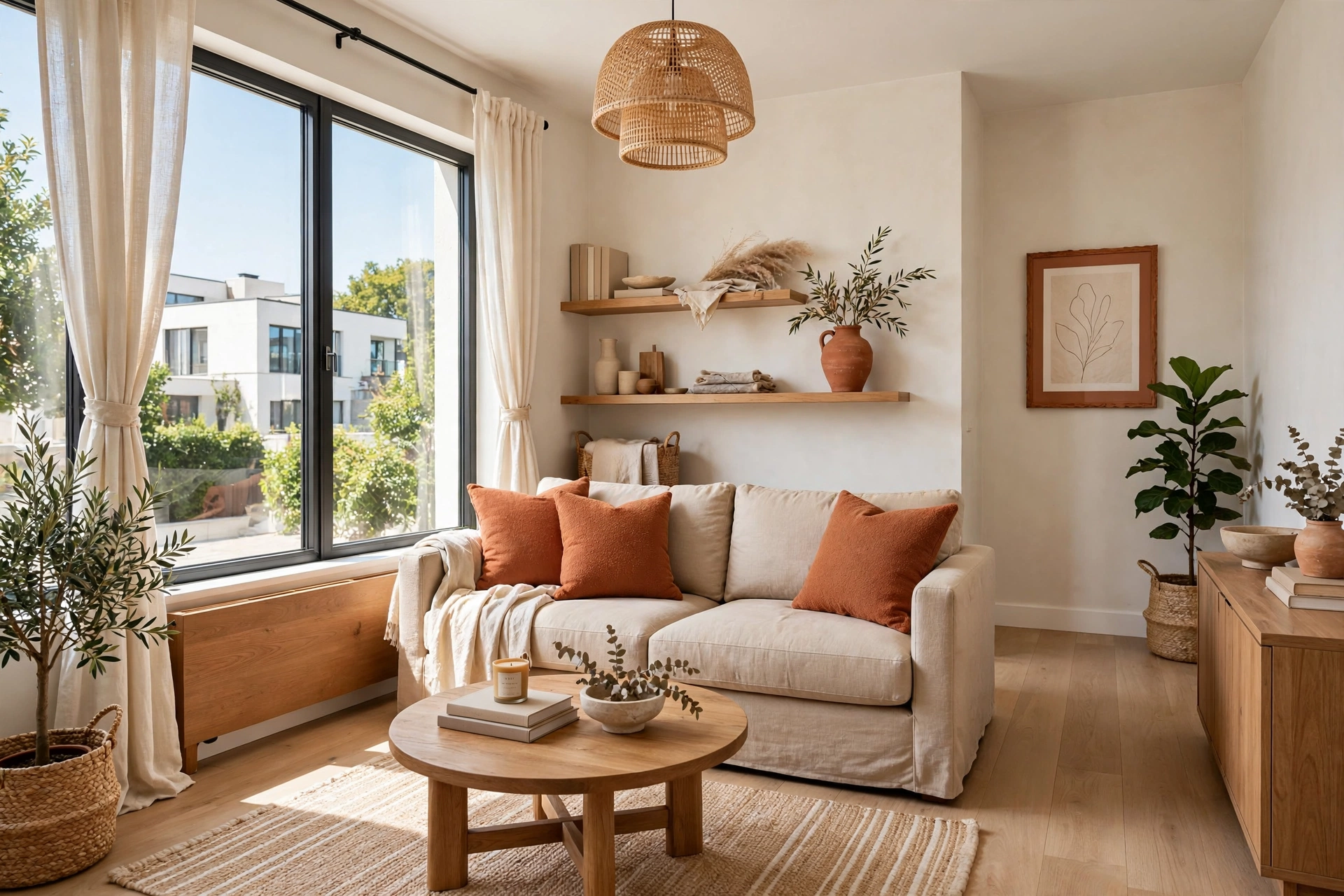
A single accent item in an otherwise calm room can look like a mistake — one red cushion on a beige sofa reads as “forgot to return it.” The designer fix is the rule of three: repeat your accent color in at least three spots around the room, at different heights. Terracotta cushions on the sofa, a terracotta vase on the shelf, a terracotta frame on the far wall — now it is a scheme, not an accident.
The repetition also pulls the eye on a journey. When the accent appears near the door, in the middle of the room, and on the far wall, the gaze travels the full depth of the space following the color trail — and a room the eye travels fully feels substantially larger than one where the gaze stops halfway. Keep the repetitions varied in scale and material (a textile, a hard object, a piece of art) so the scheme does not feel mechanical, and resist adding a fourth, fifth, sixth touch. The line between “intentional scheme” and “accent creep” is thin, and crossing it breaks the balance you worked to build.
💡 Pro Tip: Photograph your room from the doorway and squint at the photo. Squinting blurs detail and reveals only the color masses — you should see one dominant wash, one supporting mass, and small controlled pops of accent. If the accent dominates the squint test, you have accent creep.
10. Run the 60 Straight Through Open-Plan Spaces
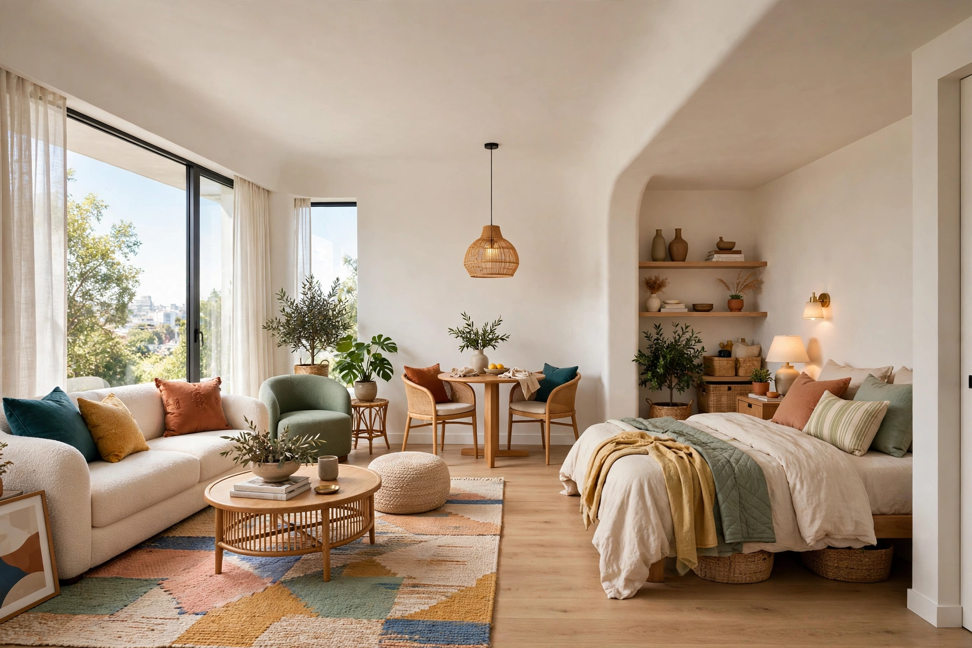
Open-plan studios are where the 60-30-10 rule earns its keep — and where most people abandon it. The instinct is to give each “zone” its own colors: blue bedroom corner, green kitchen nook, beige living area. The result is fragmentation: the eye registers three small rooms instead of one generous one, and a studio that could feel airy feels chopped up.
The fix is continuity: run the same dominant 60 across the entire open space — same wall color, same ceiling, ideally the same flooring flowing through. This single move merges the zones into one calm volume the brain reads as larger. Then let the 30 and the 10 vary slightly by zone for identity: sage bedding as the sleep zone’s 30 moment, a caramel rug anchoring the living zone, both on the same warm-white 60 foundation. Zone with the smaller layers instead of the dominant one — a rug defines the lounge, a pendant marks the dining spot, the back of a sofa separates sleep from living — and you get one spacious-feeling envelope with distinct, purposeful areas inside.
11. Try a Dark, Moody 60 in Rooms That Get Great Light
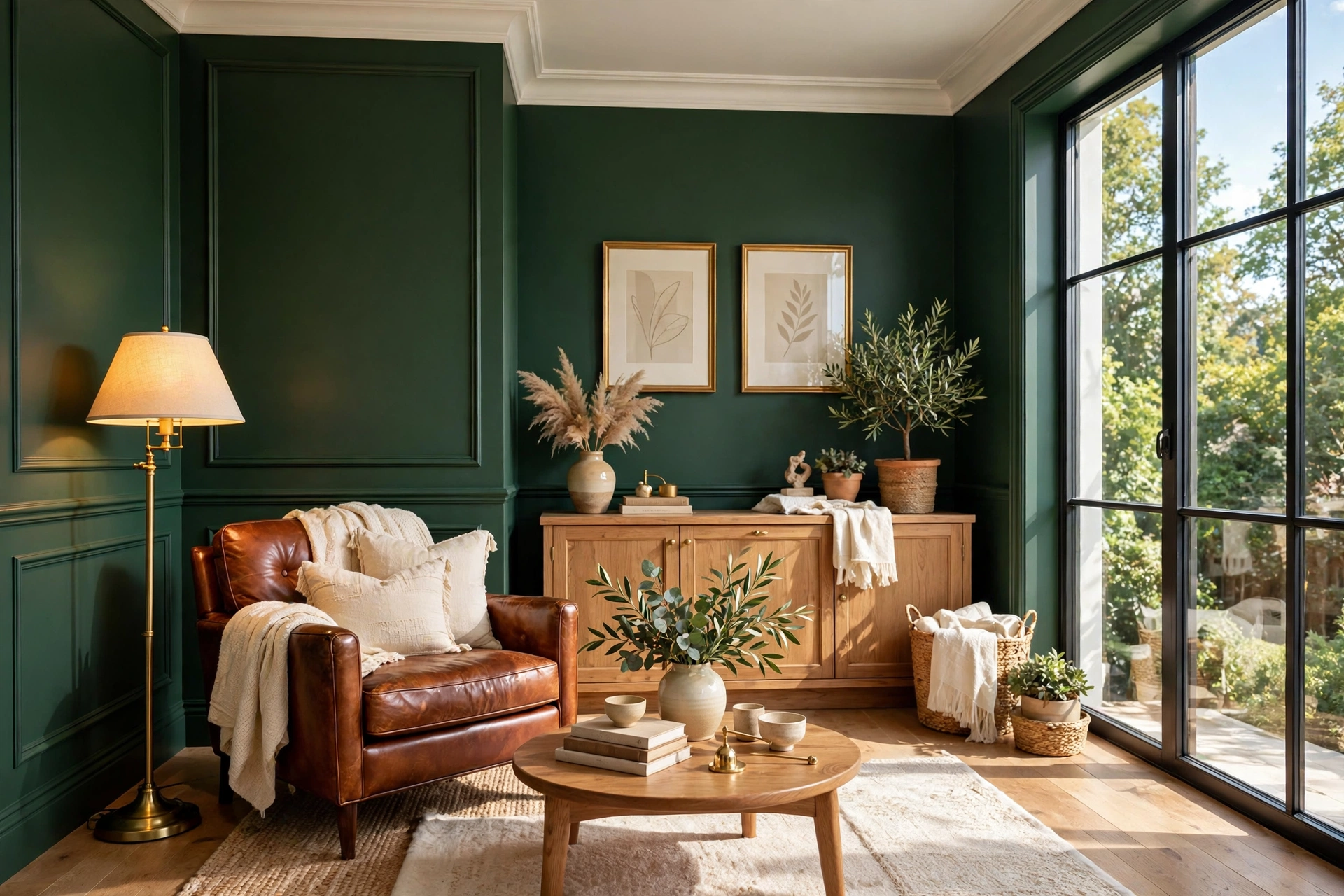
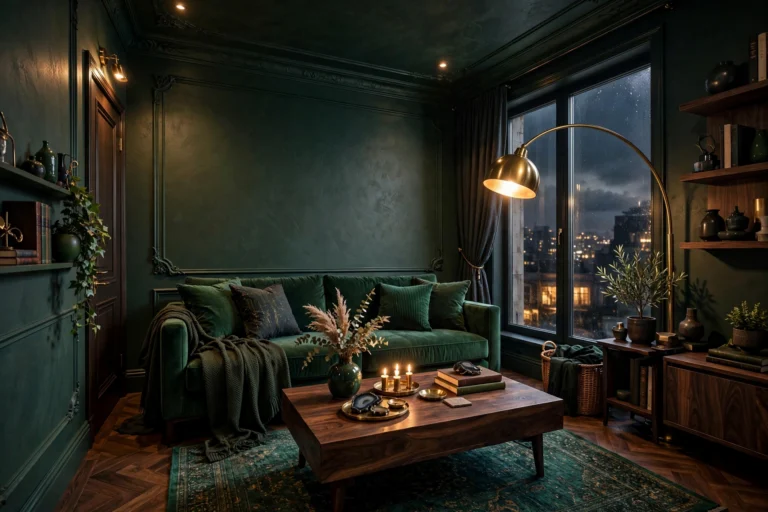
The rule works beautifully in reverse. A small room with a generous window, or with genuinely good layered lighting, can carry deep forest green, inky navy, or warm charcoal as its 60. Dark walls blur corners and edges so boundaries soften — and a room with soft boundaries can feel larger, not smaller, than a bright room with hard edges.
The dark 60 demands discipline in the other layers. Keep the 30 lighter and warm — caramel leather, honeyed wood, cream textiles — so the room gets the contrast it needs to avoid the cave effect. Then let the 10 be metallic or jewel-toned: brass, aged gold, deep emerald, burnt orange. Metallics are practically lighting in a dark room, catching every scrap of lamplight. Our roundup of dark apartment decor ideas shows this formula in action across fifteen moody small-space looks. Before committing, audit your lighting honestly: one harsh overhead on dark walls creates exactly the gloom everyone fears, while warm lamps at three heights turn the same room into a glowing jewel box.
⚠️ Warning: A dark 60 amplifies every lighting weakness. Test your evening lighting with sample boards up for at least two nights before committing — a deep green that looks rich at noon can read almost black by lamplight, changing how much contrast your 30 and 10 must carry.
12. Use the Rule to Make Bulky Furniture Disappear

Every small room has one piece that refuses to cooperate — the landlord’s beige carpet, the hand-me-down dark bookshelf, the too-big dresser you cannot replace. The 60-30-10 rule turns these into camouflage opportunities: assign the offending piece to your dominant layer by matching it, not fighting it. A dark bookshelf against walls painted to echo its tone melts into the background; its edges dissolve, and the eye glides past it.
This works because contrast is what outlines bulk. A black TV against a white wall is a visual boulder; the same TV against a charcoal wall section becomes part of the architecture. When you cannot change the furniture, change what surrounds it: paint the wall behind it in a close tone, or drape it with a textile in your 60 family. The piece does not get smaller — it gets quieter, which in a small room amounts to the same thing. Apply the thinking in reverse for pieces you love: a beautiful walnut dresser deserves contrast against your light 60 walls so its silhouette becomes part of the design. In a small room you can afford exactly one or two loud pieces — choose them on purpose.
13. Add Pattern Inside Your 10% — Never Inside Your 60
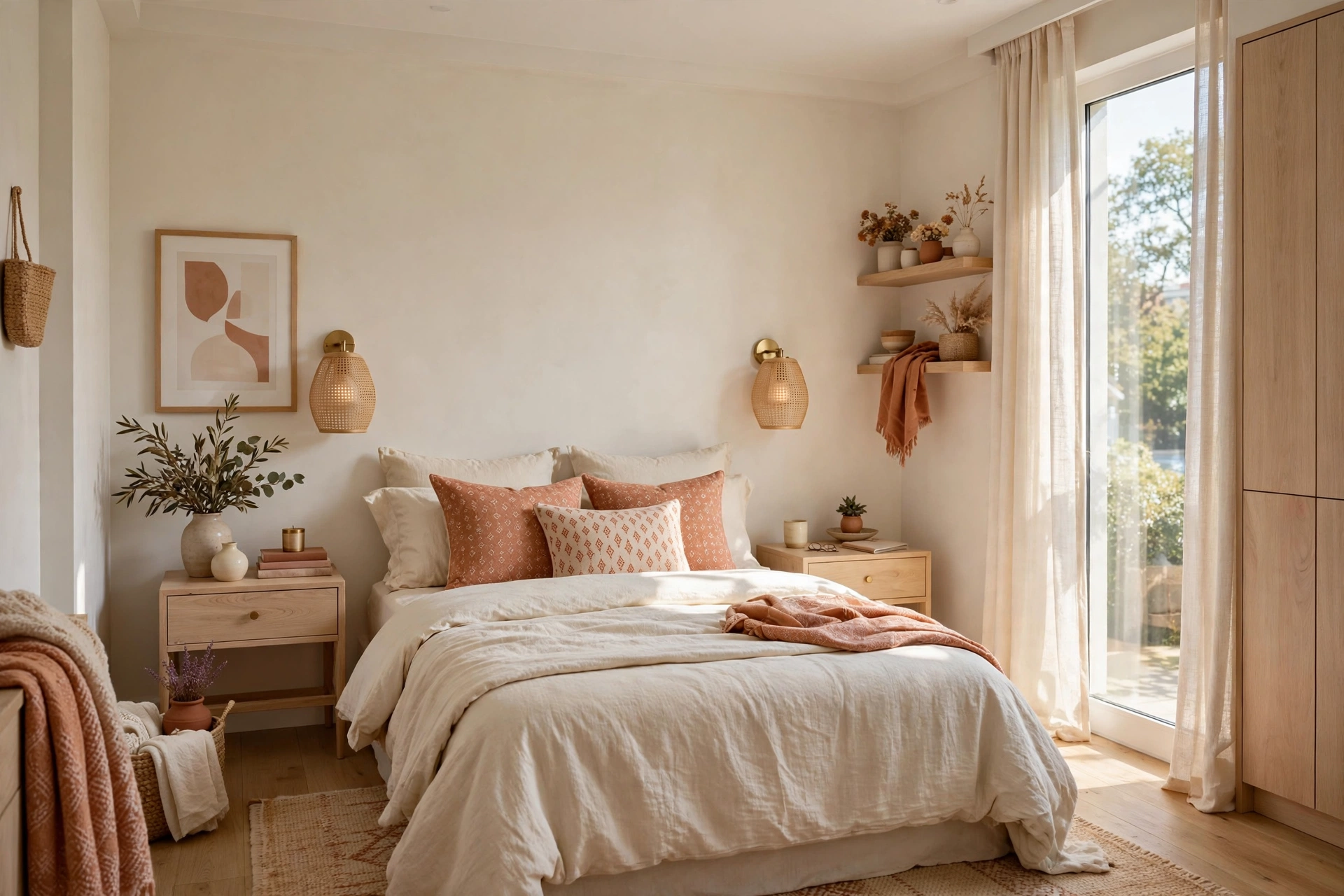
Pattern is color’s rowdy cousin, and the framework has a clear opinion about where it belongs: in the 10 percent layer. A patterned cushion, a small patterned lampshade, one lively framed print — these add energy without threatening the room’s calm. Pattern in the 60 layer, by contrast — busy wallpaper on all four walls of a tiny room, a loud all-over rug — overwhelms the hierarchy and makes the walls feel closer.
The reason is scale perception. Large, high-contrast patterns advance toward the eye, so in a compact room the walls visually press in; small-scale, low-contrast patterns recede. A ditsy floral or fine stripe in your accent color works even in a shoebox bedroom, while a giant tropical print on every wall does not. If you love a big dramatic print, confine it to one accent moment — a single cushion or framed print reads as art, not as the room closing in. The one exception: subtle tone-on-tone pattern in your 60 family — grasscloth texture, a faint limewash effect — reads as texture rather than pattern, and small rooms love it.
14. When the Rule Needs Bending: True Studios and Alcoves
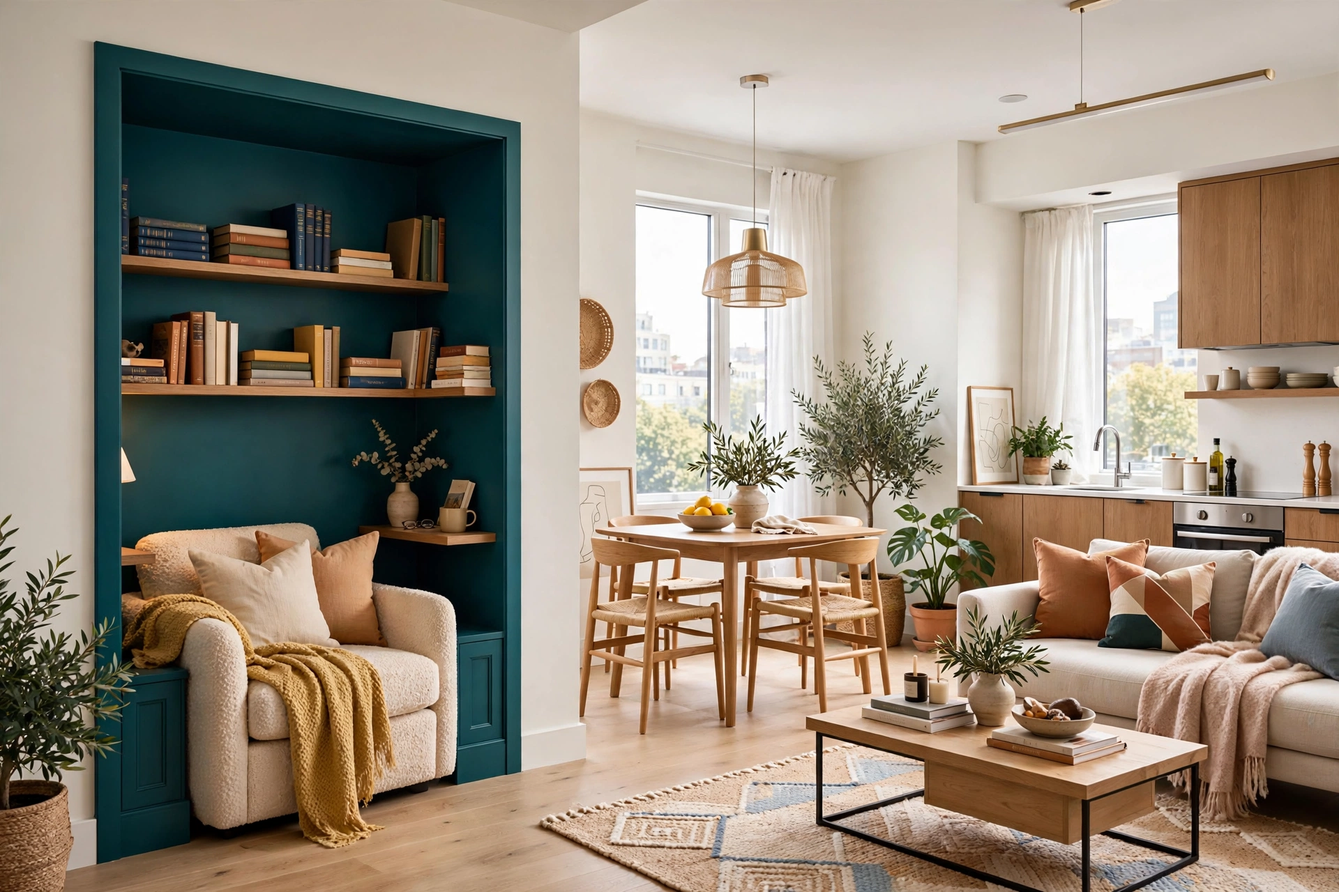
Rules are meant to be bent thoughtfully, and this framework has two legitimate small-space exceptions. The first is the true studio — one room where you sleep, work, eat, and live. Strictly applying one 60/30/10 across everything can feel monotonous, so allow a “60-30-10 per zone” variation: each zone keeps the same 60 for continuity, but gets its own 30 and 10 personality. The sleeping corner goes sage and brass; the work corner goes slate and oak — same calm envelope, distinct moods inside.
The second exception is the alcove: the weird nook, the hallway stub, the under-stair corner. These micro-spaces benefit from breaking the rule entirely — painting an alcove in a saturated accent color, or wallpapering it boldly, turns a dead zone into a jewel-box moment. Because it is small and contained, the bold color reads as intention rather than chaos. The main room keeps its 60-30-10 discipline; the alcove gets to show off. For more ideas on giving compact corners their own identity, browse our cozy small living room ideas for apartments, which treat every zone like its own tiny room.
15. Do a Final 60-30-10 Audit With Your Phone Camera
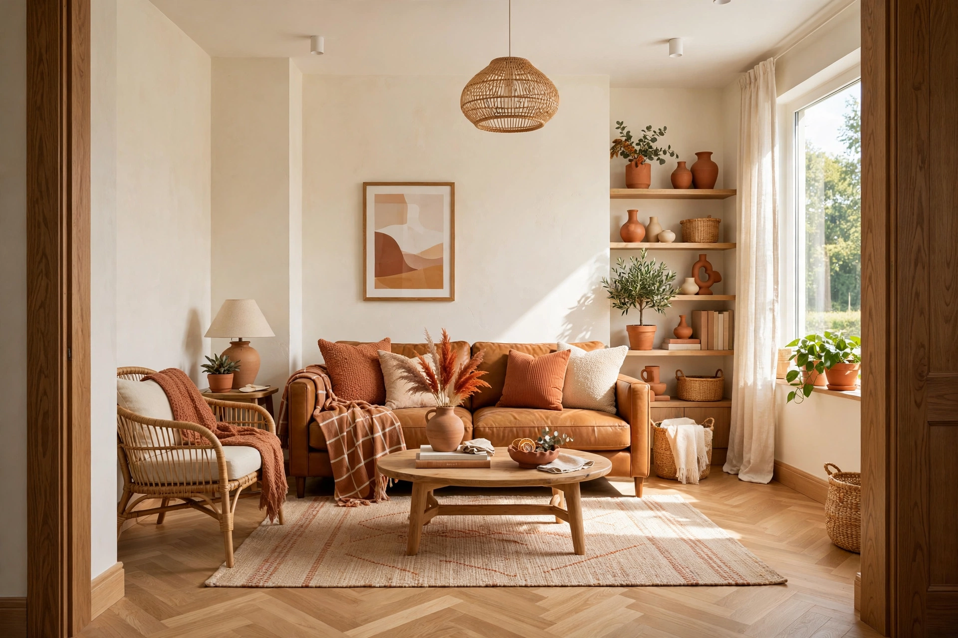
Once your three layers are in place, do the designer’s final check: photograph the room from the doorway in daylight and again in the evening. The camera is ruthlessly honest — it flattens the space into pure color masses and exposes imbalances your eyes have learned to ignore. In a balanced room the photo should show one dominant wash, a clear supporting mass, and small deliberate pops of accent. If anything else dominates, you have found your next edit.
The audit catches the four classic failures fast: accent creep (the 10 taking over whole zones), a missing 30 (walls jumping straight to accessories — stark and unfinished), a muddy 60 (undertones fighting your textiles), and a dead 10 (technically balanced but flat — the cure is one bolder accent piece, not a reshuffle). Make the audit a habit: every time a new piece comes home, snap the doorway photo and check the balance before the tags come off. The best-decorated small rooms are not styled once perfectly; they are edited continuously, and the phone camera is the best editing tool you already own.
📌 Important: Judge the audit photos at thumbnail size, not full screen. Thumbnails strip away detail and leave only color proportion — exactly what the 60-30-10 rule governs. If the balance reads correctly at thumbnail size, it will feel correct in person.
Quick Comparison: 60-30-10 Palettes by Style, Cost, and Renter-Friendliness
Your 60-30-10 Quick-Start Checklist
- ✅ Pick your dominant 60: a light, airy tone that suits your room’s natural light
- ✅ Choose a secondary 30 within a few tonal steps of the 60 — gentle contrast only
- ✅ Select ONE accent color for the 10 and commit to it across all small decor
- ✅ Test the 60 on large boards in morning, noon, and evening light before committing
- ✅ Repeat the accent in at least three spots at different heights around the room
- ✅ Photograph the room from the doorway and check the balance at thumbnail size
- ✅ Keep the expensive layers (60 and 30) neutral and swappable; let the 10 carry trends
Common 60-30-10 Mistakes in Small Rooms
Mistake 1: Letting the Accent Creep Past 10 Percent
The most common failure is also the sneakiest. You start with terracotta cushions — a perfect 10 — and six months later the terracotta has colonized the curtains, the rug, and two pieces of art. The room that once felt balanced now feels busy and oddly smaller. The defense is the doorway photo audit: the moment your accent starts dominating the thumbnail, edit pieces out until the balance returns. The 10 is jewelry — and nobody wears seven necklaces.
Mistake 2: Choosing a 30 That Fights the 60
The secondary layer should be a bridge, not a battle. Cool grey walls with orange-toned wood, or stark white walls with a chocolate-brown sofa, create a hard contrast line exactly where the eye should glide. In a small room, every hard contrast is a visual boundary, and boundaries shrink space. Keep the 60 and 30 in the same temperature family — warm with warm, cool with cool — and let the 10 provide the contrast. If you inherited a fighting piece, camouflage it toward the 60.
Mistake 3: Skipping the 30 Entirely
Some rooms jump straight from pale walls to colorful accessories with nothing in between — white walls, white sofa, then a riot of bright cushions and art. Without the middle layer, the room feels stark and unfinished, and the accent has nothing to play against, so it reads as clutter rather than design. The 30 is the room’s connective tissue: a mid-tone rug, curtains with depth, wood furniture with warmth. If your room feels “almost there but flat,” the missing 30 is usually the diagnosis.
Mistake 4: Ignoring Undertones When Mixing Neutrals
Not all neutrals are neutral. A “warm white” wall next to a “cool greige” rug next to “yellow beige” curtains creates a muddy, restless feeling even though every piece is technically neutral. Undertones — the pink, yellow, green, or blue hiding inside a neutral — must agree across your 60 and 30 layers. Compare everything side by side in daylight, and when in doubt, pull all your neutrals from the same paint brand’s color strip so they share a base.
Mistake 5: Forgetting the Ceiling in the 60
A bright white ceiling in a room with warm-tinted walls creates an unconscious contrast line all the way around the room — a visual boundary exactly where you least want one. Painting the ceiling the same color as the walls (or a half-tone lighter) erases that boundary and lets the eye glide upward, making ceilings feel higher. It is the cheapest square footage of 60 you own, and it is already installed.
Frequently Asked Questions
1. What is the 60-30-10 color rule in simple terms?
About 60 percent of what you see should be one dominant color (usually walls), 30 percent a secondary color (large furniture, rugs, curtains), and 10 percent an accent color (cushions, art, small decor). The ratio gives the eye a clear hierarchy — one leader, one partner, one spark — which reads as calm and intentional rather than busy.
2. Does the 60-30-10 rule work in a really small room?
Yes — it works better in small rooms than anywhere else. Small rooms suffer most from visual noise, and the rule is fundamentally a noise-control tool. A light dominant 60 keeps the room feeling open, a gentle 30 adds depth without hard contrasts, and a disciplined 10 adds personality without clutter.
3. Can I use the 60-30-10 rule if I rent and cannot paint?
Absolutely. Treat the existing wall color as your given 60 and build the 30 and 10 around it. Large rugs, full-length curtains, slipcovers, and bedding in your secondary color effectively shift the room’s dominant tone, while the accent layer stays fully in your control through cushions, art, and small decor. Most of the rule executes through textiles, not paint.
4. What colors work best for the 60 percent in a small room?
Light, luminous tones with the right undertone for your light: warm whites, soft greige, pale sage, powdery blue, blush white. Match the undertone to your daylight — warm-leaning dominants balance cool north light, cooler dominants suit warm south light. Always test large swatches through a full day, since undertones shift between morning, noon, and lamplight.
5. How many accent colors can I have in the 10 percent?
One. A single accent color repeated in three to five small touches reads as a confident scheme, while two or three competing accents dissolve into visual noise. If you crave variety, vary the accent’s materials and textures — a velvet cushion, a ceramic vase, a brass frame in the same color family — rather than adding new hues.
6. What if my furniture does not match my 60-30-10 palette?
Camouflage it toward the 60 (match the surrounding wall or drape it in a dominant-family textile so it recedes), reassign it as the 30 (build the secondary layer around its tone), or edit it out. Do not let it sit as an unrelated fourth color — one off-palette piece is enough to break the room’s calm. Slipcovers and throws are the renter’s best friends here.
7. Can the 60 percent be a dark color in a small room?
Yes, if the room has good light. Deep green, navy, or charcoal as the 60 can make a small room feel like a cocooning jewel box — dark walls blur corners so boundaries soften. The trade is discipline: warm layered lighting at multiple heights, a lighter 30 for contrast, and metallic or jewel-toned accents. Without good lighting, stay light with the 60.
Conclusion
The 60-30-10 color rule endures because it turns the most subjective part of decorating — “does this go together?” — into a simple, checkable system. Sixty percent calm foundation, thirty percent supporting depth, ten percent deliberate personality. Follow the ratio and your room gets the hierarchy the eye craves; break it carelessly and the room tells on you with visual noise. In a small space, where every choice is magnified, that discipline is the difference between cramped and curated.
Start this weekend with the parts that cost nothing: audit your current room with a doorway photo, identify which layer is missing or overgrown, and edit. Then build forward deliberately — a dominant tone that suits your light, a secondary layer that bridges gently, and one accent color repeated with intention. Your small room does not need more color. It needs the right color, in the right proportion, in the right place — and now you have the formula.