How to Choose a Bedroom Color Palette You Won’t Regret in 6 Months
Introduction
Walk into a bedroom with the right color palette and you feel it before you can name it: the room exhales, your shoulders drop, and sleep feels closer somehow. Walk into one with the wrong palette — a wall color that looked perfect on the paint chip but glows neon at noon — and the room nags at you every single day. Color is the single highest-impact decision in a bedroom, and it is the one people rush the most.
The regret pattern is remarkably consistent. Someone picks a wall color from a tiny swatch under store lighting, paints the whole room in a weekend, and loves it for about three weeks. Then the morning light reveals undertones they never noticed, the bedding clashes in ways the swatch didn’t predict, and by month six the room feels like somebody else’s. That cycle is completely avoidable, because choosing a bedroom color palette is not about having a designer’s eye — it is about following a process.
This guide gives you that process. You will learn how to read a room’s light, how to build a palette around how you want to feel, and how to test colors so thoroughly that regret never gets a chance. Along the way you will find fifteen palette directions and decision techniques, from foolproof warm neutrals to deep, sleep-friendly drama. If you are starting from absolute zero, this guide also pairs beautifully with the layers of dreamy bedroom decor ideas that complete the look once the color is right.
1. Decide How You Want to Feel First

Before you look at a single swatch, answer one question: how do you want to feel when you walk into this room at 10 p.m.? Serene and weightless? Warm and cocooned? Crisp and energized? That feeling is your actual color brief, and it filters hundreds of options down to a handful. A bedroom meant for winding down belongs to soft, muted, low-contrast tones; a bedroom that needs to wake you up can carry brighter, cleaner color.
Designers call this working backwards from the mood, and it is the fastest way to avoid trend-driven regret. Write your three feeling words on a sticky note and keep it visible while you choose. Every color you consider has to earn those three words, or it doesn’t make the cut. Every one of our favorite cozy bedroom inspiration rooms shares one thing: the feeling came first, and every color choice serves it.
2. Learn the 60-30-10 Rule by Heart
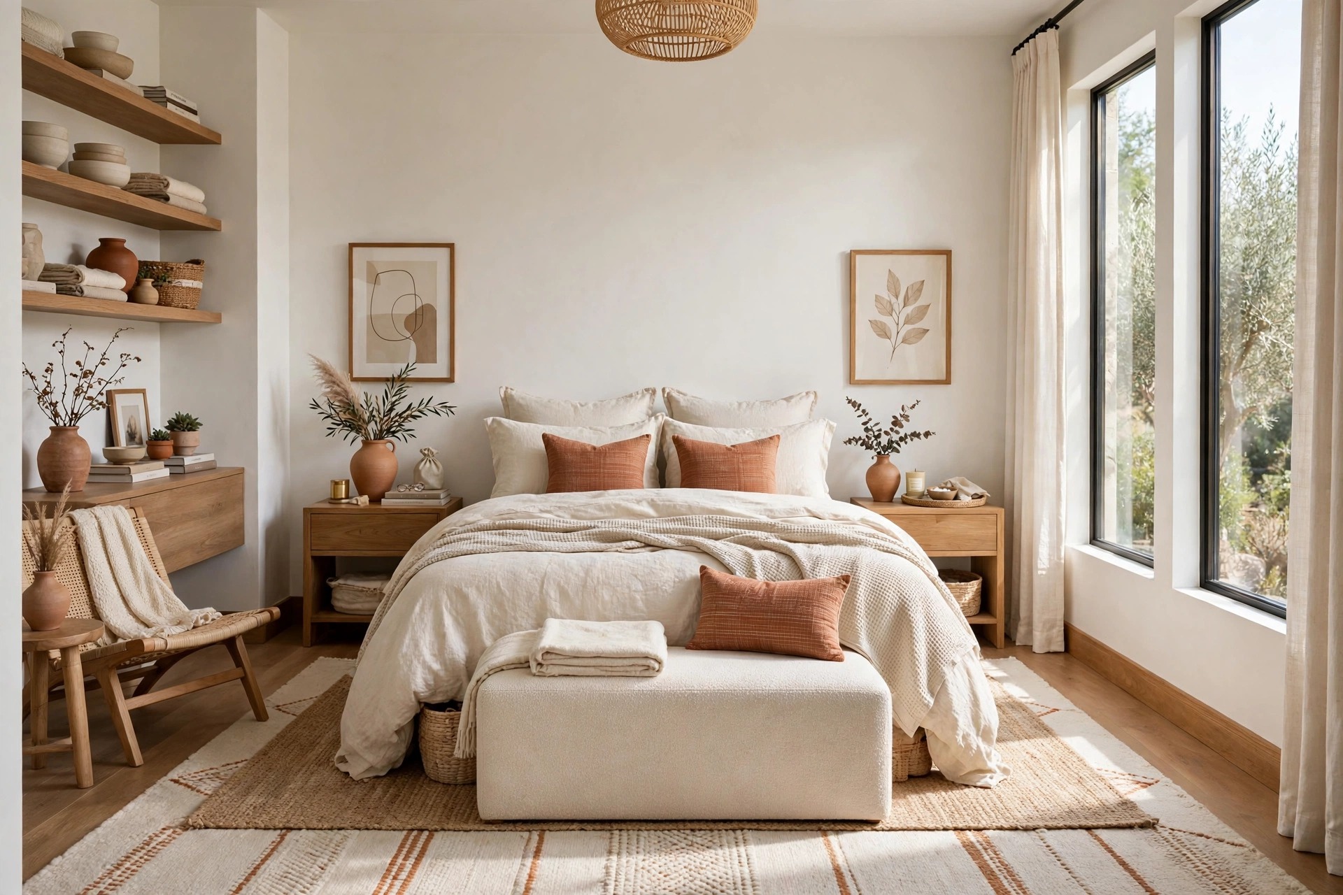
The 60-30-10 rule is the backbone of every palette that doesn’t fall apart: sixty percent of the room is your dominant color (usually walls and large furniture), thirty percent your secondary (bedding, curtains, rug), and ten percent your accent (throws, art, small decor). It works because it gives color a job description — each tone knows exactly how much space it is allowed to occupy.
The most common six-month regret is really a proportion problem: an accent color that was gorgeous on a pillow gets promoted to the walls, and suddenly it owns sixty percent of your visual field. Paint is the sixty — it must be the calmest, most forgiving color in the room. The thirty adds personality, and the ten delivers the spark. When you find yourself wanting to repaint, check which layer broke its proportion before you blame the color itself.
3. Sample in Real Light Before You Commit
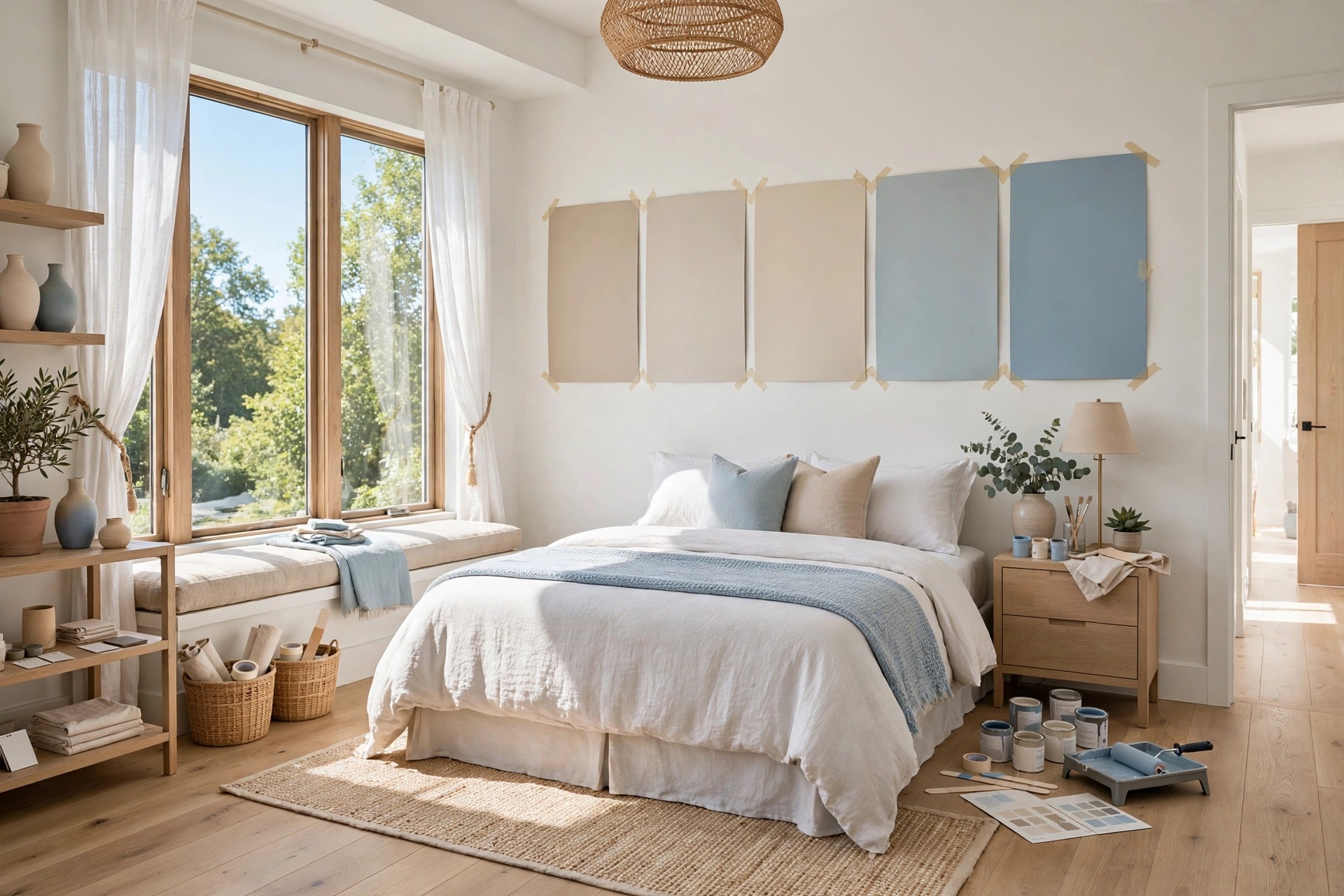
Paint chips lie. They lie under store fluorescents, they lie at sample-card size, and they lie when you hold them against a white wall. A color that reads as warm greige in the store can flash lavender in north-facing daylight or go mustard under warm evening lamps. The only light that matters is your room’s light, at the times you actually live in it.
Paint large samples — at least two feet square — on poster boards you can move around, and live with them for three full days. Check them in harsh morning sun, flat afternoon light, and warm lamplight after dark. Watch how the color behaves against your floor and your furniture, not just against white primer. Most six-month regrets would have been three-day rejections if the color had been tested honestly, so give the sample the time it demands.
📌 Important: Never choose a bedroom paint color at the paint store. Take the swatches home, observe them in your room’s real light across three days, and only then decide. The store’s lighting exists to sell paint, not to predict your bedroom.
Bedroom Color Palette Quick-Start Checklist
- ✅ Write down three feeling words for the room (serene, warm, crisp) and judge every color against them
- ✅ Assign 60-30-10 roles: calm dominant for walls, personality for bedding, spark for accents
- ✅ Paint two-foot samples on boards and observe them for three days in morning, afternoon, and evening light
- ✅ Check undertones against your floor, trim, and largest furniture pieces before committing
- ✅ Test your bedding and curtains against the finalist colors — the full palette must agree, not just the walls
- ✅ Sleep on the decision for one night after choosing; if doubt remains, sample one shade lighter instead
4. Warm White: The Palette You Can’t Go Wrong With
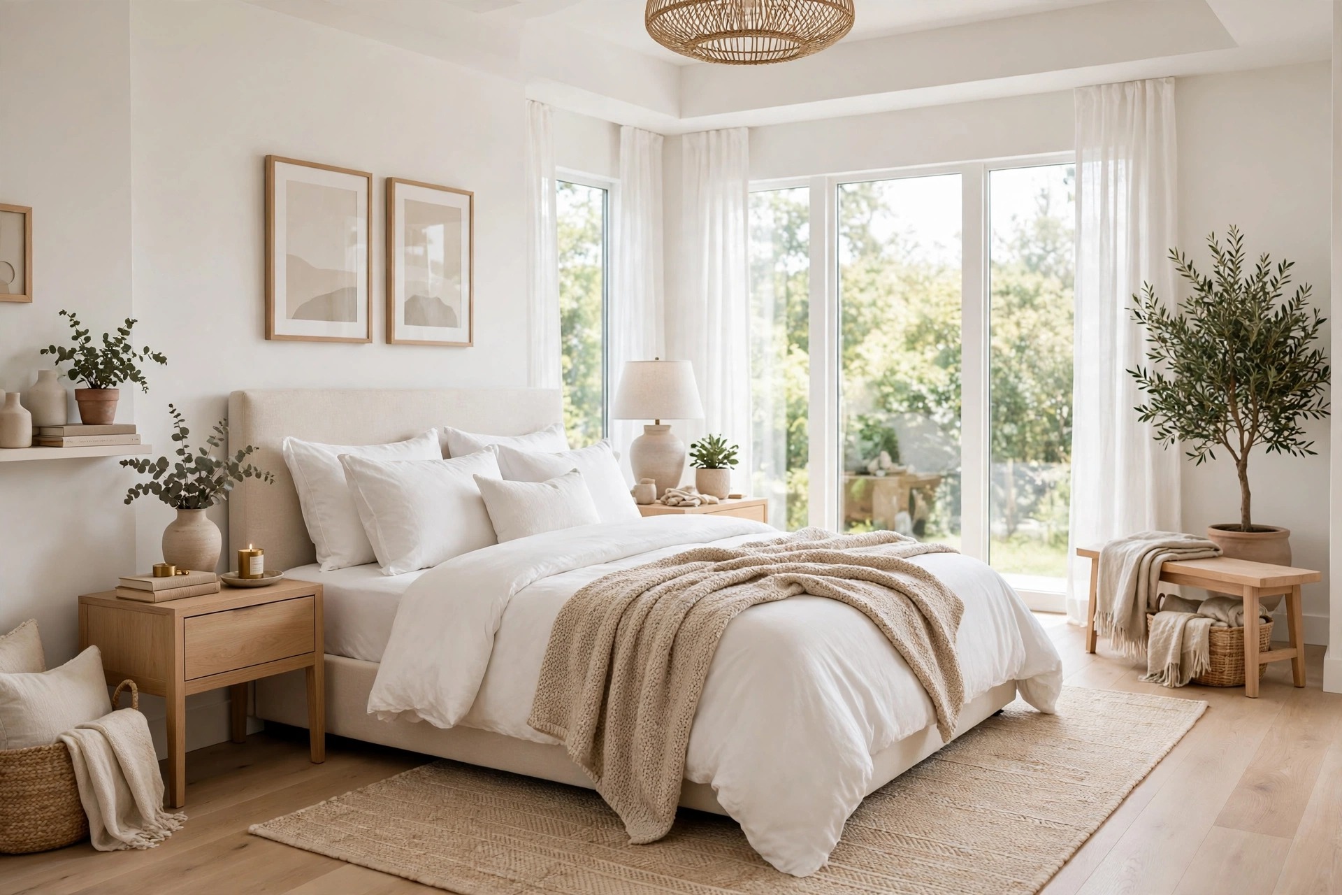
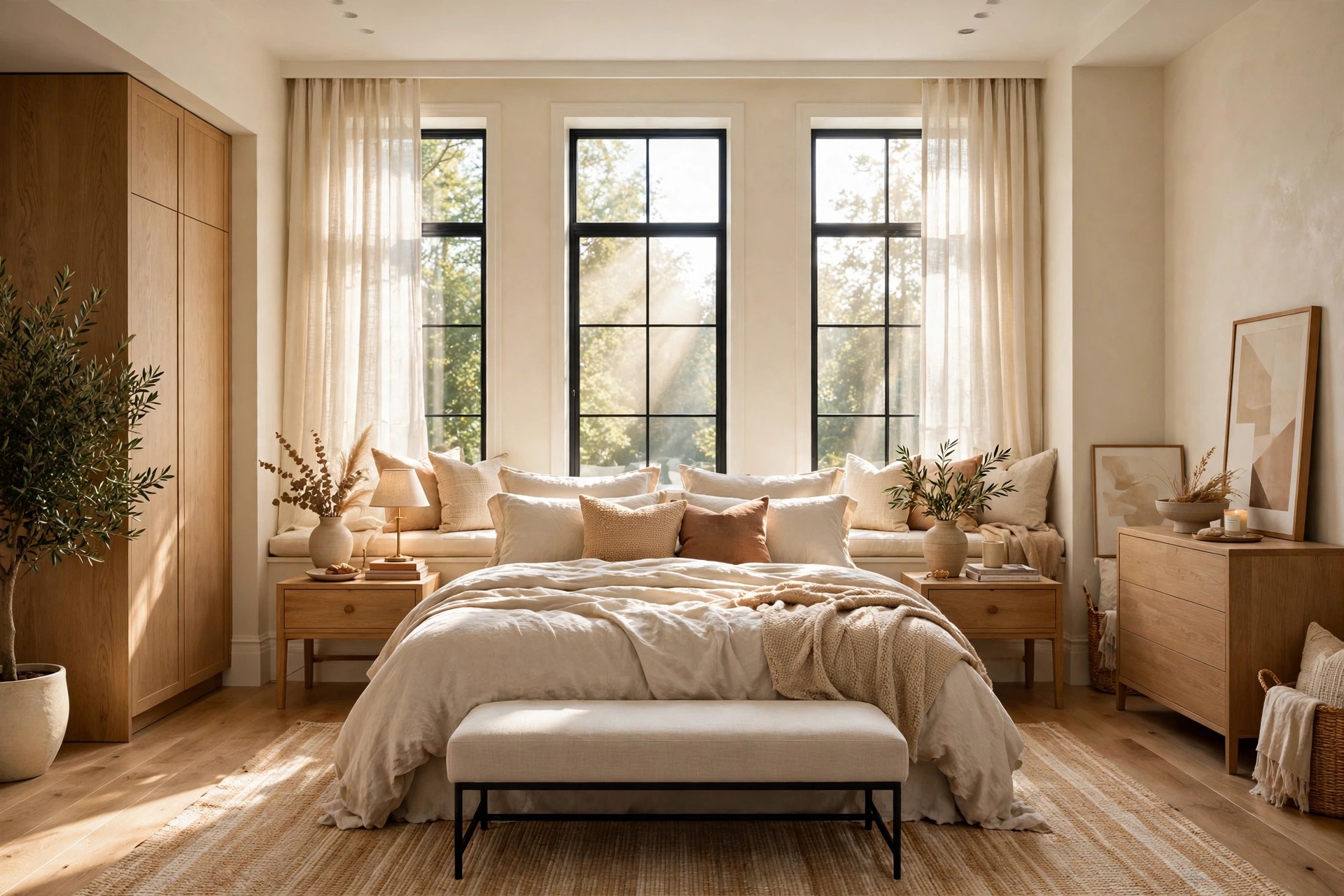
Warm white is the bedroom palette equivalent of a safety deposit box — nothing about it can go wrong. Unlike stark, blue-based whites that can feel clinical after dark, warm whites carry a soft golden undertone that flatters skin, wood, and lamplight. Walls in a warm white feel bright by day and honeyed by night, and they welcome literally any accent color you will ever love.
The trick is reading the undertone before you buy. Warm whites hide hints of yellow, cream, or even the faintest peach — sample them next to your trim, because trim-white against wall-warm-white can look like a mistake if the tones fight. Once matched, layer in warmth through textiles: oatmeal linen, camel wool, oak wood tones. The result is a bedroom that will still look right in five years, which is the whole point.
5. Greige and Taupe: Cozy Modern Neutrals

Greige — the marriage of gray and beige — earned its popularity by being the most forgiving neutral ever mixed. It shifts with the light like a chameleon: cooler and more architectural in daylight, warmer and more embracing under lamps. Taupe leans slightly warmer and moodier, perfect for bedrooms that want a hug from their walls without going dark.
These mid-tone neutrals are ideal 60-percent colors because they hold depth without stealing light. Pair them with crisp white bedding for contrast, or go full tonal with oatmeal and stone layers. Both greige and taupe play beautifully with natural wood — walnut, oak, even blackened bronze hardware. If you want one color decision that eliminates the risk of a cold, flat room, this family is it.
Quick Comparison: Bedroom Color Palettes by Cost and Effort
6. Soft Blue: The Science-Backed Sleep Color

Blue is the most consistently recommended bedroom color for a reason that goes beyond taste: studies on sleep environments have repeatedly found that people in blue bedrooms report sleeping longer and waking more refreshed. The color lowers the perceived stimulation of a room — your brain reads it as calm sky, calm water, calm everything.
The bedroom versions of blue are the muted ones: powder blue, dusty slate, soft chambray, pale Wedgewood. Saturated primary blues energize instead of soothing, so keep the saturation low and the tone slightly grayed. Blue walls pair gorgeously with white bedding and natural textures — jute, linen, light oak — for a room that feels fresh at 7 a.m. and deeply restful at 11 p.m.
7. Sage Green: Nature’s Calm, Indoors

Sage green sits in the sweet spot between blue’s calm and beige’s warmth — it is the color of a quiet garden, and bedrooms dressed in it inherit that peace. As a muted, grayed green, sage never shouts; it settles. It works especially well in bedrooms with plants or garden views, because the inside and outside start to feel like one continuous landscape.
Sage plays beautifully with warm whites, creams, and light wood tones, and it is one of the easiest colors to live with long-term because it is genuinely restful rather than merely trendy. For a tonal look, layer sage walls with eucalyptus-toned bedding and a jute rug. For contrast, add warm brass or honey-wood accents — the green makes warm metals glow.
💡 Pro Tip: If sage feels too green on the sample board, look for “grayed” versions with more gray in the mix — they read as calm neutral-green rather than obviously green, which is much easier to live with for years.
8. Blush Pink: Warmth Without Sacrifice
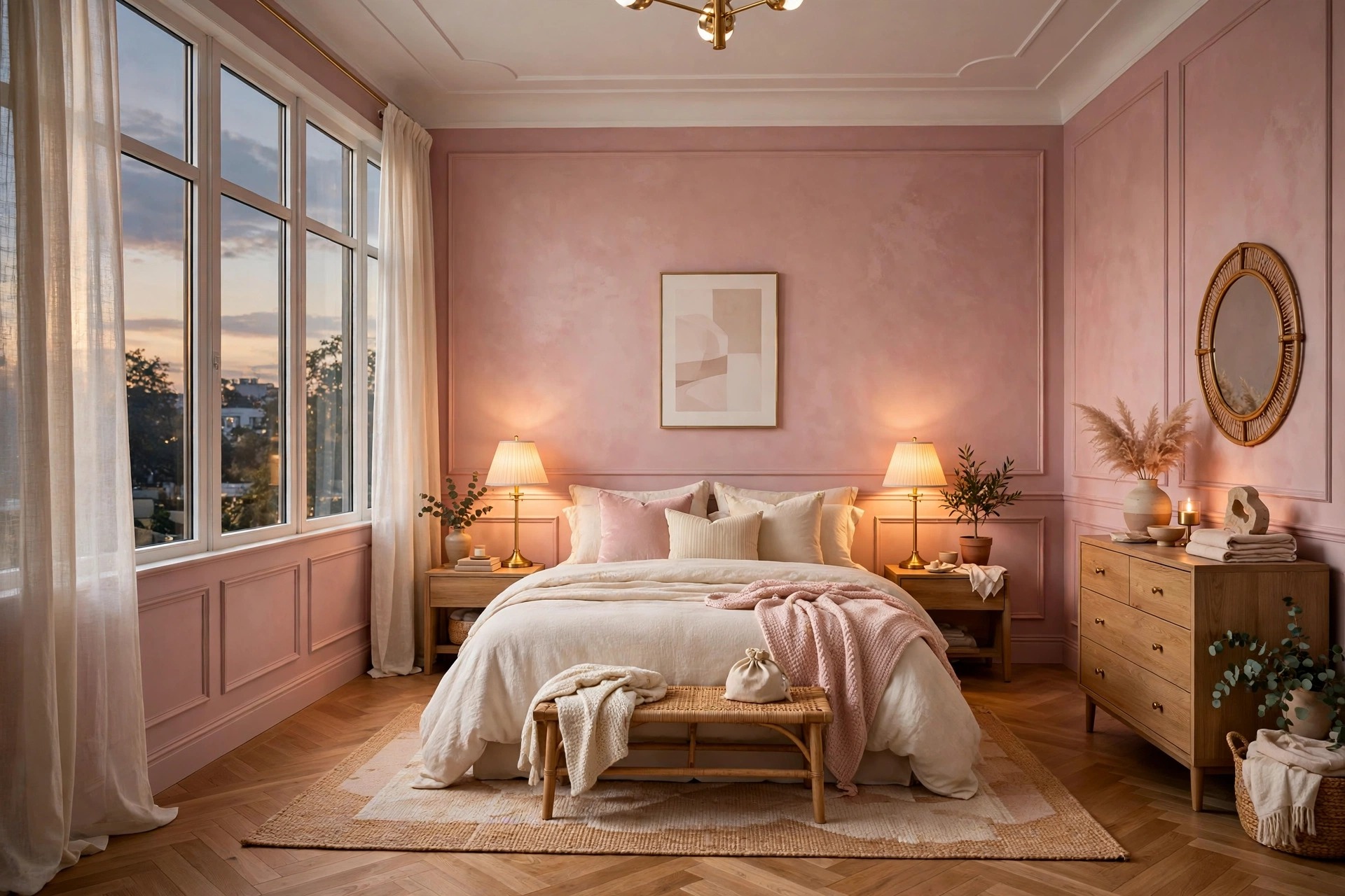
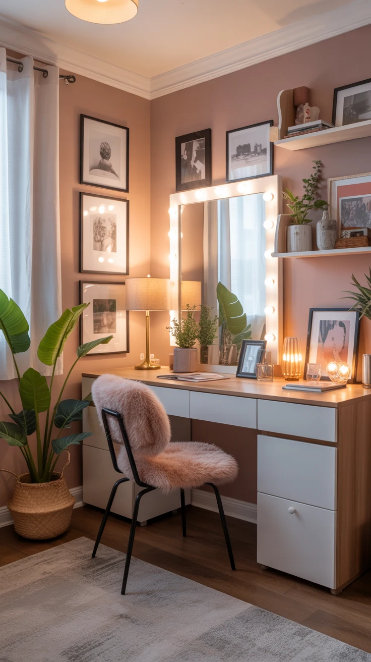
Blush gets misunderstood as a nursery color, but in a bedroom it reads as pure warmth — like candlelight painted on the walls. The key is keeping it muted and dusty rather than sweet: think faded rose, warm clay-pink, or the color of a seashell’s interior. At low saturation, pink stops being “pink” and becomes simply warm.
This is a palette that glows in lamplight, which is when a bedroom matters most. Pair blush walls with cream bedding, warm white trim, and touches of brass or caramel leather. The 60-30-10 balance matters here more than anywhere — blush works as a full-wall color only when the bedding stays calm and neutral. Many of our favorite cozy bedroom inspiration rooms use exactly this recipe: warm walls, quiet bedding, glowing light.
9. Deep Navy: Drama That Still Sleeps Well

Dark bedrooms are having a well-deserved moment, and deep navy is the most livable way in. Unlike black, which can feel flat and void-like, navy retains color and depth — it reads as rich ink, especially under warm lamplight. A navy bedroom feels like evening all the time, which is exactly the atmosphere sleep wants.
Commit to it on the walls behind the bed or all four walls if the room gets decent daylight, and keep everything else warm and light: cream bedding, brass lamps, honey wood. The contrast is what makes navy work — dark walls with dark bedding collapses into a cave. Used as the 60 percent with light 30 percent, navy delivers drama with zero regret risk, and it hides scuffs and imperfections better than any light color ever will.
10. Charcoal and Black Accents

You don’t have to paint the whole room dark to get the grounding power of deep tones. Charcoal walls on a single accent wall — usually behind the bed — give the room a dramatic focal point while the other three walls stay light and forgiving. Black works best as the 10 percent: a black lamp base, black picture frames, a black-framed mirror.
The psychology is real: dark tones recede, so an accent wall actually makes the room feel deeper rather than smaller. The trick is balancing with warm light and warm materials, because charcoal under cool white bulbs goes industrial fast. Pair it with warm whites, caramel leather, and at least one soft texture like bouclé or velvet to keep the drama luxurious rather than stark.
⚠️ Warning: Test dark colors on the wall behind the bed specifically — the wall you see least while lying down. Dark walls you face directly can feel looming at night for some sleepers, so sample the exact wall placement, not just the color.
11. Terracotta and Clay: Earthy Warmth

Terracotta brings the warmth of sun-baked earth indoors, and bedrooms dressed in clay tones feel instantly enveloping. These colors — terracotta, burnt sienna, warm clay, dusty rust — flatter human skin like nothing else, which is precisely what you want in the room where you start and end every day. The room feels warmer by several degrees without touching the thermostat.
Clay tones demand commitment to warmth everywhere else: cream or oatmeal bedding, honey oak or walnut wood, woven textures like jute and rattan. Keep the palette grounded in earth — sage, cream, warm brown — and avoid icy accents that fight the warmth. Mediterranean and desert master bedroom design ideas lean on this family for good reason: it is warmth you can see.
12. Cream, Camel, and Honey Woods
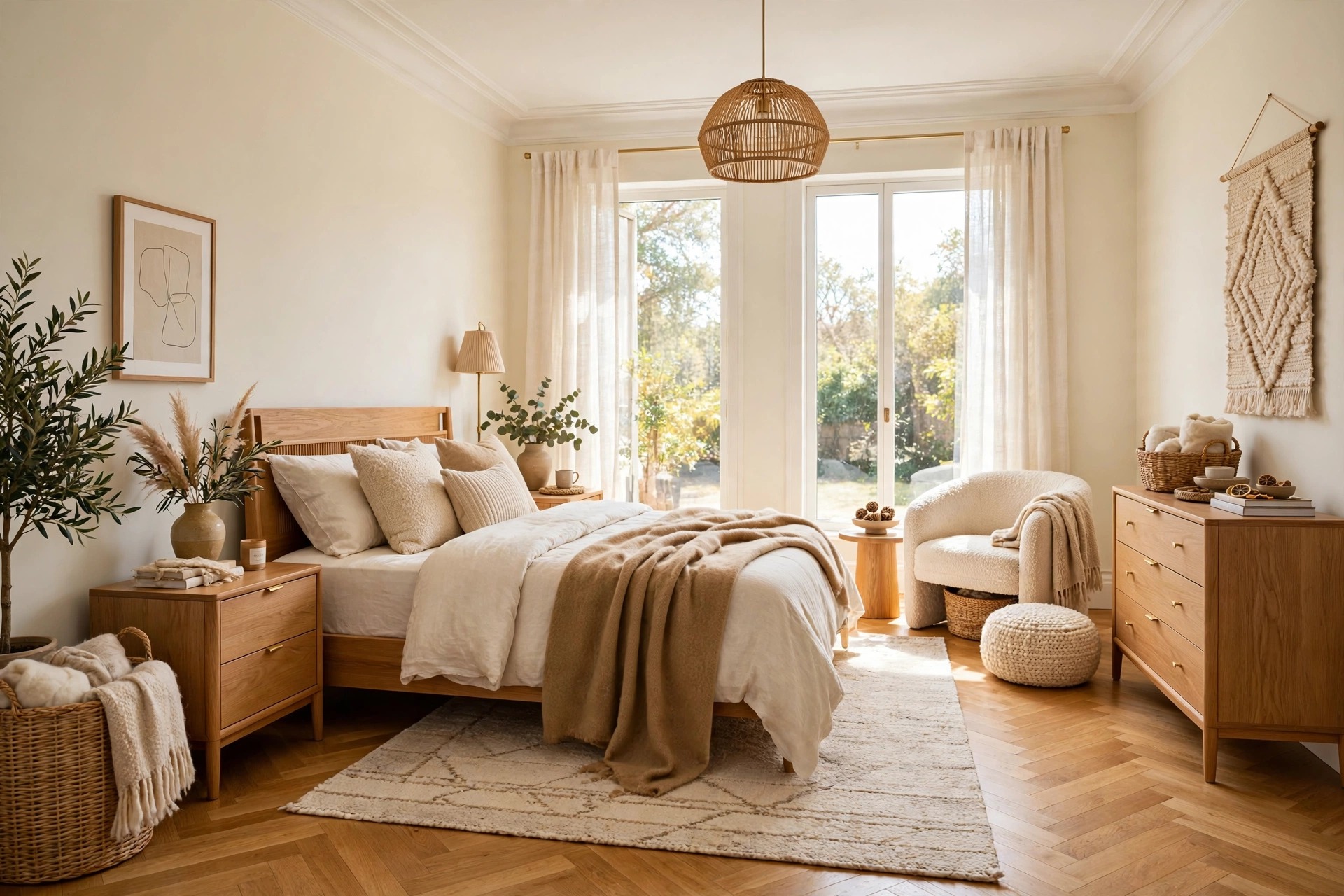
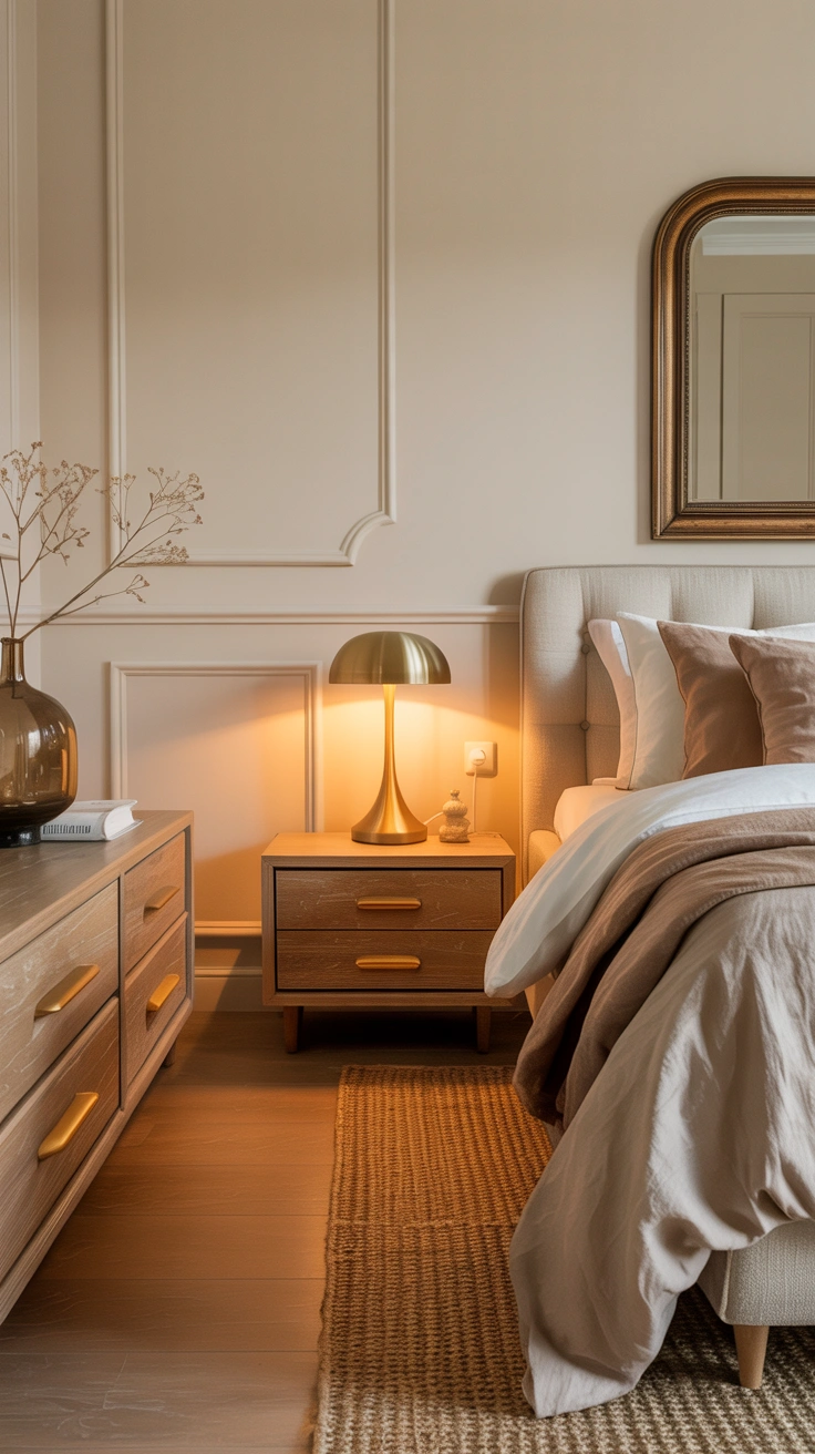
If gray felt cold and white felt stark, this is your palette: cream walls, camel textiles, honey-toned wood throughout. It is warmth built from materials as much as color — the amber glow of oak, the softness of undyed wool, the buttery tone of warm cream paint. Everything in the room agrees with everything else, which is why it never produces regret.
This palette is almost impossible to get wrong because it is monochromatic by nature: every element sits in the same warm family, so nothing can clash. Add interest through texture rather than color — nubby bouclé against smooth oak, chunky knit against crisp cotton. A bedroom in cream and camel reads as expensive in any light, and it is the easiest palette to refresh seasonally: swap the throw and art, keep the foundation forever.
13. Powder Blue and White: Fresh Coastal
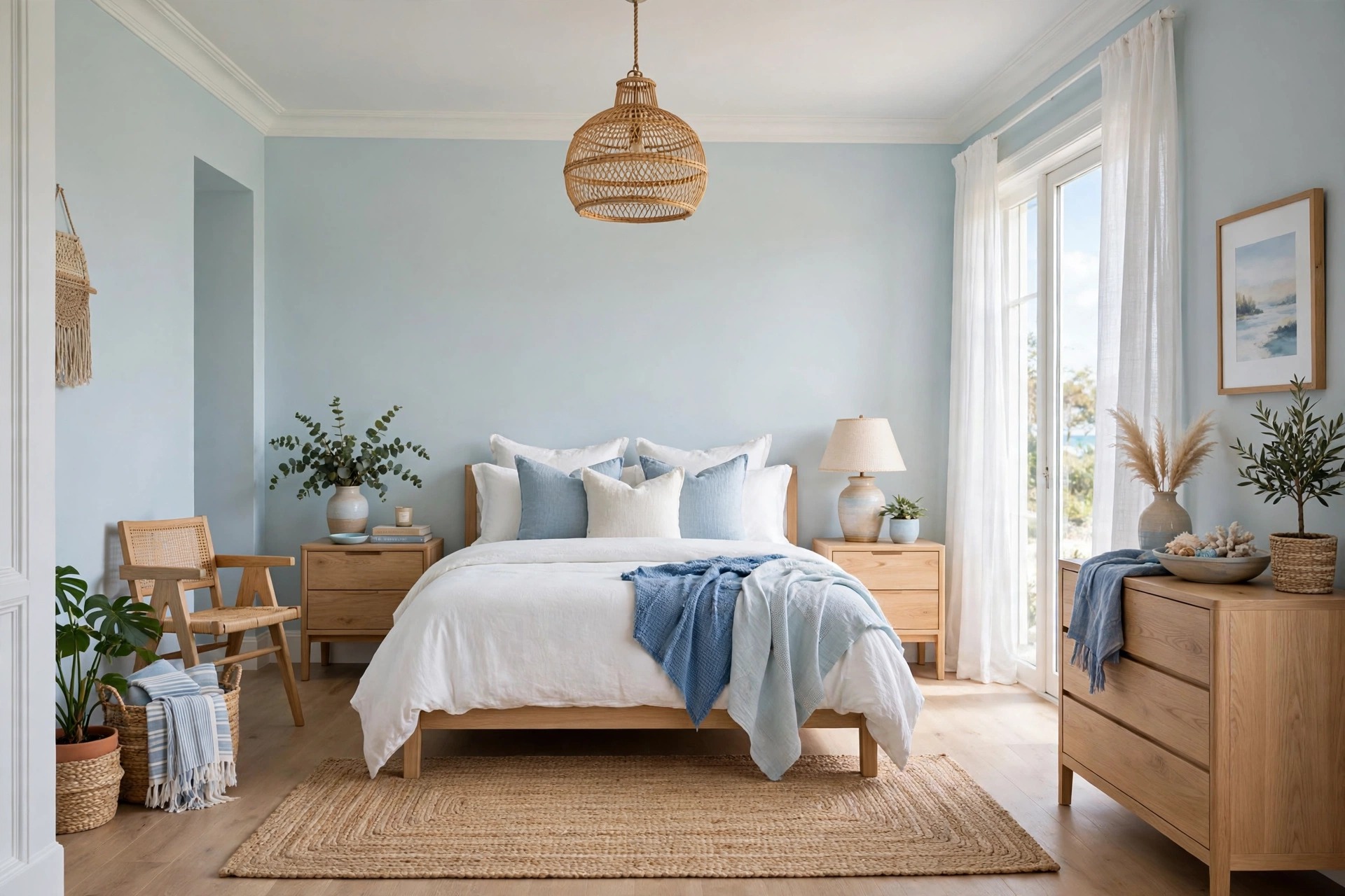
Powder blue with crisp white is the palette of sea air and open windows — fresh, light, and endlessly livable. Unlike deeper blues, powder blue keeps the room bright and airy while still delivering blue’s calming effect. It is the rare color that makes a bedroom feel both restful and refreshed, which is why coastal-style bedrooms rarely age out.
The formula is simple: powder blue or pale chambray on the walls, white or off-white bedding, natural textures (rattan, jute, light oak) for warmth. Keep the blue soft and slightly grayed rather than icy, and let white do the heavy lifting on the bedding so the blue stays a backdrop. This palette shines in rooms with good daylight — the whole look depends on sun doing half the decorating.
14. Moody Plum and Burgundy Tones
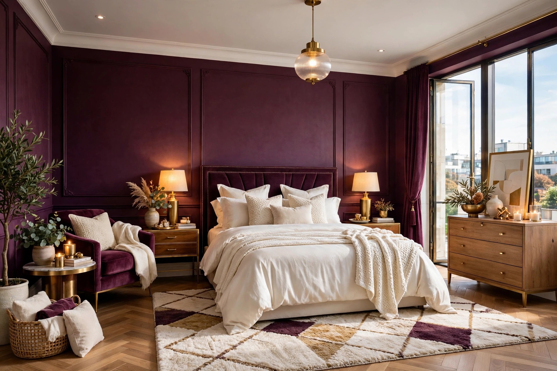
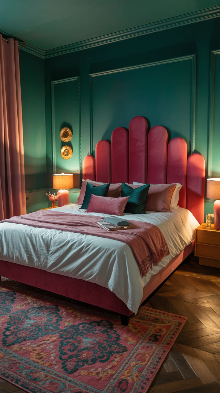
For bedrooms that want richness without navy, plum and burgundy deliver jewel-box drama with a warmer heart. Deep aubergine, muted merlot, dusty wine — these colors envelop the room in a way that feels luxurious and intimate, like the inside of a velvet box. They are evening colors, and bedrooms are evening rooms.
Use them the way you would navy: as a full wall color in a room with good daylight, or as an accent wall behind the bed. Balance with cream and gold — brass lamps, ivory bedding, warm wood — because plum’s coolness needs warm counterweights. This is a confident choice, so sample generously and live with it for the full three days; when it works, it is unforgettable, but it is not a color to choose in a hurry.
15. Build a Sample Board Before You Buy Anything
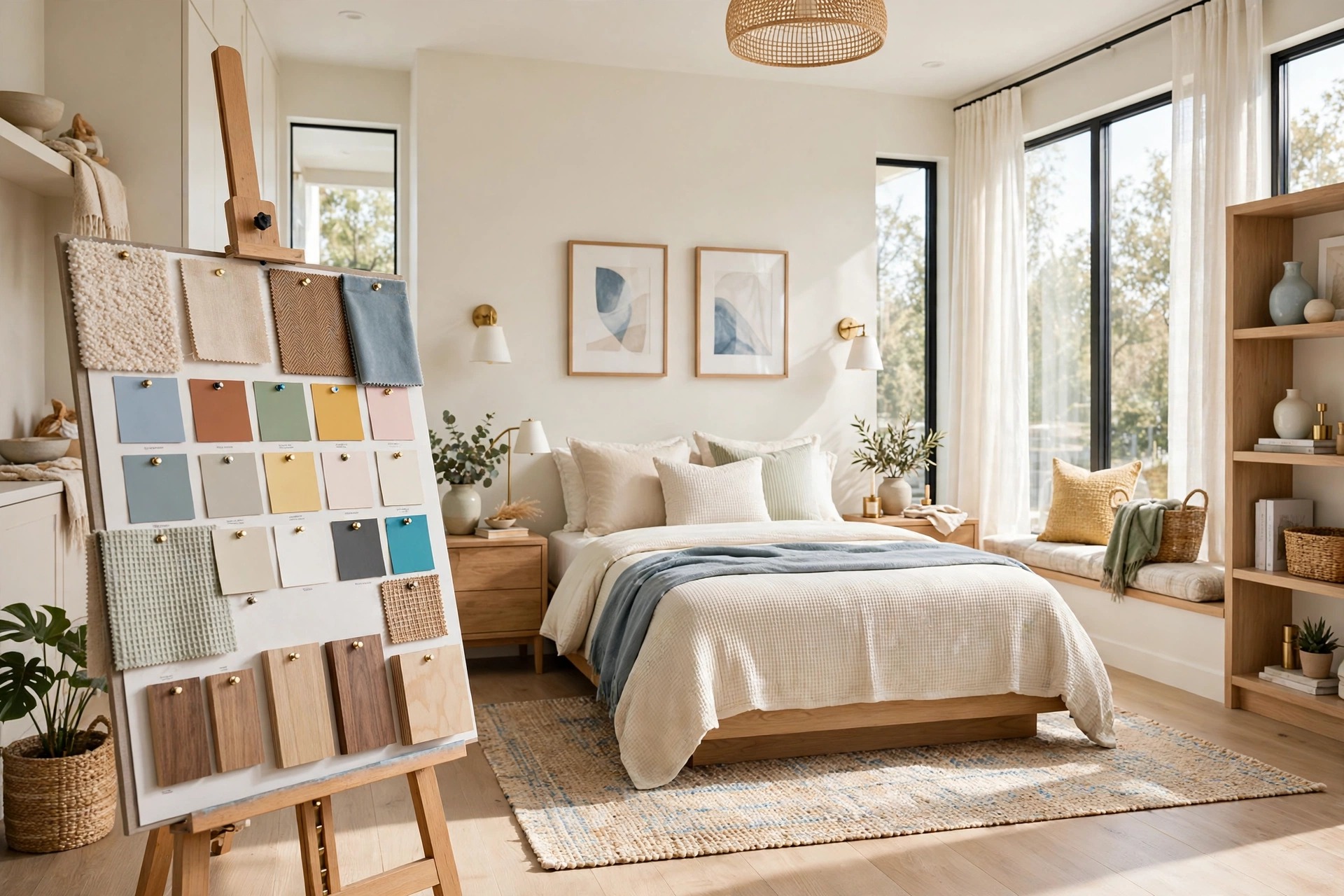
Here is the no-regret secret the previous fourteen sections were building toward: a sample board. Before you buy a single gallon, gather your palette on one physical board — paint swatches, fabric scraps of your bedding, a curtain sample, a sliver of your rug, your wood tone. Pin them together and look at the whole story at once, in your room’s light.
The board reveals what swatches can’t: that your “warm gray” wall fights your “cool gray” bedding, that your brass lamp clashes with the silver in your rug, that everything you loved separately argues when forced to share a room. Adjust on the board — it costs nothing — until the pieces agree. Every designer works this way, and it is the single biggest difference between rooms that last and rooms that get repainted in six months.
💡 Pro Tip: Photograph your sample board in morning, afternoon, and evening light and compare the photos side by side. The camera exaggerates undertone clashes your eye smooths over — if the colors fight in the photo, they will fight in the room.
Common Bedroom Color Mistakes
Mistake 1: Choosing the Color Under Store Lighting
Paint stores are designed to sell paint, not to predict your bedroom. Fluorescent overheads flatten undertones and make everything look brighter and cooler than they will at home. Bringing a swatch home is not optional — it is the entire test. The colors that survive three days of your room’s real light are the only candidates worth buying.
Mistake 2: Ignoring the Undertone
Every neutral hides a secret color: beige can hide pink, gray can hide blue or lavender, white can hide yellow or green. Undertones become loud at wall scale — the faint pink in your “neutral” beige reads as full blush across four walls. Compare your finalist against a pure white card to expose the undertone, and check it against your floor and trim, which have undertones of their own that must agree.
Mistake 3: Painting Before Choosing Bedding
The bed is forty percent of everything visible in a bedroom, so the bedding is really the second wall color. Choosing wall paint without knowing your bedding is like tailoring a suit without the shirt. Pick your bedding first — it is harder to change and has fewer options — then choose a wall color that serves it. At minimum, test them together on the sample board before the first gallon is opened.
Mistake 4: Forgetting the Ceiling and Trim
Walls don’t exist in isolation — they meet the ceiling and the trim on every edge, and those junctions can make or break the palette. Stark white trim against warm walls can look like a mistake; a brilliant-white ceiling over warm walls can glow cold. Carry your wall color onto the ceiling at fifty percent strength, or choose a trim white that shares the wall’s undertone, and the room reads as one intentional decision.
Mistake 5: Copying a Photo Instead of Testing the Room
That perfect bedroom on your screen was shot with professional lighting, edited for color, and exists in a room with different windows, floors, and furniture than yours. The exact paint color from the photo can look entirely different in your space — same name, different room, different result. Use photos for the feeling and the palette family, then run your own light test and sample board. Your room gets the final vote, always.
Frequently Asked Questions
1. What is the best color for a bedroom if I want better sleep?
Soft, muted blues and greens are the most consistently recommended for sleep — they lower the room’s perceived stimulation and are associated with longer, deeper rest. Warm neutrals like soft beige, warm white, and greige are close seconds. The colors to avoid in a sleep-focused room are high-saturation reds, bright oranges, and stark high-contrast combinations, which keep the brain in alert mode. Whatever you choose, keep saturation low and contrast gentle for the most restful effect, and style the room toward a true sleep sanctuary bedroom once the color is set.
2. Should bedroom walls be light or dark?
Both work — the question is really about light and mood. Light walls maximize brightness and make rooms feel larger, which suits small or north-facing bedrooms. Dark walls create intimacy and drama, and they can actually make the room feel deeper rather than smaller when balanced with warm light and light bedding. The safest path is light on three walls with one darker accent wall behind the bed. Either way, test the exact wall placement in your room’s light before committing.
3. How do I know if a paint color’s undertone will work?
Hold the swatch next to a pure white card — the undertone jumps out in comparison. Then check it against your fixed elements: floors, trim, fireplace stone, large furniture. The undertone must agree with those, because they are not changing. Warm undertones (yellow, pink, peach) want warm companions; cool undertones (blue, green, gray-violet) want cool ones. Mixed undertones are the number one cause of rooms that feel “off” without an obvious reason, so this check is worth ten minutes of your time.
4. Can I use bold colors in a small bedroom?
Yes, with proportion discipline. In a small room, bold color works best as the 10 percent — bedding, art, a single accent wall — while the 60 percent stays calm and light. That said, a small bedroom painted entirely in a deep, enveloping color can feel like a jewel box rather than a closet, as long as the lighting is warm and layered. The real enemy in small rooms is not bold color but visual fragmentation, so whatever you choose, keep it cohesive. Our guide to make a small bedroom feel bigger covers the full strategy.
5. How many colors should a bedroom palette have?
Three is the magic number for most bedrooms: a dominant (60%), a secondary (30%), and an accent (10%). Beginners should treat three as a hard limit until the room feels right — every extra color is another relationship to manage. Experienced decorators can stretch to four or five by keeping the additions tonal (different shades of the same family) rather than introducing genuinely new hues. If your room feels chaotic, the fix is almost always removing a color, not adding one.
6. What if my partner and I want different bedroom colors?
Find the overlap, not the compromise. Each person lists their top three feeling words and their acceptable color families, then look for the intersection — it is almost always in the muted middle (sage, warm gray, soft blue). Alternatively, use the 60-30-10 structure diplomatically: agree on the calm 60 percent together, then let each person own part of the 30 or 10 percent on their side of the bed. Symmetrical nightstands with different accent objects give both people a voice without splitting the room.
7. Is it okay to paint the bedroom ceiling a color?
Absolutely — the ceiling is the forgotten fifth wall, and color there can be transformative. A ceiling painted the same color as the walls (or one shade deeper) erases the hard line where wall meets ceiling, making the room feel taller and more enveloping. In bedrooms, a soft, slightly deeper tone overhead removes visual “brightness” and makes the room feel like it is tucking you in. Avoid high-contrast ceiling colors in rooms with low ceilings, and always sample the ceiling color in the room’s actual light, since ceilings read darker than walls.
Conclusion
Choosing a bedroom color palette you will still love in six months is not a talent — it is a sequence. Decide how you want to feel, assign every color its 60-30-10 role, sample ruthlessly in your room’s real light, and build the sample board before you spend a dollar. Each step removes one more way for regret to sneak in, until the only thing left is a room that feels like it was always meant to look this way.
The fifteen palettes above give you the full spectrum to choose from, from can’t-miss warm whites to confident moody plums. Pick the family that matches your three feeling words, run it through the process, and trust the test over the trend. If you are still building the rest of the room, our bedroom decorating mistakes guide shows the traps to avoid once the color is right — because the perfect palette deserves a room that lets it shine.